Are your backgrounds often added as an afterthought? If so, you could be missing out on a major opportunity to improve your painting skills.
Backgrounds can’t be avoided so giving them more thought at the planning stage will have huge benefits.
In the previous tutorial I showed you why backgrounds are important. In this tutorial I will give you some practical advice on how to paint, or draw, awesome backgrounds.
Backgrounds that will compliment your subject (focal point) and turn an average painting into one with the Wow factor.
What is a Background?

A painting is bound by its frame. The background is usually the space between the subject and the frame. The background is also called negative space. The space occupied by the subject is the positive space.
The exception is when the background is the subject of the painting as in skyscapes, abstract or non-figurative painting. Here the background becomes the positive space and the foreground the negative space.
While the background includes negative space, it is also much more.
Why Have a Background at All?

A subject can’t exist without a background. Even if left unpainted or plain white the remaining canvas still forms a background. This background affects how the viewer experiences the subject of your painting.
There is simply no way to avoid having a background so we may as well make full use of it.
The best way to use your background is to subtly use it to focus attention on your subject.
What are the Main Characteristics of a Good Background?
- It improves the painting by playing a supportive role but never competing with the subject for attention.
- It is different from the subject but not so different that it draws attention from the subject.
- It makes the subject look as if it belongs on the background and not as if background and subject are two different paintings.
- It makes the picture look better with it than without it.
- It supports the “mood” of the subject.
So, as you can see a background deserves as much consideration as a foreground.
What to Consider When Planning a Background?
Subtle contrast is what a background should provide and there are many elements that can be included in a background to achieve this.
Colours, Which and How Many?
You could choose to have a monochrome background i.e., only one colour as with the dog painting above. This could be any colour on the spectrum from white to black. Using only a single colour with no additional colour added to introduce variation, can make it difficult to get a feeling of depth in your painting and, if the subject is not strong enough to stand on its own, it may appear to be overwhelmed by the background.
So if you do decide to go with a plain background, make sure you have a very strong / striking subject.
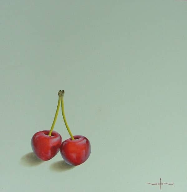
One situation where you would however want a plain background is when you are trying to create a minimalist look to your painting. You can see that in the cherry painting above.

As soon as you introduce at least one other colour (even a tone or a tint) then graduations of colour are possible which create a feeling of separation and depth between the subject and the background.
Colours that are complementary to those of the subject (opposites on the colour wheel), are often a good choice for a background. Complements show each other off very well but unless you are creating an abstract, you may want to reduce the intensity of the background complementary colour by mixing it with a bit of its opposite so that it recedes into the distance slightly and doesn’t compete with the main subject.
For example, painting a red flower against a green background it may be advisable to mute the green with either a neutral or its complement (red) thus decreasing its intensity and visually pushing it into the background and at the same time bringing the subject (the red flower) forward.
Multi colours can be used in the background. Especially when your subject is mainly one colour, having a multi-colour background can give the necessary contrast to make the subject stand out.
Harmonious colours which are close to the colour in your subject on the colour wheel will create a restful mood – again they may be toned down with either a complementary colour or a neutral so that they remain in the background.

Neutral colours make excellent backgrounds especially greys made by mixing a dominant colour in the subject with its complement and diluting with white to form a subtle grey that will set the subject off perfectly.
Whatever colour you use in your background, always try to incorporate a colour (albeit less saturated and/or of a different value) found in your subject and vice versa, This trick will visually link the subject and background and unify the painting.
Highlights, shadows and reflected light in the reference offer opportunities to introduce a subtle tint or shade of colour to the background.
Using Warm or Cool Colours

Contrast in any form adds interest to a painting.
Contrasting a cool coloured background with a predominantly warm coloured subject is one way of making your painting more exciting to the viewer. Warm colours will appear to advance while cool colours recede.
In the artwork above you can see how the warm colour seems to glow when placed against a cool background.
Play Around With Values
The background should enhance the mood of the painting.
If you’re creating a sombre subject with lots of dark values and not much contrast, then your background is likely (but not always) to be in keeping with this mood. On the other hand of you are painting a high key painting with lots of light then your background is also likely to be lighter in value and hue. While contrast between background and subject is good, too much contrast is distracting.
A way of bringing focal points of the subject forward is to increase the contrast in value with the background. The main focal point of a painting is most often where there is the greatest value contrast (light against dark). You can see this effect in the space globe artwork above.

Conversely the closer in value the subject is to the background the more it will appear to sink into the background allowing the viewer’s eye to skip over it. You can see that effect in the painting of the stork above.

A good tip is to always make the corners of your painting slightly darker than the centre. This has the effect of pulling the viewer’s eye to the lighter central portion where the focal point usually is – almost like looking through a tunnel.
You can see how I have created this effect in the above painting for a class on how to paint an abstract skyline.
Use Directional Lighting

Value differences in your background give you the opportunity of establishing the direction of light even before you paint the subject. When painting a still life or a portrait, the background on the side from which the light comes will be darker in value than the side onto which the light is shining. As the brighter (illuminated) side of the still life/portrait will be against the darker side of the background and vice versa, the resulting contrast of light and dark will help your subject come forward.
By lighting the background from above or below you create a top -to-bottom gradation of light which will create a feeling of distance between the background and subject.
You can choose to put darker parts of your background against the highlights of your subject to create maximum contrast and draw the eye.
A trick which many artists use especially in portraiture is to place a highlight behind the head (usually the main focal point) of the painting and gradually fading out to the sides. This acts as a spotlight to direct attention.
Choose Between a Complex or Simple Background
A background can be highly detailed, very plain or anywhere in between. If your subject is detailed and complex, then it’s often better to have areas of low complexity in the background where the eye can rest.
Conversely if your main subject is lacking in detail then a background also lacking detail will tend to make it disappear.
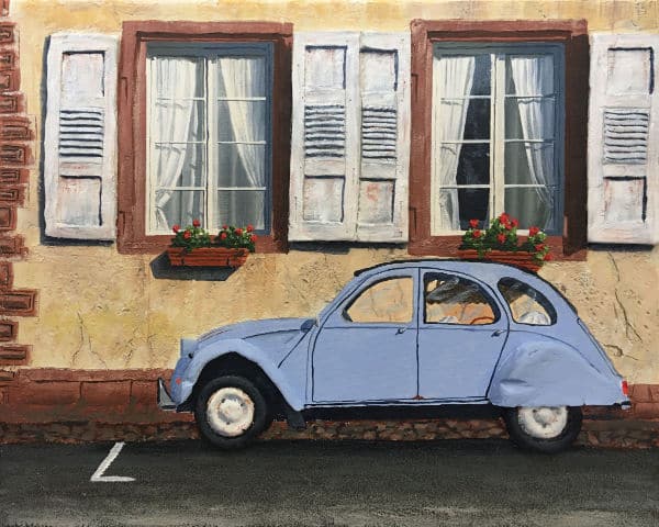
A complex background on the other hand will bring the subject into sharp focus. You can see this effect in the painting of a car above. The car is very plain so a lot of detail has been put into the background.
Detail included in the background can tell the viewer more about the subject, e.g., in the painting above the flower boxes and shutters give you the feeling that this is a scene in France.
Adjust the Proportion of the Background
By adjusting the proportion of negative to positive space, you can increase the drama of your painting. A lot of negative space above and around a subject could impart a feeling of vulnerability. A moving subject with more negative space in the direction of movement will increase the feeling of speed more than having equal amounts of negative space both in front and behind.
To break up large areas of negative space which are visually boring you could try shifting your viewpoint and cropping an image.
Little or no negative space will throw more focus on the subject and result in a changed perspective much like a close-up shot in photography.
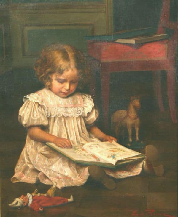
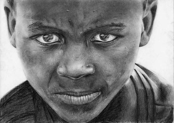
In the drawing of the little boy you can see how tight cropping has reduced the amount of background in the artwork. This makes the drawing look very dramatic.
Conversely if you are unable to crop the scene then clouds, rocks, patterns on water, reflections, shadows etc. can all be used to break up large areas of otherwise dull negative space.
Use the Background to Create Balance in the Artwork

Use the background to help balance your subject. A strategically placed cloud, tree etc. may balance the subject visually and create a more pleasing painting.
Horizontal lines in the background can effectively balance strong vertical lines in the subject or vice versa. Similarly, static lines can be contrasted with dynamic lines.
In the painting above James Whistler has used the bright white of the picture on the wall to balance the very large black area taken up by his Mother's dress.
Use the Background to Direct the Viewers Eye

Strategically placed items in the background can be used to direct the viewer’s eye around the painting.
Grass all bent in the same direction by the wind, shadows on the ground, branches pointing towards the subject or clouds arranged in a directional formation are just some of countless possibilities to manipulate the viewer’s eye.
In the painting "The Scream" Edvard Munch has used minor objects in the background, and even the flowing lines in the background to keep the viewers eye moving in a circle through his painting.
Use the Background to Create Depth / Distance

As soon as more than one colour is used in a background a feeling of depth can be introduced.
The more colours and items used in the background the greater the opportunity especially in landscapes for using overlap, intensity, hue, value, etc to increase the aerial and linear perspective and adding to the feeling of depth.
Here you can see how the sea and aircraft carrier in the background have even created the illusion of height in the painting.
How to Handle Edges
An edge is created when the subject and the background meet. How you treat edges can make a huge difference to the success of your painting.
If you make a hard edge (i.e. where the background and foreground meet both will be in sharp focus), it will catch the viewers eye and will seem to advance.
Soft or lost edges, ( where the background and subject meet are out of focus or so close in value that it’s hard to see the difference), will appear to recede. You can therefore choose which parts of the subject you want to be seen first by using hard edges to emphasise and soft or lost edges to make them almost disappear.
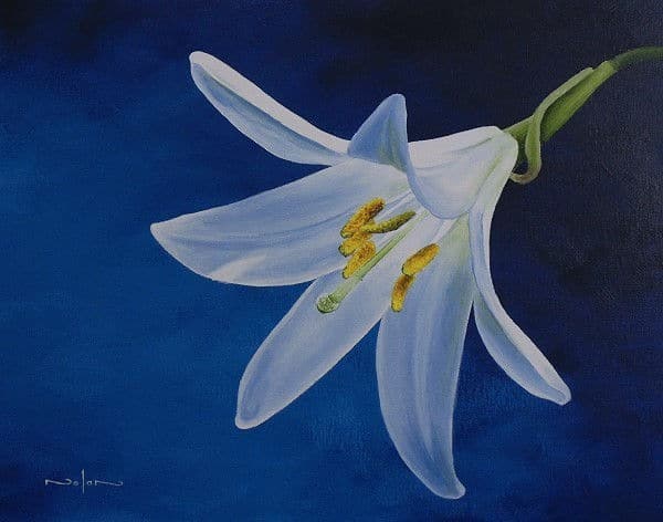
In the lily painting above you can see this effect nicely. The flower itself seems to come forward due to it's found / hard edges. The stem on the other hand has it's edges softened making it look like it is receding into the distance.
The trick is to have a good combination of hard and soft edges to be interesting to the viewer.
Be careful however as hard edges compete for attention so using too many can lead to a restless or disjointed feeling in your artwork.
How to Focus Attention Where You Want It
Avoid introducing detail near the edges of your painting that draws the eye away from the focal area. If you can’t avoid having objects near the edges, make sure the value contrast is reduced and the colours used are desaturated and/or the edges soft to keep them from drawing attention away from the main subject.
How to Recognise a Bad Background
- It dominates the picture – you see it first before the subject of the painting.
- The combination of the subject and the background has too much detail -It’s too busy – your eye doesn’t know where to look first and has no place to rest.
- It contains a mistake which immediately draws the eye like incorrect perspective.
- The subject and the background look as if they are separate paintings and not a unified whole.
- Large and boring areas of colour which don’t invite the viewer’s eye to move around the painting.
When to Paint the Background
Some artists paint the background first before painting the subject.
This is useful in that it prevents the tiny gaps often created when you paint the subject first and fill in the background later. When using this method try to slightly overlap the edges of your subject with the background colour without losing your guidelines so the subject won’t look as if it has been painted “on top”.
To avoid this “stuck on” effect always make sure your subject interacts correctly with the background. For example, look for the shadows it casts on the background objects. Look for background shadows cast onto the subject as well.
Ensure you paint the background slightly into the subject canvas area before painting the subject. That way you don't end up with a halo around the subject.
You also want continuity in the background, past the subject. For example, if you have a fence going behind the subject from left to right then the line formed by the fence needs to line up and not be staggered on either side of the subject.
Some artists paint bits of the background as they go. Having some background to compare with enables values to be more accurately judged.
The background can sometimes be added last if the outline of the subject is not too intricate. An example of this would be the lilly painting from an earlier example. As most of this subject has a hard edge, you could paint the background last without any problems.
Conclusion
Backgrounds should usually as the name suggests, remain in the background playing a supportive role.
They should contrast with the subject in some way to help make the subject come forward.
The contrast should not be so much as to be distracting.
These are guidelines not rules feel free to experiment!
Photo manipulation technology now makes it possible to do just that by trying out different types of backgrounds before you even start painting.
If you enjoyed this tutorial then you will also enjoy Dennis' Composition Made Easy course where he teaches you how to compose your paintings, including the backgrounds, for best effect.
Pin Me
