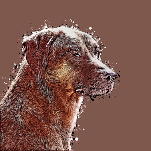
We always put in a lot of effort deciding what subject to paint or draw. That beaten up old tractor will make an awesome painting. That photo of the dog looking silly will make an awesome drawing, and so on.
Yet we very seldom put much thought or effort into the backgrounds surrounding the subject.
In this article I will show you why you need to put in as much thought into your backgrounds as you do the subject.
We will look at what is a background, learn about positive and negative space, see what characteristics backgrounds have, and how we can use backgrounds to enhance our subject.
Let's get going...
Introduction
In painting and drawing (2 dimensional art), backgrounds are like death and taxes – you simply can’t avoid or ignore them.
As soon as you draw or paint a line on a blank sheet of paper you have a subject and a background.
Backgrounds are as important to the success of the artwork as the subject itself and therefore as much thought should go into designing them.
The background is what surrounds the subject – it fills the spaces between the subject and the frame.
The size of a background depends on the dimensions of canvas and the size of the subject. Sometimes there will be very little background and sometimes a lot.
To distinguish between the space filled by the subject and by the background, artists use the terms positive and negative space. The subject occupies the positive space and the background fills the rest which is called negative space.

For example in the photo above the black puzzle piece is the subject and it occupies the positive space in the image. The white puzzle pieces are the background and occupy the negative space in the scene.
Often the background and the foreground (both negative space) are one
For example in the painting above the background and the foreground fuse into one coherent mass because they are the same tonal value / colour so form one item.
More often than not the foreground and background are distinct as you can see from the painting above. Yet together they form the negative space surrounding the subject.
The word “background” can thus be a bit misleading as it includes the foreground (if there is one). A better word could have been “surround”, as we are referring to everything that surrounds the subject.
For this article I want you to think of the background rather as the negative space surrounding the subject (which includes the background and the foreground).
Then think of the subject as the positive space to avoid confusion.
Positive and negative space can’t exist on their own, only relative to each other. Just as the subject of the artwork should be interesting, so should the background.
Characteristics of Backgrounds
More often than not backgrounds play a supporting role in the artwork.
Backgrounds are the context in which the subject rests and they are used to make the focal point of the artwork (the subject), stand out in ways that would otherwise not be possible.
Backgrounds help set the mood for the painting e.g. a dark background could convey a sombre mood whereas a light one could suggest sunshine and lightness.
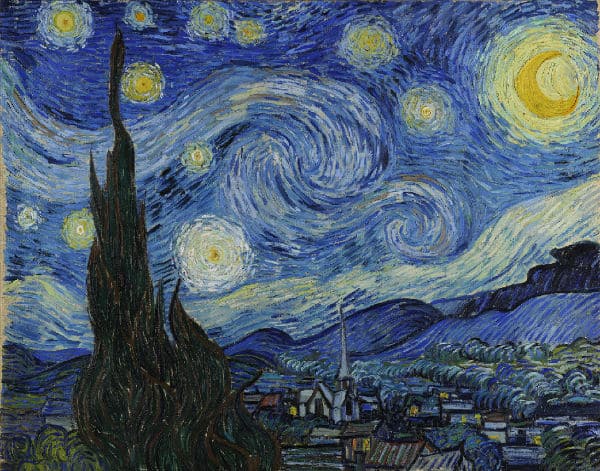
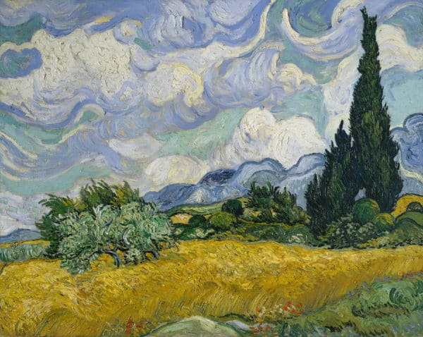
On the odd occasion, the background can even become the subject of the painting as can be seen in van Gogh's Starry Night painting.
How Backgrounds Can be Used to Enhance the Subject
Coherence : Having a feature that repeats itself in the background as well as the subject can create a sense of coherence in your artwork.
In the painting above you can see how the buildings and the background all have a strong feeling of being outlined by the use of strong contrast on the edges of each object. This adds a coherent feeling the painting.
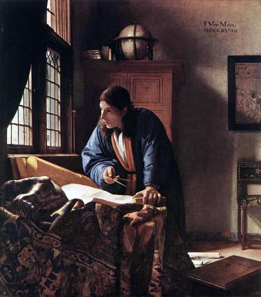
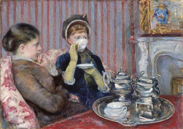
Setting the Scene : In the painting above the background tells us more about the subject. By looking at the background we know that the subject is at their place of work as opposed to a more informal setting.
Focusing Attention : In this painting all the lines in the background are pointing towards the subject. As your eye tends to follow a line, these lines constantly lead the viewers eye back to the subject.
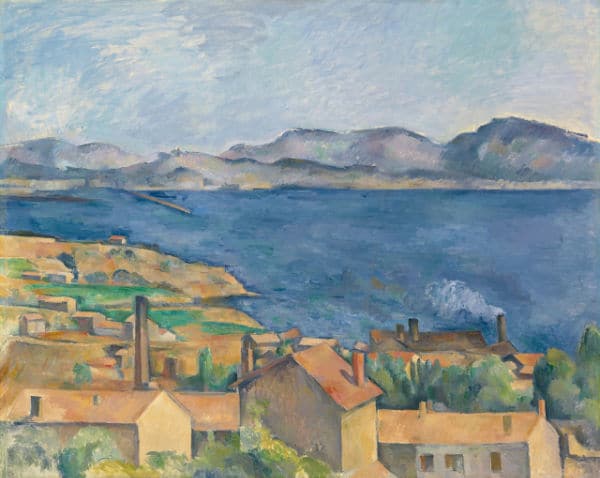
Adding Depth : In this painting the background adds a sense of depth and distance to the painting. Notice the sharp focus of the foreground compared to the objects seen through the window. Note also how the objects get smaller the further the way they are.
Framing : Here contrasting colours and tonal values have been used in the background to frame the subject and make it stand out from the surrounding objects.
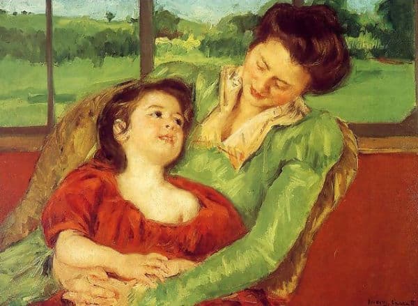
Complimenting : By using complementary colours next to each other contrast is increased and the eye of the viewer is drawn to the subject. The use of contrasting hues of red and green as well as value contrast makes the focal point (the child) stand out. Repeating the greens in the backgrounds unites the foreground and the background.
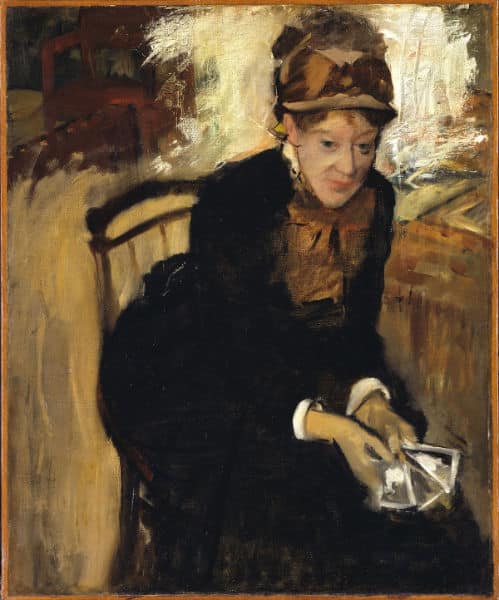
Contrasting : In this painting the plain material of the subject's clothing is used to contrast against the patterns on the wall and chair, making the subjects stand out.
Here is another example of contrasting. This time however the artist has used different brush strokes, repeating colours & shapes as well as textures to create a contrast between the subject and background.
As you can see, the background has an important role to play in uniting the elements of the artwork. This can be achieved in many ways so don't be shy to use your artists license to change the background in a way that will enhance how the viewer will experience your subject.
Add things in, leave things out. Change colours, adjust contrasts. Don't be shy.
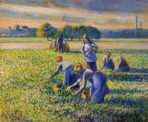
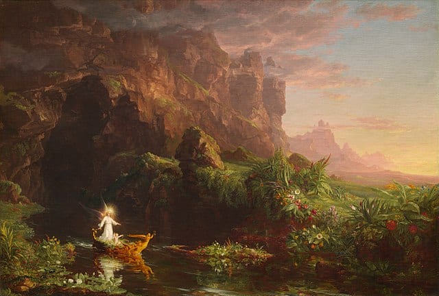
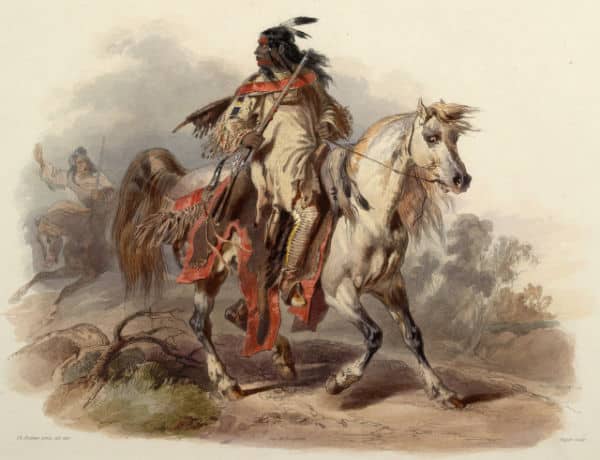
Here you can see how the addition of the clump of trees in the mid distance forms a coherent grouping with the central workers in this painting. As the workers and the trees are all at different distances they not only lead your eye into the painting, but also add coherence and harmony between the front and back of the artwork. Additionally the cast shadows lead the eye to the subjects.
Different Types of Backgrounds
Now let's take a look at the different types of background we can use in our artworks.
No Background
If the subject is strong enough to stand on its own, and the artist feels a background would not enhance the subject, then there is no need for a background other than a plain colour.
Simple Backgrounds
Very rudimentary backgrounds consisting of just a few lines which give context to the subject in a way which could not have been achieved using no background.
Vignetted Backgrounds
This type of background does not extend all the way out to the frame but just enough to bring more interest to the subject than a blank background would do.
Monochrome Backgrounds
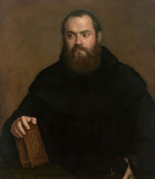
Monochrome backgrounds are different to having no background as you add different tonal value to the background which keep it interesting without competing with the subject.
In this painting the monochrome background blends in with the colours of the monk's robe while contrasting with his skin colour so as to draw attention to the focal points of the head and hand.
Gradated Backgrounds

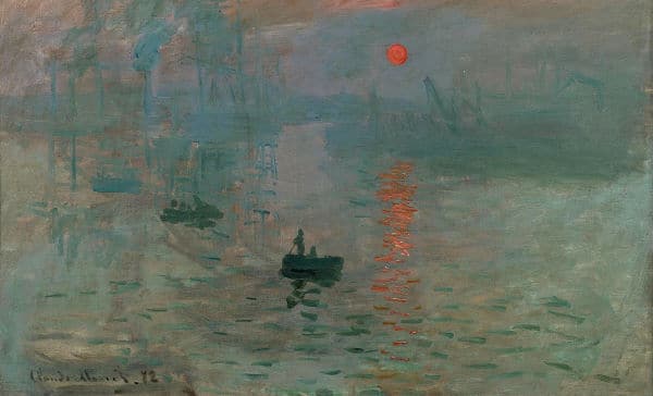
Gradated backgrounds are used by artists to introduce depth to an artwork. In this painting, from one of my oil painting classes, you can see how a simple gradation in the foreground and background have added the illusion of depth into the scene.
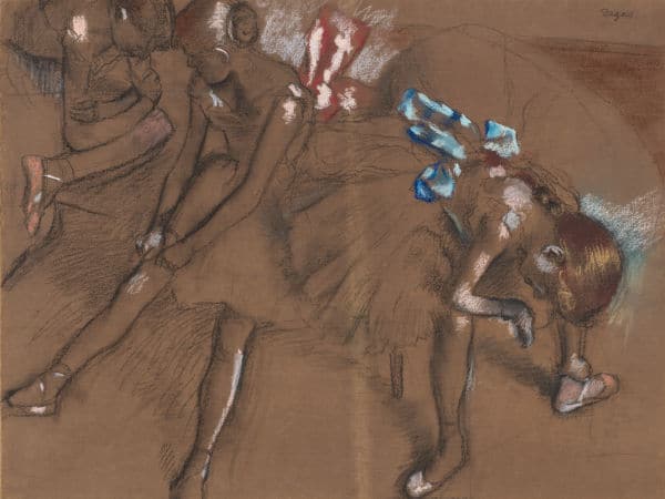
Semi Detailed Backgrounds
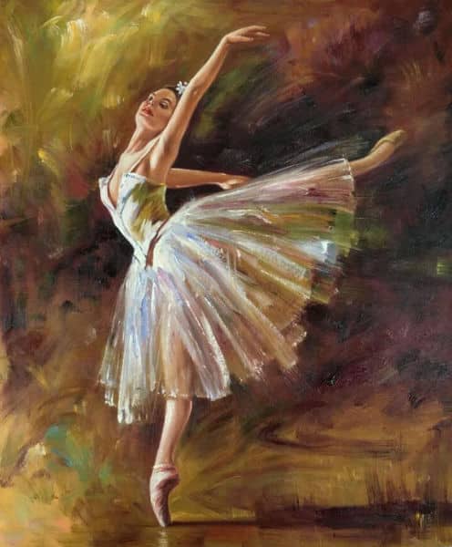
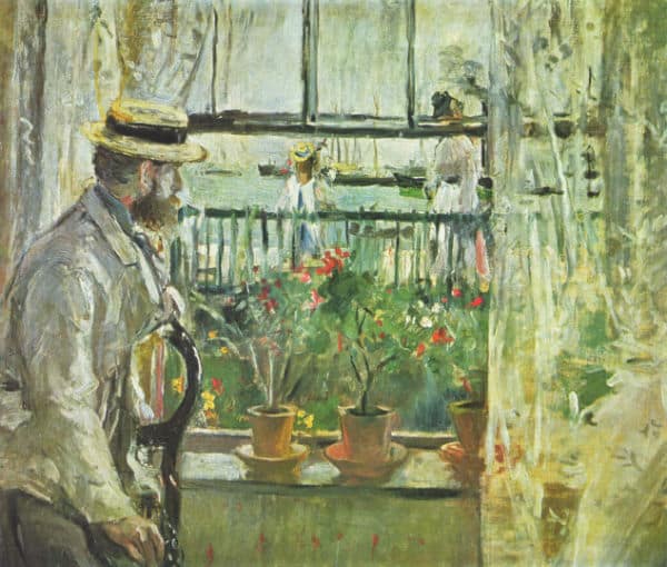
By suggesting the detail in the background you can create the impression that there are objects beyond the subject without actually adding them to the scene. You can see how it has been done in this painting of a ballerina by Degas.
Popular methods for adding semi detail in the background is to make the background out of focus by adding a bokeh effect. There is detail in the background but it’s out of focus with soft edges making it recede into the distance. This is a way of introducing different colours, tones and shapes without risking distracting the viewer from the main subject. Learn how to draw a bokeh effect.
Detailed Backgrounds
It is very difficult to successfully add a detailed background to an artwork that doesn't distract from the subject. As such should be attempted with great caution by a beginner.
Used properly though, it can give the viewer information about the subject not otherwise possible. The key here is that the background doesn't attract attention away from the main subject.
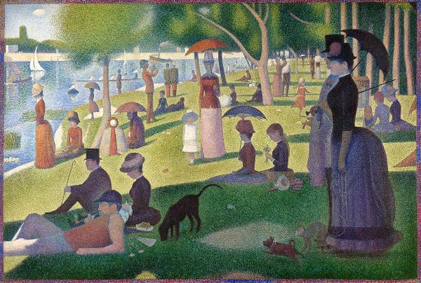
In this painting by George Seurat you can see how he has masterfully added in a lot of detail throughout the painting, yet these details have all been cleverly understated or kept in the shade so as to ensure the central figures (mother and daughter) remain the focal point.
Detailed backgrounds with lesser focal points are a technique to keep the viewer’s eye circulating between background and foreground and thus involving the viewer with the artwork.
Now that you have more knowledge about backgrounds, how about a few tips to help you successfully use them in your next painting or drawing.
6 Tips to Improve Your Backgrounds
1) Don’t include too much detail all in sharp focus as it can confuse the viewer as to what your intended focal point or main subject is. Rather leave the high detail for the focal point while toning down the amount of detail in the background objects.
2) Don’t miss the chance for contrast between the background and your subject.
Value contrast (using darks against light) is a technique often used by painters to make the subject of their painting stand out, or to make part of the subject recede into the background.
Colour contrast, pattern contrast, form contrast, contrast in size are all opportunities you can cash in on to make your subject “pop”.
3) Don’t leave thinking about the background until the subject is complete e.g. when painting a still life or portrait. Plan them together from the get go.
4) Don’t forget the opportunities for adding depth your background offers. Techniques to introduce atmospheric perspective make 3-dimensional art possible on a 2-dimensional surface.
5) Avoid boring backgrounds with large areas where nothing of interest is going on e.g. large expanses of sky painted in the same hue of blue with no variation in value or brushstrokes. Variety adds interest for the viewer’s eye.
6) Don’t try to paint a background from memory – your memory won’t remember all the details – and it’ll show. All ways use a reference.
I hope this tutorial has given you some pointers to think about when considering the background of your next painting or drawing.
In the next tutorial we will dive even deeper into the practical things you can do to bring your backgrounds to the next level.
Pin Me