A Comprehensive Guide
Article Navigation:
1. Understanding Art Composition
2. Steps for Composing an Artwork
3. The Role of Focal Points
4. Visually Balancing Your Composition
5. Adjusting Visual Weight in Your Composition
6. Steering the Viewer's Eye in Your Artwork
7. Using Lines in Composition
8. The Rule of Odds and Framing in Composition
9. Common Composition Mistakes to Avoid

No one is an artist unless he carries his picture in his head before painting it and is sure of his method and composition.
If your aim is to enjoy the pure act of creating, learning about composition may not be a high priority. However, if you aspire to communicate through your art, sell your pieces, or elevate your skills, understanding composition is a vital stepping stone on that journey.
Understanding Composition
In essence, composition encapsulates all the elements of art—line, shape, colour, texture, value, space, and depth—and the principles that weave these elements together, including rhythm, balance, emphasis, gradation, harmony, variety, and movement. While it might seem daunting, understanding composition is a skill that can be honed with practice, and fortunately, there are proven guidelines that provide a helpful structure for your creative endeavours.
Defining Composition
Composition is about directing the viewer’s eye, enabling them to see what you want them to see in your artwork. It is an integral skill in the toolbox of any successful artist.
Busting Myths about Composition
Contrary to common misconceptions, composition is:
- Not a rare talent bestowed upon a select few
- Unrelated to your choice of painting subject
- Not a static concept, as ideas about good composition have evolved over time, influenced by movements like cubism and abstraction
- Not a science, but rather an intuitive process—we often know instinctively when a picture is pleasing; understanding composition reveals why
- Not a rigid set of unbreakable rules
1. Find Your Message
The first question to ask yourself is: "What do I want to say with this artwork?"
Finding your message is a critical first step in the artistic process, serving as the emotional thread that binds together your artwork. This message could encapsulate a narrative, emotion, or idea that captivates your imagination, ultimately helping to engage your audience.
2. Choose a Subject
Think about why you're attracted to a certain image. What's the narrative that intrigues you? What emotions do you feel when you see it?
It can be as simple as the expression on a dog's face or the way light dances on leaves—just ensure it captures your imagination. After all, you can't engage your viewer unless you, the artist, are emotionally involved first.
3. Use Photos as a Guide
Photos can be useful for composing, but remember to use them as inspiration rather than replicating them precisely. You have the artistic license to manipulate your reference to better convey your story.
4. Choose a Dynamic Reference
Opt for references with clear distinctions between highlights and shadows, and different textures to pique viewer interest. Feel free to exaggerate any aspect of your reference if it makes it more appealing.
5. Convey Your Emotion
After you know what you want to say, consider how to convey it. How can you ensure your viewer feels the same emotion when viewing your art as you did when creating it?
By adhering to these steps and being aware of composition, you will set yourself up for success in your artistic journey.
In creating a visually appealing artwork, one essential element is the focal point. The focal point is where your viewer's eyes are drawn to, often forming the primary subject or the point of maximum interest. While determining your focal point, it's crucial to consider its position and how it impacts the overall composition.
Focal Point Placement and the Rule of Thirds
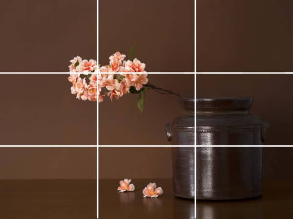
A tried and tested method of selecting the best place for your focal points is using the rule of thirds. Imagine your canvas divided into nine equal sections by two horizontal and two vertical lines. Placing your focal point/s on or near any of the intersecting lines, while avoiding the centre, assures a more dynamic composition.
Horizon Line Placement in Art Composition
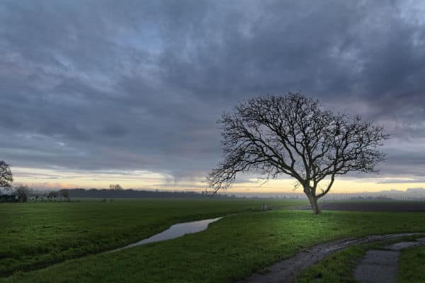
When deciding on where your horizon line should be, it's best to put it either on the bottom or top horizontal rather than in the middle.
Impact of Centrally Placed Compositions
Centrally placed compositions convey a feeling of calm, but the eye tends to stay in the centre and not move around the painting.
Pro Tip: Be careful of placing your focal point near the edges of the frame. This may encourage the viewer's eye to leave the picture instead of entering and exploring.
Cultural Differences in Viewing Art
Cultural differences can influence how viewers "read" a painting. Most Western cultures, for example, tend to view an artwork from left to right, i.e., from the top left-hand corner to the bottom right.
Visual balance is what concerns artists. Because we, as humans, are made bilaterally symmetrical (the same on both sides of a centre line drawn from the head to the toes), we appreciate visual symmetry. However, we also find a bit of asymmetry or imbalance exciting and interesting. The artist can choose what kind of visual symmetry to use depending on the mood they want to convey.
Understanding Different Types of Symmetry in Art Composition
1. Central Symmetrical

The centre of interest is placed in the middle of the frame, usually in a triangular composition. This type of symmetry is restful and static. Historically, centrally placed compositions were popular for religious scenes to convey formality, rationality, and solemnity.
2. Radial Symmetry
There is visual balance in several directions as the visual elements are arranged around a central point.
3. Asymmetry

This occurs when the two sides of the design are not the same, and the visual weight of each side differs, yet balance is still achieved. Asymmetrical composition is dynamic and exciting.
The Steelyard Principle in Art Composition
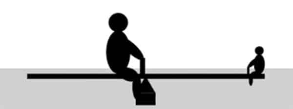
The steelyard principle comes into play when the subject is not centrally placed in the frame but on one side of the middle. The subject must be close to a pivot point and must be balanced by a smaller element with light visual weight on the other side.
To create a compelling composition, you must understand how to adjust the visual weight of objects in your artwork. Several factors can influence this, including color, shape, line, texture, and edges.
Color and Visual Weight
Color, in terms of hue, value, intensity, and opacity, determines the visual weight of an object.
1. Hue

Warm colors come forward, while cool colors recede. Warm colors are perceived as having more visual weight than cool colors.
2. Value

Darker values appear heavier than lighter values when they are identical in size. A large light shape can be balanced by a much smaller dark shape.
3. Chroma or Intensity

More intense (brighter) colors come forward because they carry more visual weight.
4. Opacity

Opaque colors have more visual weight than transparent colors.
Shape, Line, Texture, and Edges in Art Composition
The shape, line, texture, and edges of the elements in your artwork can also contribute to the visual weight.
1. Shape
Squares appear heavier than circles, and complex shapes appear heavier than simple shapes.
2. Line
Thick lines seem heavier than thin lines. Thick lines appear to come forward, thin lines recede.
3. Texture
Textured shapes appear "heavier" than smooth shapes.
4. Edges
Hard edges catch the eye and have more visual weight than soft edges that blend into the surroundings.
To create a truly engaging composition, you must guide the viewer's eye through your artwork. You can achieve this by employing strategic use of color, lines, and implied lines of sight and movement.
Using Color to Guide the Viewer
Our eyes are naturally drawn to color. Therefore, using color strategically can help guide the viewer's eye through your composition.
1. Background color

Bits of the background color included in your subject help tie the subject to the background. This helps prevent your subject from appearing pasted on.
An example of this would be when you have colors from the background objects reflecting in the subject.
2. Echoing hues
Echo the hue of the focal point with reduced intensity and in smaller amounts in other places in the picture. This attracts the eye but does not detract from the main focal point.
Consider a landscape painting of a serene lake at sunset. In this composition, the focal point is the setting sun, which bathes the entire scene in a warm, vibrant orange hue.
Now, to apply the principle of "Echoing Hues," you might want to subtly incorporate elements of that orange hue elsewhere in the painting to establish a cohesive visual harmony and lead the viewer's eye around the artwork.
For instance, you could paint a small patch of orange flowers in the foreground that mirrors the orange of the sunset. This creates a visual echo that ties the foreground and the background together, and keeps the viewer's eye moving around the painting.
Additionally, you could add a hint of orange reflection on the surface of the lake and some orange tones on the clouds. These touches will echo the hue of the focal point (the sunset), thereby creating a sense of balance and visual interest throughout the composition.
This technique of repeating a color or a shade in different parts of a painting can be very effective in tying the entire composition together.
Lines, Actual and Implied, in Art Composition
Lines, both actual and implied, are a powerful tool for directing the viewer's eye around your artwork.
1. Actual lines
These are more obvious and can be used to lead the viewer's eye in a particular direction.
Imagine a painting of a bustling city street from a street-level perspective. In this painting, the straight, vertical lines of the tall skyscrapers on either side of the street serve as "Actual Lines". They draw the viewer's attention upwards, emphasizing the imposing height and grandeur of the buildings.
Additionally, the horizontal lines of the windows on the buildings, the street itself, and other architectural details provide a sense of stability and order to the composition.
The converging diagonal lines formed by the street disappearing into the distance create a sense of depth and perspective, guiding the viewer's eye towards the focal point - perhaps a specific building or a feature at the end of the street.
In this way, actual lines - whether they're vertical, horizontal, or diagonal - serve as crucial elements in a composition, guiding the viewer's eye, creating a sense of perspective and depth, and contributing to the overall mood and message of the artwork.
2. Implied lines
These are not actual lines so are a more subtle or subconscious way of leading the viewer's eye.
Imagine a painting of a flock of birds in flight against a sunset sky. Even though there aren't any physical lines connecting the birds, the viewer's eye naturally connects them, creating an implied line. This line could give the impression of the birds' movement across the sky, adding dynamism to the artwork.
Line of Sight and Movement – An Implied Line
When you include people or animals in your picture, the viewer’s eye will naturally follow the perceived line of sight. This can be a powerful tool for guiding your viewer's attention to a specific area.
Using our flock of birds example an implied line could be the gaze of the birds. If the majority of the birds were painted to appear as if they were looking or moving in a specific direction, the viewer's eye would be naturally drawn along that path, creating another implied line.
In this scenario, the implied lines created by the positioning and direction of the birds could lead the viewer's eye towards a specific focal point in the painting, like the setting sun or a distant mountain range.
These implied lines can help to guide the viewer's eye through the composition, creating a sense of movement and narrative, and drawing attention to the elements that the artist wants to highlight.
The Rule of Space in Art Composition
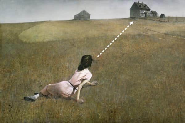
The rule of space is an important principle in composition. It involves leaving enough space in the direction that your subject is looking or moving. This prevents the image from feeling unbalanced or squashed.
Lines can greatly influence the feeling of your composition. By understanding the effect of different types of lines, you can manipulate how the viewer interacts with your artwork.
Leading Lines

A popular composition device in landscapes is to use a curved line e.g., a path or stream or row of trees that moves towards the back of the picture to lead the viewers’ eye and create depth. This is known as an S or Z shaped composition.
Radial Lines

Another type of leading line is the radiating lines where the perceived (or actual) lines all point towards the central focal paint. The lines don’t have to be straight, and they don’t have to surround the focal point completely.
Vertical Lines
Vertical lines show the direction of gravity and are the most important type of line in composition. However, it's crucial to interrupt these lines with horizontal or diagonal ones to prevent the viewer's eye from exiting the picture.
Horizontal Lines
Horizontal lines are particularly popular in landscapes. However, strong horizontal lines should be broken by a vertical line to prevent them from visually splitting the picture.
Diagonal Lines
Diagonal lines are the most dynamic of lines as they suggest movement. These lines can add an exciting element to your composition.
The rule of odds and framing are both valuable composition techniques that can enhance your artwork's visual interest.
The Rule of Odds
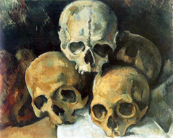
Odd numbers of objects (3,5,7) in a composition are more dynamic and interesting than even numbers. Establish a hierarchy of visual importance within the group to prevent boredom.
For example in the image above the lighter skull attracts more attention than the other two because of it's difference in color.
Framing Your Subject

Framing is a useful technique to direct the viewer's eye to your focal point. By surrounding your focal point with a frame of darker or lighter value, you can create a frame within the frame formed by your canvas boundaries. This visual separation can be achieved using O-shaped, U-shaped, C-shaped, or tunnel-shaped frames.
To enhance your compositions, there are several practices you can adopt. Understanding the work of the masters, studying modern painters, and recognizing the subtleties in composition they have used can significantly improve your skill set.
Study the Old Masters and Successful Modern Painters
Look at how they use (and sometimes break) composition guidelines to convey their message. By seeing how they subtly incorporate often more than one of the composition guidelines mentioned above, you will become aware of these techniques and better able to apply them to your compositions.
Composition Checklist to Prevent Common Mistakes
While you're learning, this checklist can help you spot common composition errors:
- Avoid cutting the picture in half with the horizon line. Place the horizon line above or below the middle of the picture, choosing to emphasize either the sky or the foreground.
- Don't include too much detail. While detailed areas can add interest, it's equally important to have some "rest" areas for the eye. In general you reserve the most detail for the focal point as that gives the eye more to look at than the rest of the painting keeping the eye coming back to examine more of the detail.
- Correctly place your subject in the frame. The main subject should usually be placed off-center (rule of thirds), and visually balanced by smaller objects off to the side.
- Avoid positioning your subject facing out of the picture. Leave empty space, or “looking room”, in the direction your subject is looking or moving.
- Include a clear focal point. Without this, your artwork may just become a pattern.
- Plan the path you want your viewers’ eye to follow. Use primary and secondary focal points and leading lines to guide the viewer’s eye around the picture.
- Be mindful of including unnecessary objects. Include only elements that help convey your message. Avoid adding elements for purely decorative purposes.
- Maintain visual balance. A small, high contrast element carries as much weight as a large, more subdued element.
Remember, the guidelines for composition should be considered collectively when composing a picture. They suggest structure you can use to build your picture. As you gain experience, composition becomes more intuitive, and special effects can be achieved by bending or breaking these guidelines.
Good luck with your compositions. The next art concept you would be interested in learning now are the 7 Elements of Art.
Pin Me