Introduction
Every time you create an artwork there are 7 elements, or components, that your artworks consists of. More often than not we just take these elements for granted, or don't even give them a second thought.
They are however critical to the success of your artwork. By keeping them in mind as plan and create your artwork, you will end up with a much better artwork.
One that will be easier to look at as the person's eye will flow through your artwork more fluently. You will have control over how their eye moves through your painting - you will be able to lead them through the painting.
This is just one of the benefits of knowing the 7 elements of art. Let's dive right in by looking at what these 7 elements are:
What are the 7 Elements of Art?
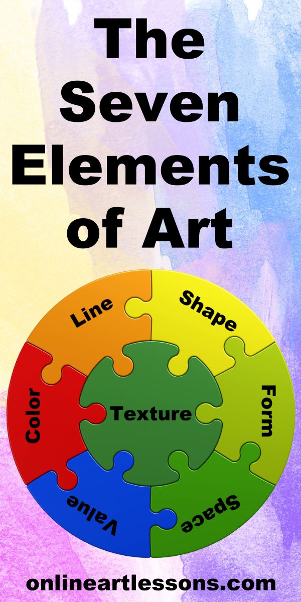
The seven elements of art are line, shape, form, space, value, color and texture. These elements are the essential components, or building blocks, of any artwork. Any good artwork should consist of these 7 ingredients.
Element 1 - Line
Line is the most basic element of art. Without line the other elements couldn’t exist so let's start here and then we will gradually go more advanced.
A line can be thought of as a moving dot. If the dots overlap, it’s a solid line, if they don’t it’s a dotted line. A line has a beginning and an end and by its existence, creates an edge.
If a line joins up it forms an outline (also called a contour). An outline creates a shape.
Lines can be:
Long or short
Thick or thin
A thick line gives emphasis and advances while a thin line recedes.

Straight
Straight lines on the other hand are more mechanistic and dynamic and rarely found in nature.

Curved
Curved lines change direction gently with no sharp angles and suggest comfort and ease to the viewer. Curved lines most often relate to the natural world.
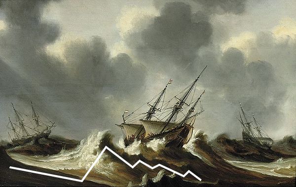
Zigzag
Zigzag lines alter direction fast and create feelings of unrest, turmoil and movement.
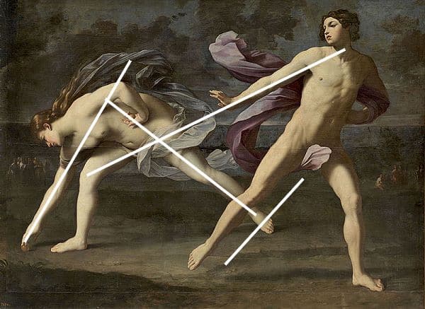
Diagonal
Diagonal lines, give movement and dynamism to a composition.
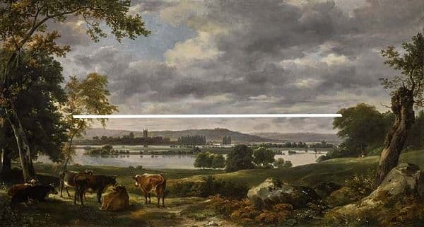
Horizontal
Horizontal lines create the feeling of stability and calm.
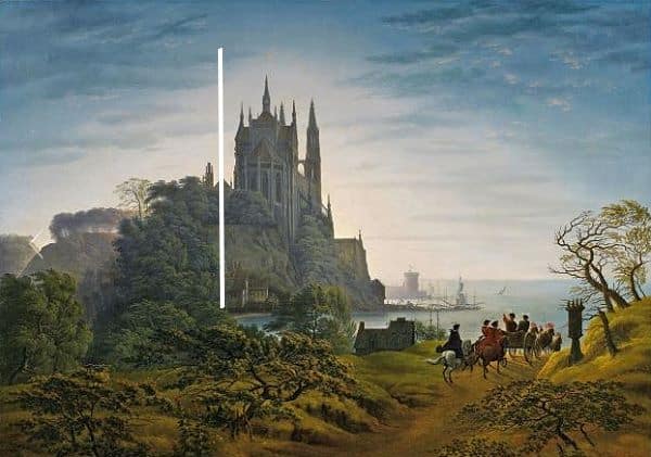
Vertical
Vertical lines give the impression of height and strength and often have a spiritual connotation.
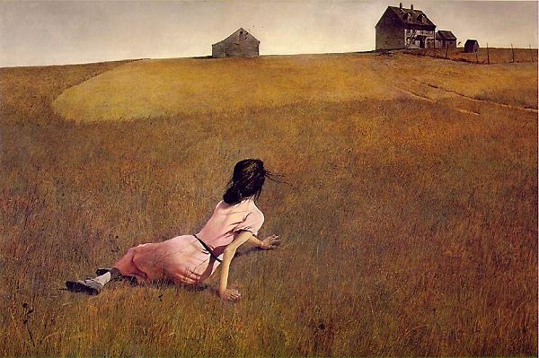
Imaginary
Lines can be imaginary or implied; for example line of sight can be a very strong albeit invisible line along which the viewer’s eye travels. Also a pointing finger can send the viewers eye on a journey through the painting.
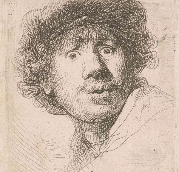
Three Dimensional
Lines alone can also be used to create a three dimensional effect, (depth, in a 2-dimensional artwork. Hatching lines (straight or curved) are used to turn shape into form using value as seen the works of the masters like Rembrandt.
In summary lines can:
- Describe 2-dimensional shapes and 3-dimensional forms
- Create feelings of movement and emotion
- Create value and thereby show the direction of light
- Change 2-dimensional shapes into 3-dimensional forms with value
- Depict texture
Element 2 - Shape
When a line meets up to enclose a space, a shape is formed.
Shapes can be:
Geometric or organic.
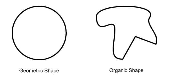
Shapes are 2-dimensional, i.e. they have height and width but no depth e.g. a square. The best way to remember the shape element is to think of an outline.
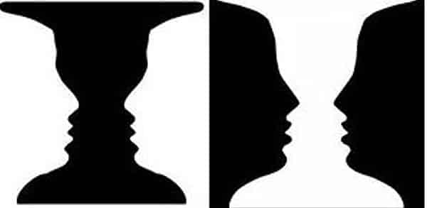
Positive or Negative Shapes
The object you draw on your page is a shape enclosed in a frame. This frame may be a box you drew to designate the edges of your drawing area or the edge of the page if you didn’t draw a box. The object you draw is the positive shape. The rest of the space in your box (or if you didn’t draw a box then the rest of the page) is called negative shape.
Element 3 - Form
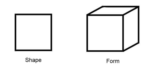
Form is the next step up from shape as we now add depth to it to create a three dimensional form.
A square (shape) vs a cube, a triangle vs a cone etc. etc. Form encloses volume i.e. height, width as well as depth.
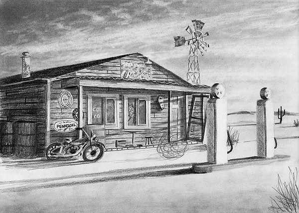
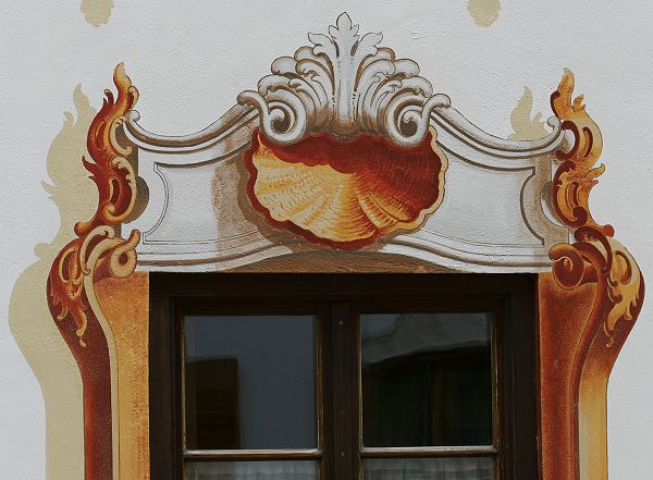
In drawing and painting form can only be implied because they are 2-dimesional (flat) media. Artists must use tricks to fool the viewer’s eye so as to create the illusion of the third dimension i.e. depth. This is known as Trompe l’oeil and is achieved using tools like value (shading), colour and contour lines.
Here you can see how shading has been used to create the illusion of 3-dimensional objects on a flat wall:
Like shapes, forms can be geometric or organic.
Organic forms are common in nature while geometric forms are more characteristic of architecture and man-made items. Nature however also uses geometric forms on occasion. Examples are crystals and honeycombs.
Element 4 - Space
Space is what lies between, around or within an object.
To show space in a 2-dimensional medium the artist must use techniques to create the illusion of space between items that are in reality on a flat surface.
How do artists create this feeling of space between objects?
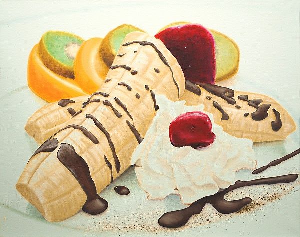
Overlapping
When an object is drawn or painted on top of another object the viewer’s eye interprets this as one object being in front of another implying there must be a space between them.
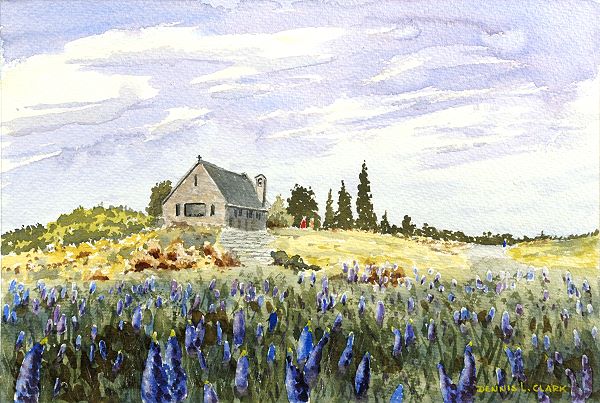
Placement
Objects higher up in the picture plane will seem to the viewer’s eye to be further away than objects placed low down in the picture frame.
Size
Smaller objects look as if they are further away than larger objects. Notice how much smaller the house is in relation to the flowers.
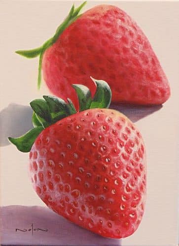
Detail
The further away an object, the less detail is visible to the viewer. By purposely reducing the amount of detail in an object it will appear further away than an object with greater detail.
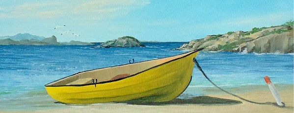
Colour and Value
Objects in the distance usually appear cooler (bluer) and lighter in colour. Close up objects appear warmer and darker in value.
Perspective
Can be used to create the feeling of depth on a 2-dimensional surface. The most commonly used perspective types are linear and 2-point perspective.
Negative Space
Space can be either positive or negative in the same way as shapes can.
Negative space is all around the object, which is the (positive space) subject of the painting.
Negative space is very important and an artist must plan the negative space as carefully as the main subject.
Is there enough negative space to give the subject room to “breathe” or does it appear boxed in?
Negative space can be cut to a minimum or eliminated entirely for a very close up and intimate focus on the subject.
It can be greater on one side than the other, or greater at the top or bottom.
All choices which will affect how the viewer sees the overall composition.
Element 5 - Value

Value is how light or dark something is.
There is a scale of light and dark from pure white through to pitch black. The value of a colour depends on how light or dark it is compared to the value scale.
Getting the values right is more important than getting the colours right in painting. Value is what makes it possible to show 3-dimensional forms in a 2-dimensional surface.
By increasing differences in value, contrast is increased as well. A highlight will look brighter when surrounded by a dark value. Decreasing contrast will make objects visually recede into the picture plane and draw less attention.
The focal point of a painting is where you want to add the most contrast as this high contrast automatically draws the viewer’s eye.
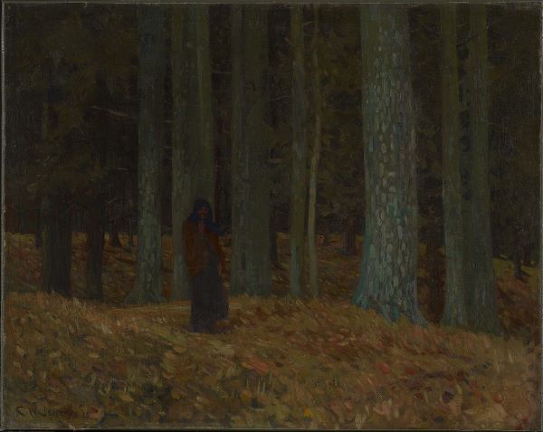
If a painting is done on the lower (darker) edge of the value scale it is called a “low key” painting. Low key paintings give rise to a heavy, mysterious, dramatic, sometimes brooding feeling in the viewer.
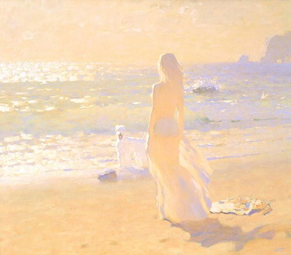
By contrast “high key” paintings take their range of values from the upper end of the value scale and create emotions of lightness, quickness, spirituality etc.
Most paintings however use the full range of values from light to dark.
Value is what artists use to portray light and form. The further from the light the darker the value.
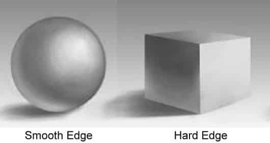
How value changes determines the form of an object.
If there’s a gradual transition in value it conveys to the viewer that the surface is gently rounded. This is called a soft edge.
If however there is a rapid transition between values it means there is an edge. This is called a hard edge.
Value is also used to create shadows which show light direction and anchor the object, preventing it from appearing as though it is floating.
Element 6 - Colour
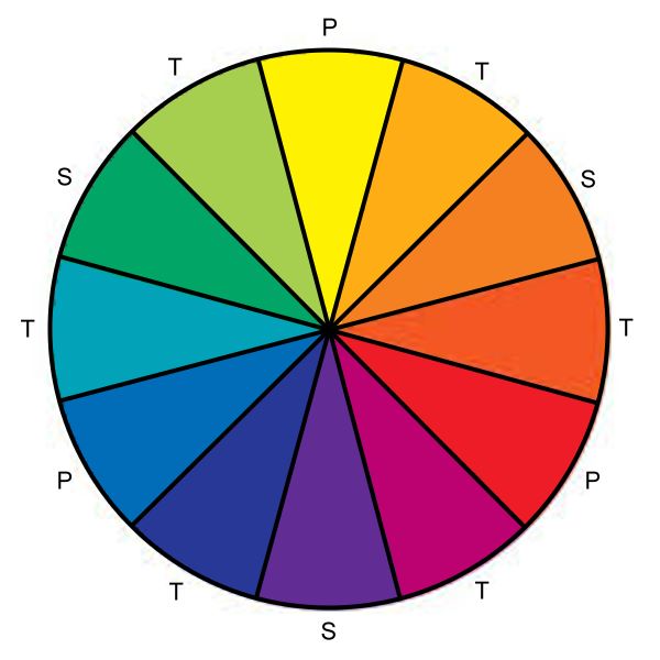
Colour is created when light is reflected into the viewer’s eye.
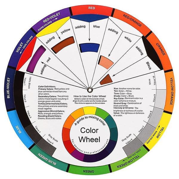
In art, colours are arranged on a colour wheel. The colour wheel was developed by Isaac Newton who took the colour spectrum and bent it into a circle.
The colour wheel shows primary colours, (colours that can’t be mixed), secondary colours (made by mixing two primaries) and tertiary colours (made by mixing a primary and secondary colour).
Colour theory helps the artist to mix desired colours from primary colours. It’s only a theory and can’t be proven but it is nevertheless useful to the artist. Colour theory is based on the colour wheel, colour value and on which colours work well together - also called colour schemes.
There are various colour schemes which define the primaries. The most common is the Red, Yellow, Blue model. Another popular scheme uses Cyan, Magenta and Yellow as the primaries. There are several other and each works well in different situations.
Colour is described by its hue – red, green etc. (Hue the name we give a colour.)
A colour has intensity called chroma, also known as saturation, brightness or purity. The more pure the colour is (less of other colours mixed in), the more intense or saturated it is. In painting only small amounts of saturated colours are usually used as accents. Too much saturated colour can give a garish result. The chroma of a colour is not the same as its value.
Colours also have value. Value is how light or dark the colour is, as discussed in Element 5 above. Each colour falls on the value scale from light to dark. Yellow would be near the top (light end) of the scale while purple would be found near the bottom end. To change the value of a colour you follow the Colour Mixing Rules.
Note: this page contains affiliate links to products on Amazon. If you purchase through the links I will earn a small commission for the sale at no extra cost to you.
Art supply stores sell interactive colour wheels which are essential to the artist working with colour. I recommend this Color Wheel.
Element 7 - Texture
Actual texture is the way an object feels to the touch.
Drawing or painting texture on a 2–dimensional, flat surface is a challenge for artists. The artist must instead convey the illusion of the actual texture to the viewer on the flat surface.
How this is done is by the careful use of value and specific marks / brush strokes which then mimic the actual texture.
Every textured surface reflects light in a very particular way. Think of the difference in texture between a chrome ball and a concrete ball. The artist, through careful observation and the use of light and dark values, recreates this actual texture visually on the picture plane.
You can follow our tutorial in Drawing Weathered Textures to get a feel for how this is done.
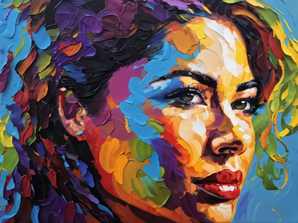
It is possible to create actual 3D texture on a flat surface by the addition of texturing compounds which create a raised surface. Impasto paste is one way or you could even add sand etc. to the paint. Even thick paint will leave the texture of the brush marks for the viewer to see.
You can follow our tutorial on Texture Painting Techniques to see how you can add texture to your canvas.
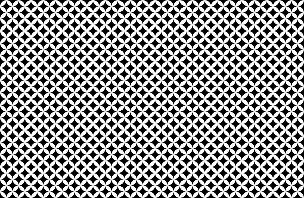
It is also possible to create patterns by the repetition of shapes that creates 2D texture. This is often used in Op Art. (Optical Art).
Pin Me
Conclusion
I think you will agree that you have been using many of the seven elements throughout your artworks without even realising it.
Now that you are however aware of these elements, you can look out for them as well as look out for ways to incorporate more of them into your artworks.
This will add extra depth, dimension, texture and interest to your artworks, taking them to a whole new level.
