Short Class Video
Class Tutorial
Drawing the background
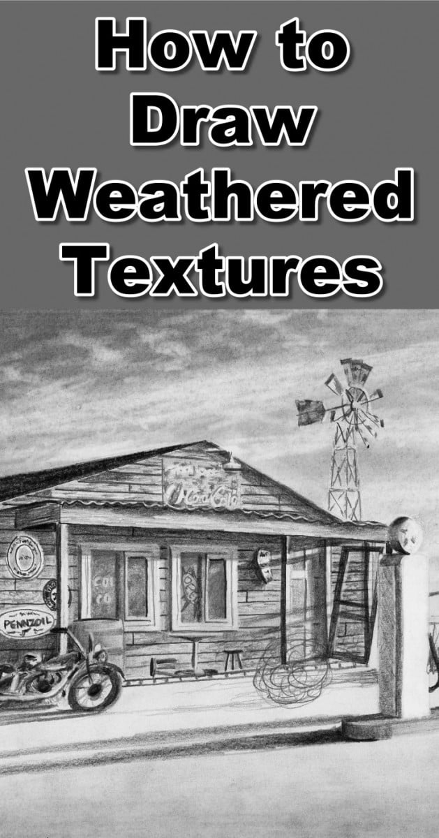
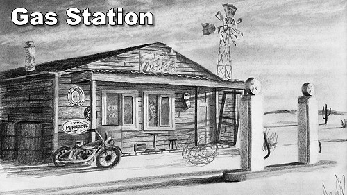
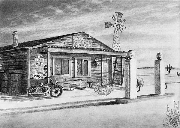
In this tutorial we will draw an abandoned gas station in order to show you how to draw weathered textures.
The scene is very complex and includes lots of man made items. This always means you have a lot of work ahead of you as you need to work very accurately.
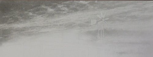
I start by working in a basic shading into the sky area. The clouds are then erased using a kneaded eraser.
To ensure I don't lose the lines for the house and windmill, I create myself a template which I transfer onto baking paper.
This allows me to overlay the transparent template over the sky and redraw any lost outlines. This time however I use an eraser instead of a pencil to establish the outlines. This technique allows me to draw a complex sky while still ensuring it flows seamlessly behind the foreground objects.
To draw the windmill I look at the tonal value of each fin and block it in. To get the rusty effect I use a darker tonal value to draw in random spots.
Drawing the building
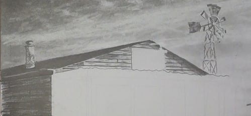
When working on the building it is super important to ensure that all the planks are parallel to each other and moving towards the vanishing point so I work to establish these lines first. If you don't get this correct the building will look skew. I have a separate tutorial which teaches you all about perspective and vanishing points which you can also follow.
After I'm happy that my perspective lines are correct I work on getting the tonal value of the entire face of the wall correct.
Lastly I will work on getting the textures in the wood correct. This texture is created by adding lighter and darker patches in the wood and very thin lines to simulate cracks.
Adding detail to the weathered textures
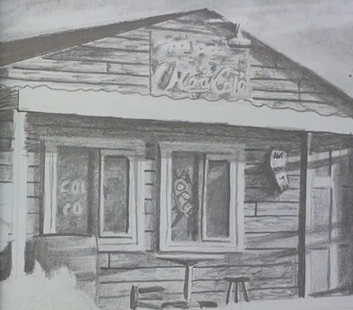
For the sign I lay in its basic tonal value, erase the wording using my pen shaped eraser. I then strategically place rust marks around the erased words to make the wording more readable.
The doors are drawn in the same manner as the windows.
I first establish the outlines, then the depth caused by the recessed panels. These are shown as shadows in this case.
After that I cast any external shadows onto the door or window. Lastly I work on the detail like cracks or wording.
The wine vat is a simple shading from left to right to show it is a round object. The recessed top and straps are then suggested.
The corrugated sheeting on the veranda is coming loose so the shadow it casts on the plank below has varying lengths.
I work these shadows in very dark against the corrugated sheet, then fade lighter downward making the shadow longer where the sheet has separated from the roof.
To show the thickness of the sheet itself I strategically darken the plank on the wall behind it, being careful to leave a thin highlight where the corrugated sheet is visible.
For the signs on the wall, I simply scribble in what looks like writing on the sign. The signs are too far away to read the actual writing so there is no need to try and print it incorrectly.
Drawing the motorbike
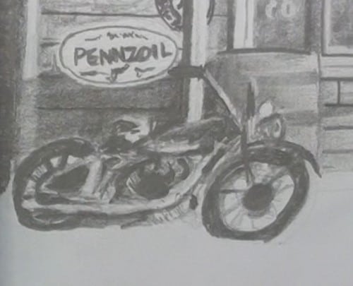
When it comes to the motorbike your first thought is to panic about how are you going to draw in all that detail.
As with the signs, the motorbike is too far away to see the detail. It is also physically too small on the paper to even try.
As a result we will simply suggest the details.
I start by drawing in the dark areas as these help define the shape of the bike. From there I'm able to pick out a few of the major details like the exhaust, handlebars and fuel tank which I then suggest with a few basic shadings. This is all that is needed in order to make it look believable on the drawing.
Drawing the petrol pumps
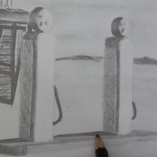
We have come a long way with the drawing and are getting close to the end so let's move on to the petrol pumps.
The base is a few tonal values to show the angle change between the side and the top as well as a few shadows being cast by the pumps themselves.
The same thing happens on the pumps. The two sides have different tonal values in order to show each side is at a different angle.
The darker side also has a bevel which I indicate with a darker edging. I suggest some texture on the raised area by using cross hatching.
The tops have a basic shading on the side to show they are round and the suggestion of a star logo.
Drawing in the finishing touches
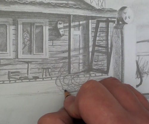
To finish off I flick in some grass, suggest the cactus and swirl in the tumbleweed.
To show that the sun is setting I establish some really long shadows cast by the objects.
To make the shadows look correct I keep them parallel to each other. I draw them dark against the object then fade them lighter away from the object.
Final drawing
Click the button below to view the real time follow along version of this class:
Pin Me
