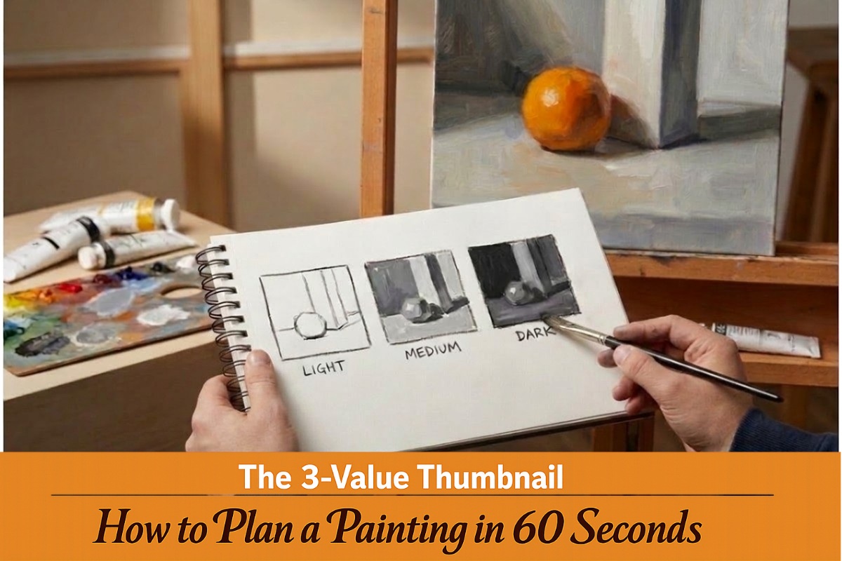
Stop “Blank Canvas Panic” and guarantee a strong composition before you ever touch a brush.
Introduction: The Power of the Tiny Sketch
Have you ever spent two hours blocking in a gorgeous sky, only to step back and realize the whole thing feels off? The colors are right. The brushwork is confident. But something is missing, and you cannot quite name it. That sinking feeling usually has one cause. The composition was never sound to begin with.
Most of us want to skip straight to the fun part. We see a beautiful reference photo, squeeze out fresh paint, and start chasing color and detail before the big picture has been settled. Hours later, we are stuck with a painting that looks flat or lopsided, wondering where we lost the plot.
There is a faster way to protect yourself from that disappointment. It takes about sixty seconds. And it costs almost nothing.
I call it the 60-Second Rule. If your scene does not read clearly as a tiny, simple sketch in under a minute, no beautiful color or careful detail will rescue it later. Think of it as a quick proof of concept. The big shapes of light and shadow give the painting its backbone. Get them wrong, and everything stacked on top will eventually collapse.
This is where the thumbnail comes in.
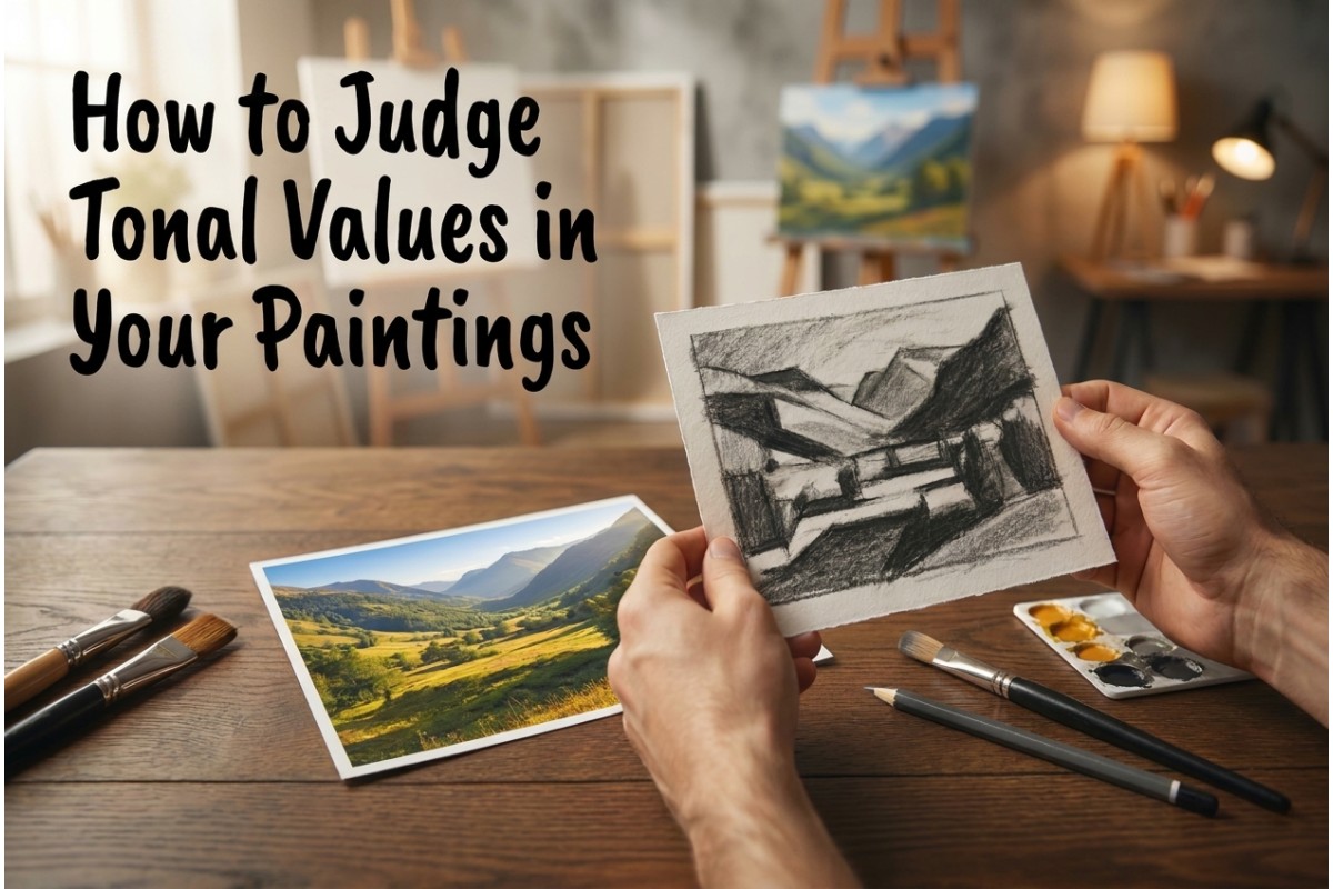
Your thumbnail only needs to map out the big lights and darks. Nobody else needs to see it. It is a roadmap for your painting. The goal is to lock in the pattern of lights and darks before you ever touch a brush. Get that right, and the rest of the painting becomes much easier to steer.
In the next section, we will look at why three simple values are all you need to make this work. It is simpler than you might think.
Why Three is the Magic Number
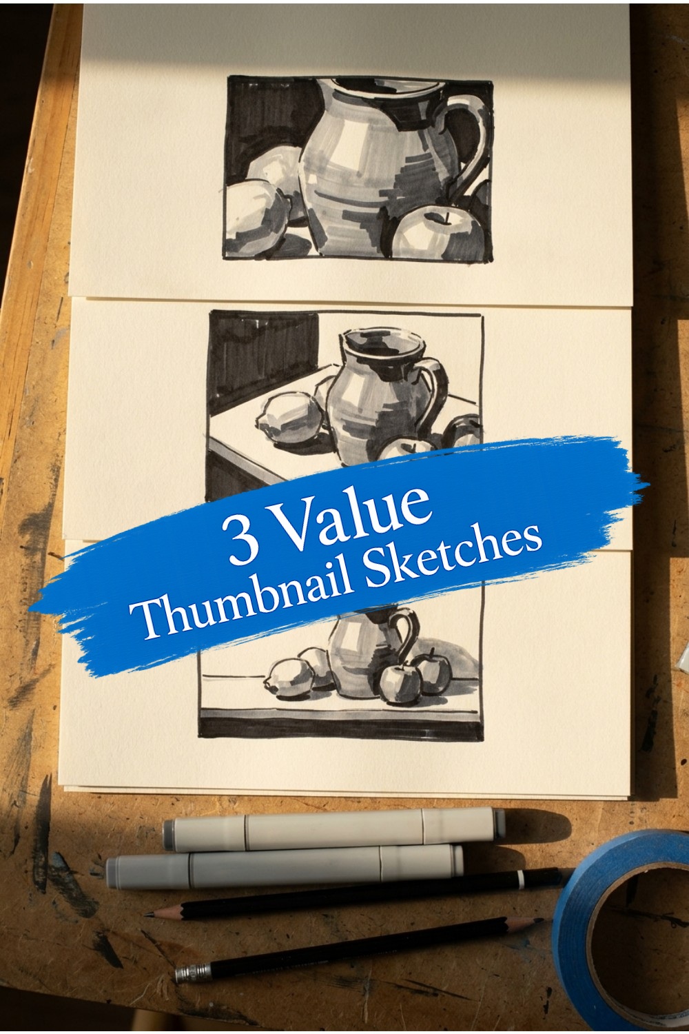
Every successful painting hides a simple structure underneath its color. That structure is built from three big value groups. The lights hit the highest surfaces. Your darkest shapes settle underneath to give the image real weight. Whatever sits between them becomes the middle tone that quietly holds the two together. Think of it as a sandwich. Without the filling, you are only pressing two dry pieces of bread against each other.
A sketch with just light and dark might seem dramatic at first. But then you look closer and realize there is nowhere for the eye to travel. You lose the turning of form and the sense of distance. Subtle clues that guide the viewer disappear. It is like trying to read a map that only shows coastlines. You can see where the land ends, but you cannot see the hills inside it.
Four or more values might sound richer. Inside a tiny thumbnail, they just create noise. The point of a quick sketch is to simplify, not to copy every gentle shift in your reference photo. Too many greys make your eye bounce. Shapes break apart, and you slide right back into drawing tiny details instead of planning the big structure. Save those soft gradations for the final painting. Your thumbnail needs to stay brutally simple.
Tonal Value
The relative lightness or darkness of a color, independent of its hue (the “color” itself).
Three values give you enough structure to build a clear map without inviting clutter. They force a decision. Is that shape light? Is it dark? If it is neither, call it middle and move on. That habit of choosing is what separates a planned painting from a guessing game.
Now you need a tool that locks you into those three boxes. Not every drawing medium will do. In fact, picking the wrong tool is how most beginners accidentally produce five or six muddy greys instead of three clean values.
The Minimalist Toolkit
You do not need fancy supplies to thumbnail well. In fact, the cheaper the better. Grab a sheet of printer paper, a bargain-bin sketchbook, or even a sticky note. The goal is to remove the pressure of ruining good paper. These sketches are disposable maps, not finished art.
Here is the one place where I will ask you to use a specific tool. Get three markers in light grey, mid grey, and black. Brush pens or chisel-tip markers both work fine, and no-brand office markers are perfectly adequate.
Leave the pencil in the drawer for this exercise. Pencils invite you to fuss with lines, hatch little shadows, and gradually sneak in details that do not matter yet. Markers do not let you do that. A fat marker tip forces you to think in bold shapes rather than wispy lines. When you touch the paper, you make a clear decision. Light, middle, or dark. That is exactly the mindset you need before we start building your composition.
In the next section we will look at how to frame your tiny sketch and use the squint test to find your big value shapes.
Step 1: Framing and Squinting
Pick up your sketchbook and a marker. Before you draw a single shape, draw a small rectangle on the page. Match the proportions to your canvas. If you are working on a 9 by 12 inch canvas, your thumbnail box might be roughly 3 by 4 inches. Keep it small. A tiny box forces your brain to simplify. You do not have room to draw every brick or blade of grass.
Now look at your reference or your subject. Relax your eyes and squint until the scene blurs. If you wear glasses, take them off. You are not trying to count eyelashes or map every leaf. You are looking for the big, chunky masses. See where the light shapes sit and where the shadow shapes pool. Squinting strips away the noise and shows you the real structure of the scene.
When I squint at a landscape reference, the sky usually becomes one simple light shape. A row of trees collapses into a single dark silhouette. The ground plane settles into a mid-tone strip. You do not need to name every value yet. Just notice where the light masses end and the dark masses begin.
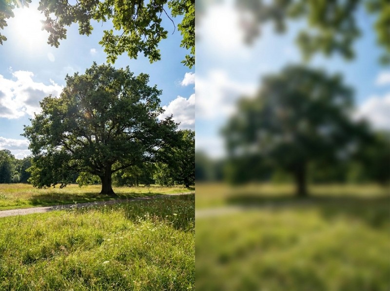
If you struggle to see anything but detail, try closing one eye and squinting the other. Some students find it easier to look through barely open fingers. Use whatever trick gives you that soft, blurry view. Once those large shapes reveal themselves, you are ready to start placing them inside your box. We will cover that in the next step.
Step 2: Mapping the Extremes
Now that your boundary box is drawn and your eyes are squinted, it’s time to make the two most important decisions in your painting. Every scene, no matter how busy, contains two anchor points. There is one area that is clearly the brightest light. There is another area that is clearly the deepest dark. Everything else in the painting will be measured against these two extremes. If you get them right, your painting has a solid spine. If you miss them, the whole thing will feel mushy no matter how lovely your colors are.
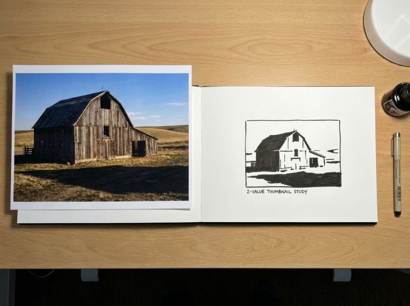
Look at your reference and find the lightest light. This might be a sunlit wall, a patch of sky, or the top of a white wave. Don’t fill this area with any marker at all. Leave it as the raw white of the paper. That empty paper is your brightest light, and you only get one shot at it. Protect it. Work around it.
Next, find the darkest dark. This is usually a cast shadow, the underside of a rock, a tree trunk in deep shade, or a dark window. Take your black marker and fill that shape in completely. Don’t scribble little lines and don’t crosshatch. Fill it solidly. You are not drawing a thing; you are carving out a shape. If the dark area breaks into tiny fragments, simplify it into one or two larger masses. The viewer’s eye will thank you.
With only these two values on the paper, you already have more structural information than most painters put on their canvas in the first twenty minutes. The white tells you where the light lives. The black tells you where the weight lives. The distance between them is the range you have to work with.
If you find yourself tempted to add a third tone here, resist. That grey mid-tone is the bridge, and it comes in the next step. Right now, let the extremes sit alone. Get comfortable with the bold contrast. A thumbnail that reads clearly with just black and white will only get stronger when the middle value is added.
Step 3: The Mid-Tone Bridge
You have your white lights and your black darks sitting on the page. But the mid-tone is what knits them together.
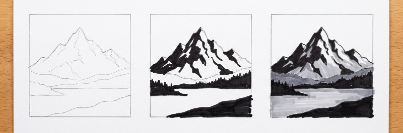
Pick up your light grey marker and look at the shapes that are left. These are the areas that sit between your brightest lights and your deepest shadows. Think of a sunlit wall turning away from the window, or the side of a face in soft light. Fill them in with a flat, even tone. Do not scribble or hatch. You want a simple shape, not texture.
This is where the three-value system starts to work. The mid-tone acts as a bridge. It lets the eye travel from the lights into the darks without jumping a chasm. If you skip this step and leave too much white paper showing, your sketch will feel spotty. If you fill too much with mid-grey and crowd out the lights, you lose the sparkle. Aim for a clear majority of one value, with the other two playing supporting roles. That contrast is what gives your thumbnail energy.
Now comes the honesty test. Hold your sketch at arm’s length and look at it with fresh eyes. You should still be able to tell what the subject is instantly. If the scene collapses into a grey smudge, your shapes are too small or your values are scattered. A thumbnail should read instantly. If it does not, scribble a new one. This is exactly why we work small and cheap. A failed thumbnail costs you sixty seconds, not six hours of painting.
Troubleshooting Your Thumbnails
Most beginners assume their thumbnail is wrong because they lack talent. But small sketches go wrong for specific, fixable reasons. Once you know what to look for, you can correct the problem in seconds.
Common Thumbnail Problems
| Problem | What Causes It | How to Fix It |
|---|---|---|
| Too much detail | Using a fine pen or drawing too large | Switch to a fat marker and keep the sketch under 2 inches |
| Grey and muddy | Not enough contrast between light and dark | Force a clear black. If your darkest dark looks like mid-grey, press harder or grab a darker marker |
| Everything looks equally important | Forgetting the focal point | Make one area significantly lighter or darker than the rest so the eye knows where to land |
If you catch yourself redrawing the same scene and getting the same dull result, stop. The problem is rarely your hand. It is usually a single decision you have not made yet. Ask yourself which value group is actually running the show. Once you can answer that, you are ready for the next step. Instead of clinging to one safe sketch, we will make three different versions of the same scene and let the best one win.
Strategic Planning: The “Winner” Method
One thumbnail is a guess. Three thumbnails is a strategy. Most beginners stop after the first sketch because they are tired or they think the job is done. But the first idea is rarely the best one. It is simply the first one.
Give yourself options. Take the same reference photo and block out three quick variations. Keep each one under two minutes. You are not polishing. You are auditioning shapes.
For the first sketch, make it light-dominant. Let the paper do most of the work. Touch down your mid-grey and black only where you need them. This high-key version feels airy and open.
Next, go dark-dominant. Flood the scene with black and mid-grey, saving just small pockets of white. The mood shifts from calm to dramatic, even though the actual shapes barely changed.
For the third option, move the focal point. If your first sketch put the lightest light in the center, try pushing it to one side. Swap which area claims the darkest dark. You are testing the same scene with a different emphasis.
Now line them up. One usually feels stronger. The shapes click. The eye knows exactly where to go. That is your winner.
You do not need to explain why it works yet. Your thumbnail will do the explaining while you paint.
A painting is only as strong as its value structure.
Teacher’s Note
Keep this in mind when you stand at your easel. Colour alone cannot save a painting if the big value shapes are wrong. When you feel lost in the details, your thumbnail is the map that brings you back. In the next section, we will look at exactly how to read that map while you paint.
How to Use Your Map While Painting
Tape your thumbnail to the corner of your easel, or stick it to the edge of your palette with a bit of masking tape. You want it in your line of sight while you work, not buried under a reference photo where you will forget to check it.
Here is where your tiny sketch earns its keep. When you are up to your elbows in color mixing, hue will try to steal your attention. You start worrying about whether your green is too yellow or your red too orange, and you stop thinking about value. Your thumbnail pulls you back. Hold your brush near the sketch and compare the paint value on your bristles directly to the marker value on the paper. If your mixture sits in the mid-tone grey but you are trying to match an area you marked black, you know exactly what to do. Add a touch of burnt umber, cool it down, shift the color all you like, but get that value darker. The thumbnail does not care about your color temperature. It only cares about light and shadow, and that is what your painting needs most.
This habit will pull you out of the weeds every time you start overworking a passage. And the more you cross-check your paint against your map, the faster your eye learns to spot a wrong value before the brush even hits the canvas. But speed comes from repetition, not theory, so let us look at a simple way to build that repetition into your practice.
The 10-Minute Sprint Exercise
By now you have the tools. The only thing missing is mileage. A single thumbnail is useful, but the real breakthrough comes when you iterate quickly without falling in love with one idea too soon.
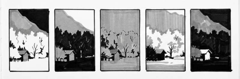
Here is the drill I give every new student. Grab one reference photo, something with clear structure like a landscape or a simple still life. Set a timer for ten minutes. You need five separate thumbnails before the bell rings. That gives you about two minutes per sketch. No longer.
But you cannot simply copy the reference five times. For each sketch, shift the value dominance. In the first thumbnail, keep the sky light and the ground dark, just as you see it. In the second, flip it. Make the sky your darkest mass and let the foreground open up into light. In the third, push everything toward a mid-key so the contrast stays soft and quiet. In the fourth, pick one small shape and make it the only dark accent against an otherwise light world. In the fifth, let the whole scene sink into shadow except for one bright shape.
You will probably hate one or two of them. That is the point. You will also find one that makes your heartbeat pick up. Notice how the mood shifts. A dark sky does not just read as night. It can feel heavy and brooding, or even claustrophobic depending on what surrounds it. A light ground can feel like fresh snow or sun-bleached sand. These are small changes on paper, but they become entirely different paintings on your canvas.
If you find yourself slowing down to add detail, scribble faster. Use a fatter marker. Set your phone timer where you can see the seconds drop. The time pressure shuts down the part of your brain that wants to make everything pretty and wakes up the part that thinks in big shapes.
Do this drill three times with three different photos and you will start to see compositions in your head before you ever touch a brush. You will stop wasting hours on paintings that were doomed by a weak value plan. The ten minutes you spend here can save you ten hours of frustration later.
Conclusion
Those sixty seconds at the start of your session are the shortcut that keeps you from spending three hours on a piece that was doomed by a weak composition from the first stroke. A thumbnail is not extra homework. It is the map that lets you stop guessing and start painting.
Forget fancy tools and pretty drawings. Grab a rectangle and two markers. The real requirement is the willingness to think in shapes before you think in color. The painters who grow fastest spot their problems while they are still easy to fix. Sometimes that means scribbling three bad thumbnails before one finally clicks.
Make this your new rule. Before every painting, give yourself one minute. Squint, map your three values, and decide if the scene actually works. Then paint. When the values are already decided, the color almost takes care of itself.
Your future self will thank you. And your paintings will show it.