A practical guide to fixing flat artwork and creating strong value patterns.
Introduction
You mixed the color exactly right. The drawing is accurate. But the painting still looks flat.
This is one of the most frustrating places to be as a painter. Everything is technically correct, yet the result is boring. You start to doubt your eyes. Maybe you just cannot see tonal values properly.
Most of the time, your eyes are fine. You can already tell a light tone from a dark one. Your eyes are not the problem. The real struggle is how you distribute and arrange those tones across the whole canvas.
A good painting is more than a collection of correctly observed tones. It is a designed pattern of light and dark that holds together even when someone views it from across the room. Learning to judge that pattern is a completely different skill from simply identifying whether a shadow is darker than a highlight.
In this article we will treat tonal values as a design tool. Getting the value pattern right matters more than getting every color note perfect. We will separate the skill of seeing tone from the skill of arranging tone. You will learn how to use squinting to strip away detail so you can see the big shapes. We will group values into clear families and look at why some patterns feel dramatic while others feel weak. We will study how master painters controlled their light and dark masses. You will see the mistakes that flatten beginner work. Then you will get exercises to catch problems early.
If you have ever stood back from your easel and wondered why the painting does not work even though every part looks right, this is for you. Stop looking for the answer in your color mixing. Start looking at the pattern.
The Two Different Skills, Seeing Tone vs Arranging Tone
You mixed the right colour. The drawing is accurate. The edges are reasonably clean. And still, the painting sits there like a deflated balloon. Nothing is technically wrong, yet nothing holds your eye. This is the exact spot where most hobby painters stall, because they have spent years learning to see tone and almost no time learning to arrange it.
Seeing tone is a perceptual skill. It is the ability to look at a shadow on a white wall and recognise that it is darker than the wall itself, even though both are technically white in local colour. Most beginners, after a few months of practice, can do this well enough. They can hold up a value scale and match a mid-grey. They can tell a light from a dark. The frustration creeps in when they realise that accurate observation alone does not make a painting sing.
Arranging tone is a design skill. It is the decision to move that wall shadow up to a lighter value so it merges with the wall, or push it darker so it frames the window. You are no longer reporting what you see. You are deciding what the painting needs.
Value Pattern
The planned distribution of light, mid, and dark tones across the entire painting surface. It is the underlying map that guides the viewer’s eye before colour ever enters the conversation.
Think of it like music. Hearing that one note is higher than another is not the same as composing a melody. You can have perfect pitch and still write a boring song. In the same way, your eye can be honest about values while your painting remains tuneless because the notes are scattered without intent.
The shift from seeing to arranging is awkward because it feels like you are lying. You spent all that effort learning to paint what is there, and now I am suggesting you paint what is needed instead. But a camera already records exactly what is there. Your job is to restructure it into something a viewer can feel.
Before we look at how to design these patterns, we need a reliable way to strip a scene back to its bare values. The tool for that is the squint, and it reveals a problem most beginners do not know they have.
The Power of the Squint
If you only take one habit from this article, make it this. Squinting at your subject is the fastest way to stop copying details and start designing with values. When your eyes are fully open, your brain busily reads every surface detail and colour shift. That is useful for drawing accuracy, but it works against you when you are trying to judge the overall tonal pattern. You need to see the forest, and squinting blurs the trees.
Here is what happens when you narrow your eyelids. The scene goes softly out of focus. Hard edges dissolve. Colour becomes less insistent. Small jumps in value, the ones that make a wall look textured or a face look busy, melt together. What remains are the large, simple masses of light and dark. Your eye stops cataloguing objects and starts reading relationships. That shift, from object-seeing to pattern-seeing, is exactly what turns a competent copier into a painter who designs.
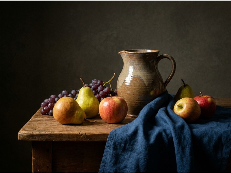
Look at the reference photo above. Open and detailed, it probably looks interesting. Now imagine squinting until the edges blur. The background clutter melts together. The subtle shifts in the clothing drift toward the middle. The shadow half-tones lose their separate identity. Some areas will cling to the light family. Others will drop into the dark family. And a few will hover in between.
If you are lucky, the scene naturally separates into clean value groups. More often, especially with beginners’ reference material, everything collapses into a muddy middle. I call this the grey soup problem. Once the detail is stripped away, you discover that the light areas are not very light, the darks are not very dark, and most of the painting territory is swallowed by similar mid-tones. The reference still looks correct when your eyes are open, but under the squint test it turns to mush. This is one reason why a painting can be accurate and lifeless at the same time. There is no structural skeleton for the eye to grip.
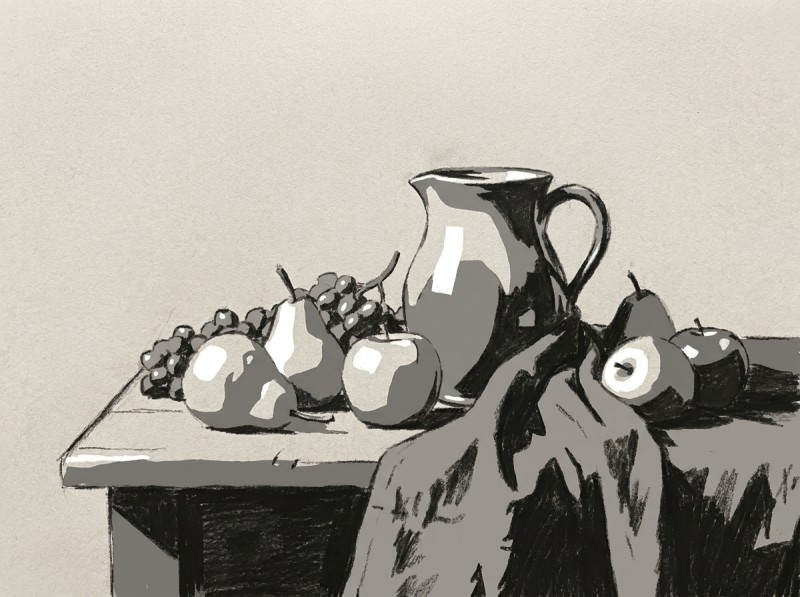
The sketch above shows the same scene forced into three big value families. Notice that it does not follow every local colour. The light side of the face may be darker than a white collar in reality, but here it belongs to the light mass because of its relationship to the whole. The squint reveals these forced marriages. It shows you what must be grouped together if the painting is going to hold together from across the room.
Use the squint constantly. Hold your reference at arm’s length, narrow your eyes until edges disappear, and ask one ruthless question: can I still read this as a simple pattern of lights and darks? If the answer is no, you do not have a value problem yet. You have a value grouping problem, and the next section will show you exactly how to fix it.
The Three Big Value Families
Squinting strips away the detail, but it does not tell you what to do with what remains. The next step is to sort every shape into one of three families. Light, middle, and dark. These three groups are the foundation of every strong value pattern.
Nature is not organised this way. A single tree might carry ten subtle shifts from sunlit yellow-green to cool shadow. Your job is not to copy each one. Your job is to decide which family each shape belongs to, then push it there. If a shadow is slightly lighter than another shadow, group them both into dark. If a sunlit wall has a gentle turn, keep it in the light family. Be ruthless. The magic happens when you stop copying values and start commanding them.
Most successful paintings do not split the real estate evenly between the three families. One group usually dominates. You will see scenes that are almost entirely light, held together by a few dark accents. Or paintings that live in the dark range, with one bright shape doing all the talking. The middle family can lead too, though it takes a steadier hand. When one family is clearly in charge, the painting stops looking like a report and starts looking like a decision.
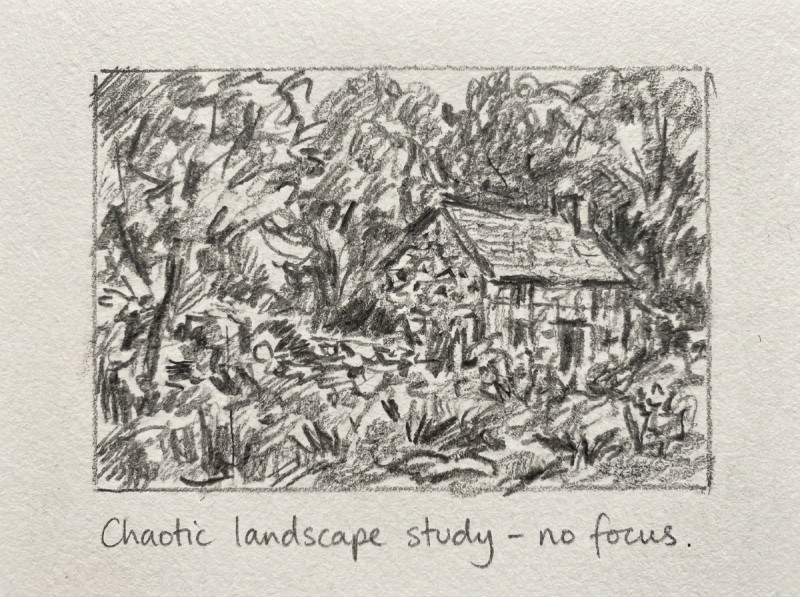
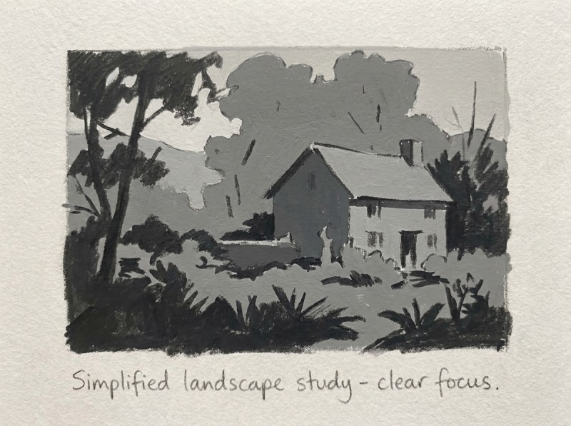
Compare these two thumbnail sketches of the same scene. In the first, every rock, leaf, and shadow keeps its own private value. Nothing connects. The eye drowns in small differences and the image feels both busy and flat. In the second sketch, the same scene has been forced into three clear groups. The sky and hills become one light shape. The middle ground settles into a single mid tone. The foreground trees and their shadows drop into dark. It reads instantly. It feels solid.
You do not need all three families in every painting. Some of the strongest studies use only two. But if you bring all three onto the canvas, think of them as teams. Let one team carry the game. The others are there to support.
Next, we will look at exactly why this balance matters. Get it wrong, and even a beautifully rendered subject can feel weak. Get it right, and the painting practically reads itself.
Why Some Tonal Patterns Work Better Than Others
Once you can sort your scene into light, mid tone, and dark, the next decision is the one that actually makes or breaks the painting. You have to choose who is in charge.
A strong value pattern is never democratic. One of those three families needs to dominate. It should occupy roughly two thirds or more of your picture area, while the other two families share what is left. When you let one value family run the show, the painting suddenly feels intentional. When you split the territory evenly, the result is visual noise.
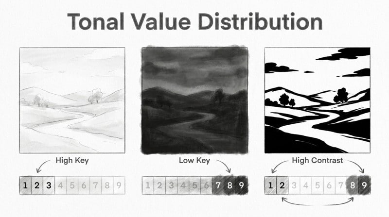
Think about a painting that is mostly light. We call that high key. It feels airy, delicate, maybe nostalgic or quiet. Now picture one that is mostly dark. That is low key, and it carries weight, drama, or mystery. A mid-tone dominant painting can feel soft, atmospheric, or subdued. The mood is set by whichever family owns the largest share of the canvas.
The problem starts when you give equal billing to all three. A third light, a third mid, a third dark might sound balanced on paper, but on the canvas it creates a tug-of-war. The viewer’s eye bounces around looking for a leader and never finds one. The painting becomes flat not because the values are wrong individually, but because they are arranged like competing radio stations playing at the same volume.
This is why a grey soup painting often feels boring rather than simply neutral. It is not that everything is middle grey. It is that everything is claiming the same amount of attention. Even a painting with a full range from white to black can fail if those extremes are sprinkled around like seasoning instead of being organized under one dominant value.
Dominance gives the viewer a place to rest. It creates a visual temperature for the whole piece. Once you establish that primary family, you can place a small amount of strong contrast exactly where you want the eye to land. The contrast becomes meaningful because it sits inside a controlled environment.
In the next section we will look at how some of the best painters in history used this exact principle. When you see how Sargent, Sorolla, and Rembrandt divided their value real estate, the idea of dominance stops being theory and starts looking like a practical tool you can borrow.
Steal the Value Patterns of the Masters
If you are unsure what a strong value pattern looks like, the easiest place to find clarity is in paintings that have already lasted a few centuries. The masters were not guessing. They knew exactly where to place their darkest dark and their lightest light so your eye would land in one specific spot.
The trick is to stop looking at the subject matter and start looking at the underlying design. A portrait by Sargent and a beach scene by Sorolla might seem completely different on the surface. Strip away the colour and the narrative details though, and you often find the same structural logic at work.
Let us look at three examples. If you have image editing software, convert them to grayscale yourself. If not, simply squint until the colour disappears. Either way, watch for the dominant value family and the one sharp accent of contrast that does all the heavy lifting.
John Singer Sargent, “Madame X”
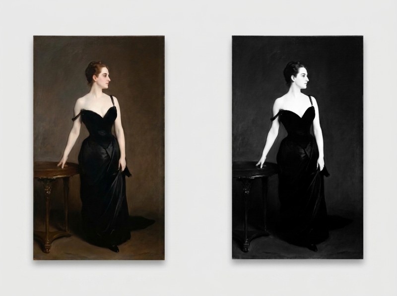
This is a predominantly dark painting. The figure sinks into deep blacks and muted mid tones. The background is not light. The dress is not light. Almost everything sits in the lower two thirds of the value scale.
Your eye goes straight to the pale skin of her shoulder and face. Sargent kept one small island of light in a sea of dark. He did not scatter bright accents around the canvas. He saved them. That single controlled light shape against the surrounding darkness creates the glamour and the focus. The painting is remembered for the mood precisely because he resisted the urge to brighten anything else.
Joaquín Sorolla, “Children on the Beach”
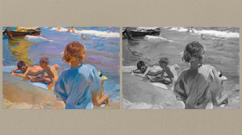
Now flip to the opposite extreme. Sorolla’s beach scenes are overwhelmingly light. Bright sunlight fills almost the entire surface, from the sand to the spray. The dominant family here is high key, with gentle shifts between pale warm and pale cool.
But the painting does not float away. Sorolla anchors the composition with a few carefully placed dark accents. Look for the shadows under the children or the dark swimsuits. Those small dark notes against all that brightness act like tent pegs. They keep the eye from drifting and give the sunlight its punch. Without them, the scene would be nothing but visual noise.
Rembrandt, “The Night Watch”
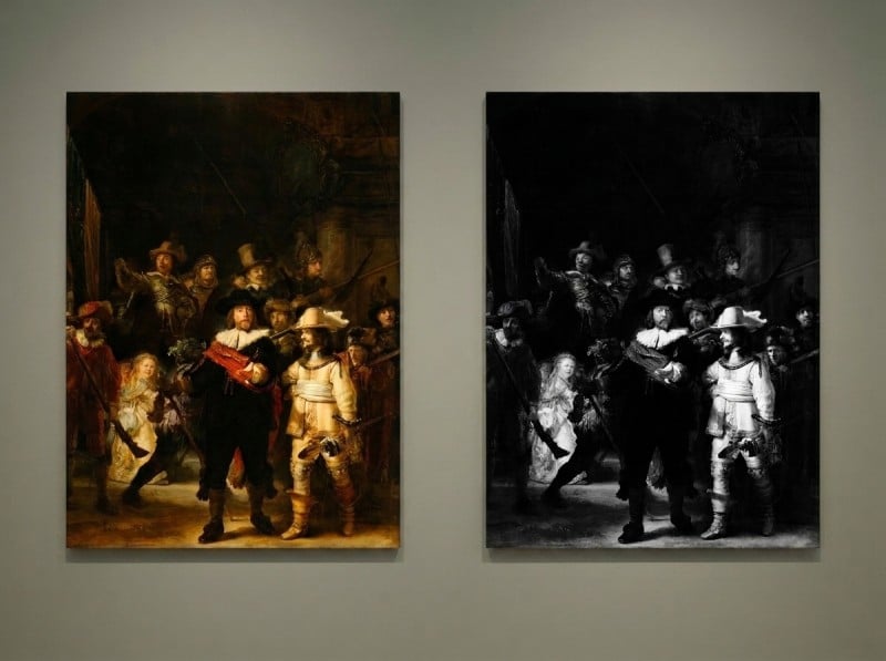
Rembrandt gives us a masterclass in controlled drama. The canvas is roughly split between deep shadow and middle value. The darkest darks are concentrated in the left foreground and the recesses of the background.
Then one figure steps forward into a pool of light. The captain’s coat catches a strong, focused light that skips over almost everything else in the scene. The strongest contrast in the entire painting sits right there. Your eye starts with that relationship and then wanders through the secondary figures almost as afterthoughts. He designed a path for you before you ever had a chance to look away.
What you should notice is that none of these paintings split the value families evenly. Each one picks a dominant side, dark or light, and then uses the opposite value as a tool rather than a competitor. The strongest contrast is not sprinkled across the canvas like salt. It is placed once, deliberately, where the artist wants you to look.
You can do this with your own references. Take a painting you admire and reduce it to three values on a small thumbnail. Notice which family wins and where the single sharpest contrast sits. See how everything else is quietly lowered to support it. That thumbnail is now a recipe you can borrow for your own work.
I will say it plainly. Beginners often try to invent value patterns from scratch while also wrestling with colour, drawing, and technique. That is a lot to juggle. Give yourself an advantage. Let the masters solve the distribution problem for you first. Once you have borrowed their structure a few times, you will start to feel the logic in your bones. After that, your own paintings will begin to show the same kind of quiet control.
The Biggest Tonal Mistakes Beginners Make
Even when you understand dominance and contrast, it is easy to fall into habits that quietly ruin a painting. These mistakes rarely look wrong at first. They feel safe. But they leave the viewer uninterested because the value pattern underneath is broken. Here are the six I see most often in the studio, with a clear way out of each one.
1. The Grey Soup
You step back from your canvas and everything looks competent. The colors are pleasant. The drawing is accurate. Then you squint, and the whole image collapses into a single muddy middle grey. Nothing stands out because nothing was allowed to be truly light or truly dark.
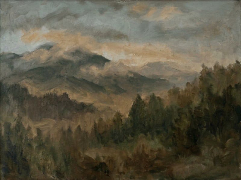
The fix is to reassign every major shape to a clear family. Push the sky into a lighter group, the foreground into a darker group, and let the mid-tones serve only the areas that really need them.
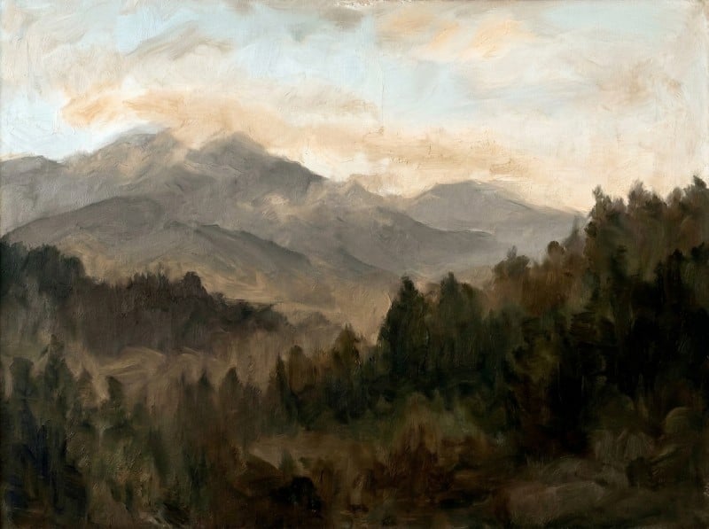
When you separate values by a full step instead of letting them all huddle together, the eye reads the big structure instantly. Light and dark are doing different jobs, and the painting begins to breathe.
2. Everything Competing Equally
This happens when you paint every area with the same level of energy and contrast. The background is as busy as the subject. The vase fights with the wall behind it. The viewer’s eye darts around looking for a place to land, but every seat in the room is taken.
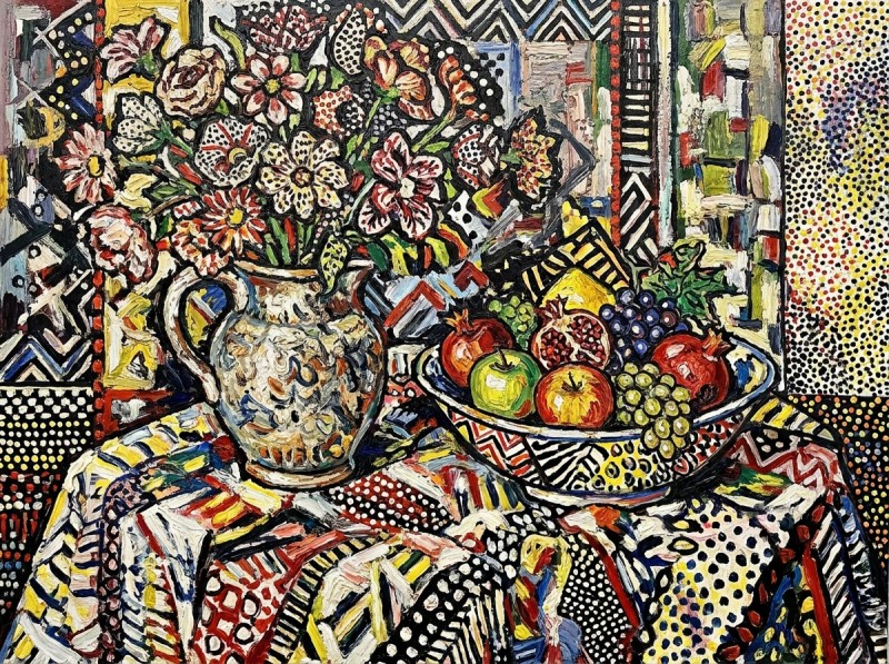
Choose one area to lead. Quiet the surrounding shapes by pushing them closer together in value. If the figure is the story, let the background settle into a simpler, closer range so the figure can step forward.
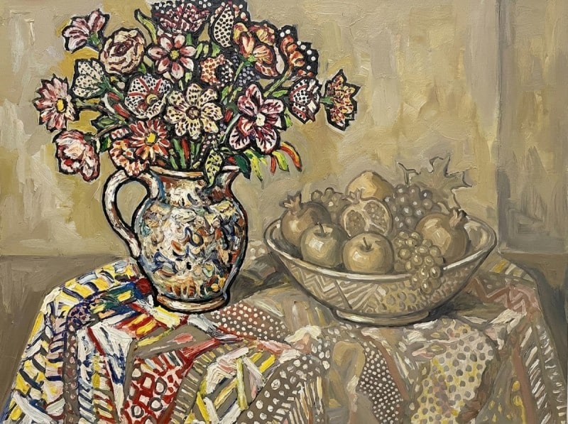
A painting needs hierarchy. When every shape speaks at the same volume, the result is noise. Give the background a supporting role. That creates a stage for what matters.
3. Contrast Scattered Everywhere
Beginners often notice that strong contrast looks exciting, so they add strong contrast everywhere. The tree trunk has a dark against a light. The cloth has a dark against a light. The face has a dark against a light. The eye gets pulled in ten directions and never rests.
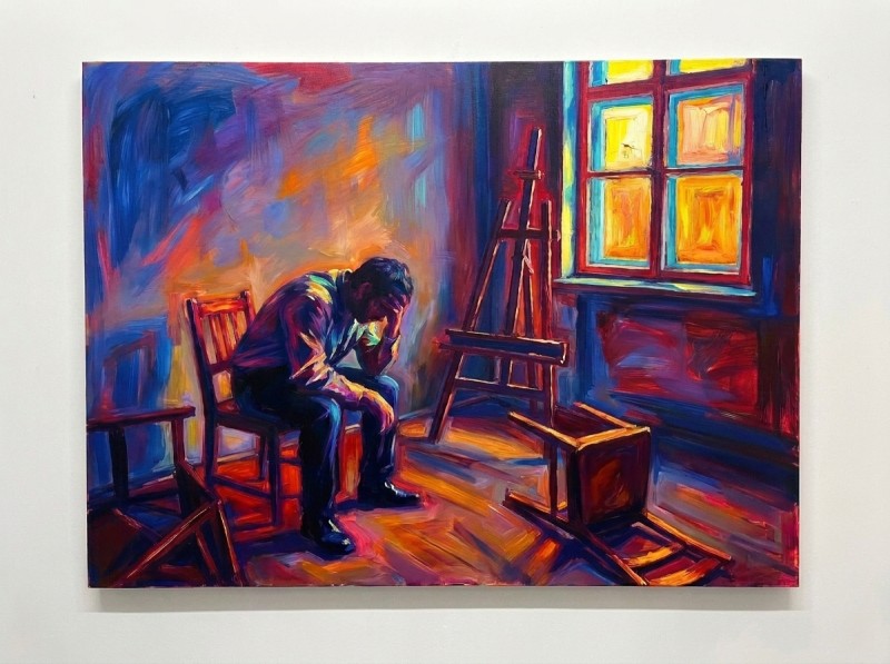
Reserve your strongest light-against-dark jump for one chosen area, usually the focal point. Let other passages carry softer transitions. A middle-grey shape against a light-grey shape is enough to suggest form without shouting.
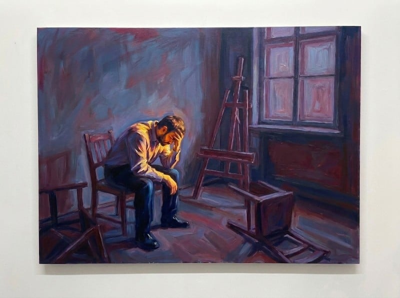
Contrast is attention. If you spend it on every object, you have none left for the main idea. A single, well-placed contrast acts like a spotlight. The rest of the stage can stay dim.
4. No True Darks
Many painters stop at mid-grey because they are afraid of making a hole in the canvas. The painting ends up timid and washed out. The lights feel dim because nothing darker is sitting nearby to push them forward.
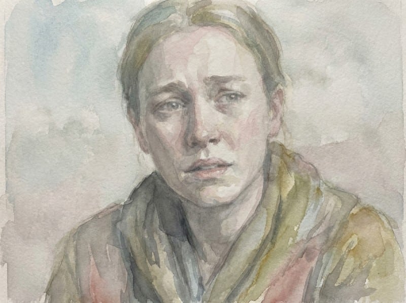
Find the darkest value your painting needs. Mix it with confidence and place it where it supports the pattern. It might be only a small accent under the chin or deep in the foreground shadow.
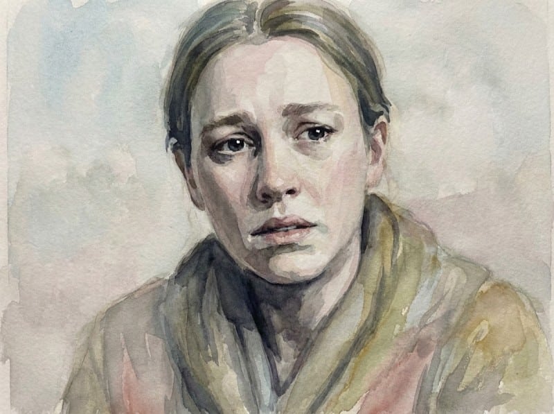
Dark values give weight. Even a small area of true dark makes the surrounding mid-tones feel richer and the lights feel brighter. Without that anchor, the whole image floats away.
5. Outlining Everything
When you are unsure how two shapes separate, it is tempting to draw a dark line around every object. The result looks like a coloring book. The illusion of form disappears because real objects do not have black borders.
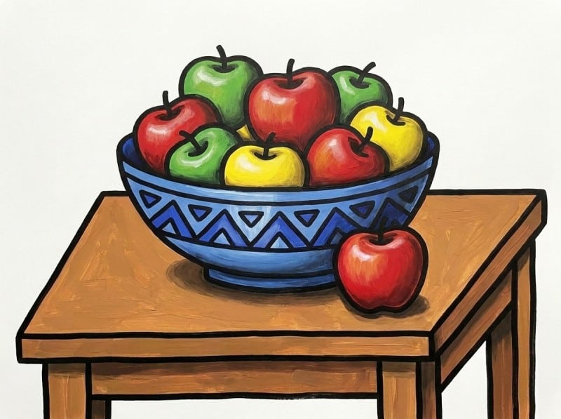
Let the values themselves create the edge. Place a dark shape against a light shape, and the boundary appears automatically. If two shapes are meant to group together, keep their values close.
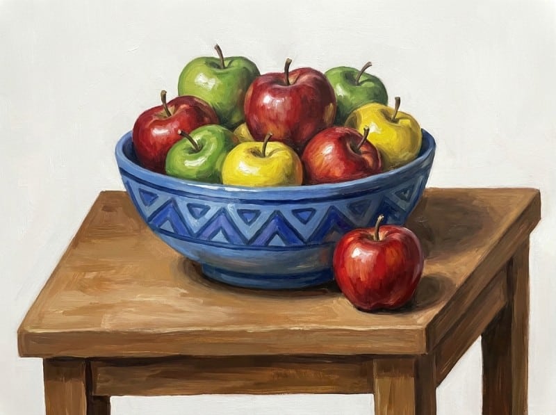
In nature, edges are created by difference in tone, not by outlines. Trust the big value masses to do the drawing. You will get a more believable, more painterly result, and you will stop drawing with paint.
6. Misplaced Strongest Contrast
This is the most subtle mistake. The painting has a strong dark and a strong light, but they sit in the wrong place. The sharpest jump lands on a shoe in the corner, or a faraway hill, while the main subject sits safely in the middle greys.
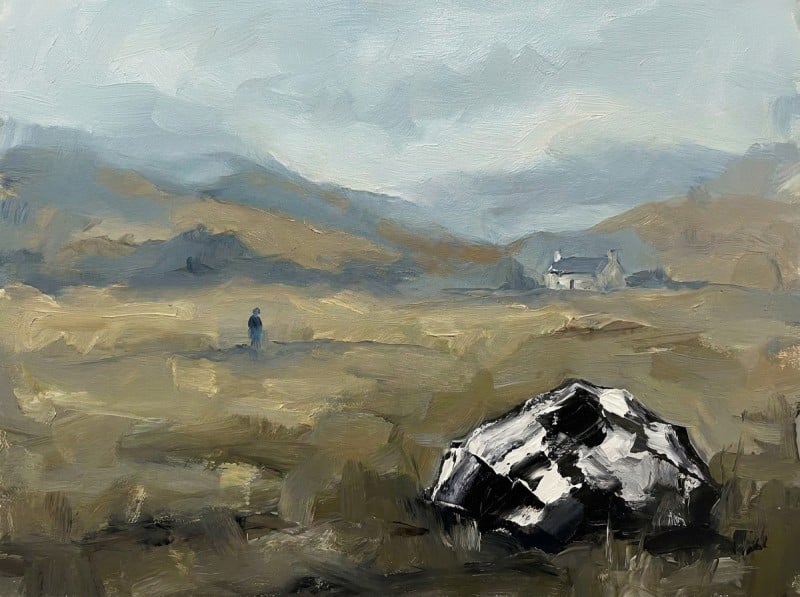
Move the accent. Place the strongest value jump at the center of interest. Let the main subject carry the weight, and keep secondary areas in a narrower range.
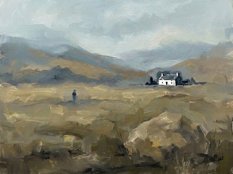
The viewer enters the painting through the strongest value difference. If that difference lands on a trivial detail, the painting feels accidental. If it lands on the story you want to tell, the whole composition finally has a front door.
Case Study, From Reference to Result
I want to show you exactly how distribution works in practice. We will take a late afternoon coastal reference and compare a weak value plan against a strong one. Then you will see the finished painting that came from the better plan.

The photo shows a bright sky, sunlit sand, cliffs in shadow, and a small boat on the shore. It is full of information. If you paint every local colour and tone exactly as the camera recorded it, you will end up with a fragmented painting. The values need designing, not copying.
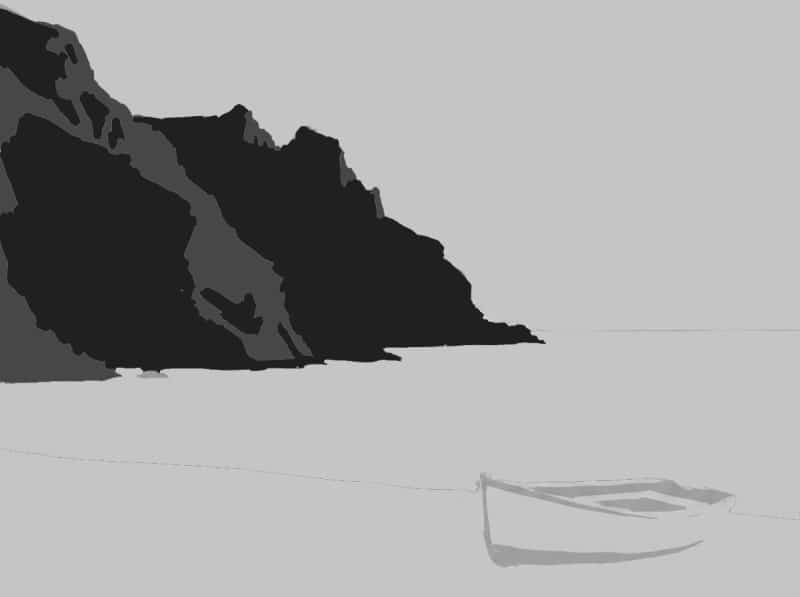
This is the weak plan. The sky, water and the sand all sit in the light value family, and so does the boat. The cliffs are middle and dark. But the light shapes are broken into too many similar competing pieces. The sky is one patch, the sand is another, and the boat sits off by itself. They are all similar in lightness, so no single light mass feels dominant. The darkest dark belongs to the cliff, but it sits on it’s own off to the side with nothing to balance it out. Nothing in the image anchors the eye. The boat should be the focal point, but it has nothing to contrast against and it is pushed right to the corner. That pulls the viewer to the edge and traps the eye there. The painting feels jumpy because every value group is shouting at the same volume.
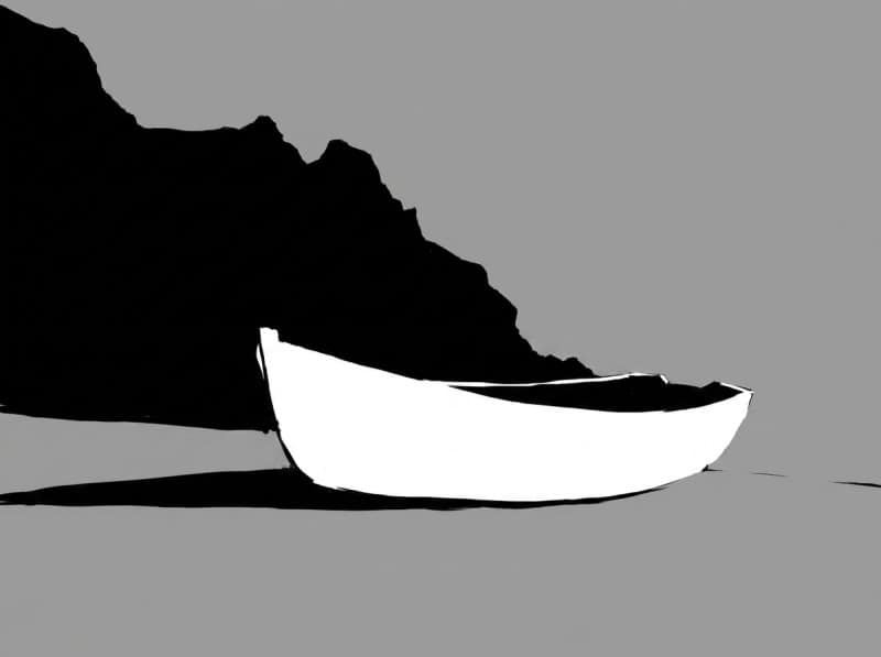
Now look at the strong plan. I kept the sky, water and the sand in one continuous light shape. They will be different colours in the painting, but they share the same value family. That gives the work a clear dominant light value covering the upper and lower areas. I pushed the cliffs deeper into the dark family instead of letting them compete with the middle values. I lightened the value of the boat then shifted the viewpoint so that the boat moved inward and appears larger to make it sit as the lightest accent against the darkest part of the cliff. Now the strongest contrast is near the centre of interest, not the edge. The eye moves easily from the big unified light mass, through the middle value water, and rests on that one sharp light against dark. The whole painting supports that single moment.

Here is the finished piece built from that plan. The colours are warm and specific, but the structure underneath is what makes it hold together. You can see the large light shape dominating most of the canvas, the dark cliff anchoring the left side, and that small bright note of the boat doing the focal point work. Colour alone could never rescue the first plan. It needed the underlying value architecture.
Once you see the difference between copying a reference and designing a value pattern, you can start judging your own paintings with the same eyes. Next, I will give you a practical checklist to do exactly that.
What Should You Look For in Your Own Painting
Use this checklist when a painting feels finished but looks flat, or when you sense a problem you cannot name. It will take you two minutes.
1. The Squint Test
Squint at your own work the same way you squinted at the reference. If the big shapes dissolve into grey soup, your mid tones have crept in and taken over. Push your darks darker and your lights lighter to bring the three families back into their proper groups.
2. The Dominance Check
Step back and ask which family is running the show. Mostly light? Mostly dark? Mostly mid? Pick one. If no family is clearly in charge, the eye does not know where to settle. Adjust the smaller shapes so the dominant family owns at least sixty percent of the canvas.
3. The Focal Point Check
Locate the sharpest value jump in the painting. Is it sitting exactly where you want the viewer to look? Many beginners accidentally park their strongest contrast in a corner or along the edge. Move it. There should be one clear stage for the star, and the rest should read as supporting cast.
4. The Black and White Photo Check
Snap a photo and drain the colour. Hue tricks the eye. Two colours can scream at each other and still sit at the same dull value. If important shapes vanish in black and white, they are too close in value. Separate them by a full step.
5. The Distance Test
Put the painting across the room. Six metres is good. Ten is better. A strong value pattern reads from the other side of the studio. If the painting only holds together when you are standing over it, the structure is too polite. Beef up the big contrasts.
That is the whole routine. You do not need a critic. You need five specific jobs to do while you look.
If every check passes and the painting still feels lifeless, the issue is probably colour temperature or drawing. But values are the usual culprit. Fix the pattern first.
Next, we will look at exercises that train your eye to spot these problems before they end up on the canvas.
Exercises That Actually Improve Your Eye
You now know what to look for. But training your eye to spot value problems without thinking takes deliberate practice. These four exercises strip away colour and detail until nothing is left but the value relationships. You just need some cheap acrylics or gouache, a brush, and scrap paper or a small canvas board.
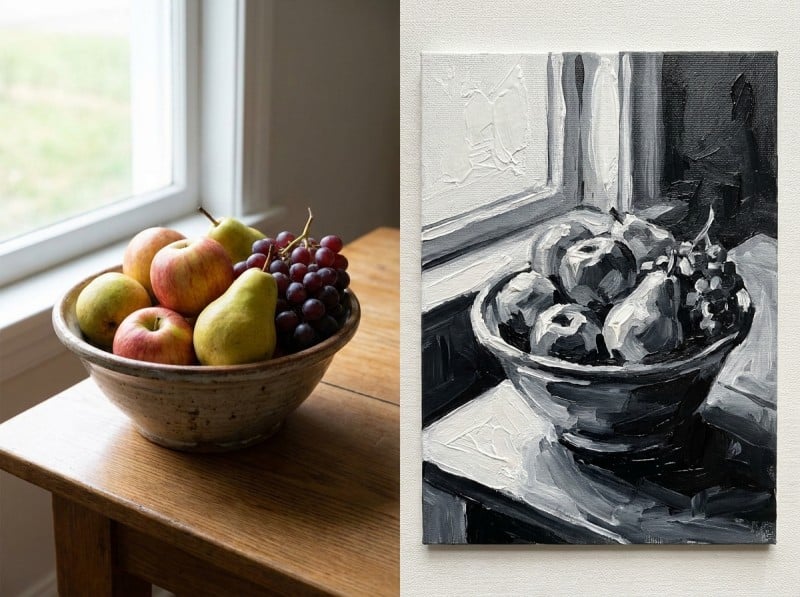
Black and White Paintings
Pick a simple still life or landscape photo and paint it using only black and white. Do not use grey straight from the tube. Mix every value yourself by adding water or white to black. This forces your hand to match what your eye sees. After three or four of these, you stop guessing whether a shadow is dark enough. You know.
Keep them small. An hour each. Try the same subject twice. The first attempt almost always has the mid-tones too light. The second one usually looks stronger because your eye already knows the range.
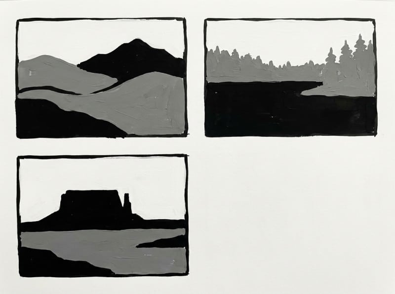
Three-Value Thumbnails
Before you touch a big canvas, do five-minute thumbnails. Light. Mid. Dark. That is it. Use a marker or a flat brush and block in the big shapes without any detail. If you cannot make the scene read in three values, you will not make it read in twenty.
Do ten of these from different reference photos. Then pick your best two and enlarge them into small colour studies. You will be surprised how much better the final painting looks when the bones were sorted in five minutes.
Value-Only Master Copies
Take one of those master paintings we looked at earlier. Sargent, Rembrandt, or whoever speaks to you. Make a small copy in black and white or burnt umber and white. Do not worry about likeness or anatomy. Just match the value pattern. Where does the lightest light sit? How big is that dark mass compared to the mid-tones?
No one needs to see the finished copy. You are simply borrowing the rhythm of a great pattern and letting it travel through your own hand. You feel the design in a way that no grayscale conversion on a screen can teach.
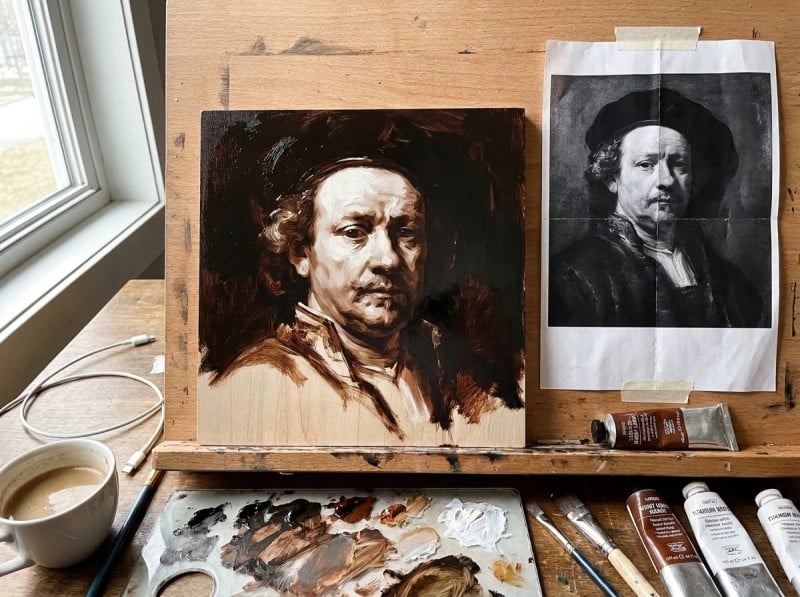
Photo Reduction
Print a colour photograph. Now paint a version using no more than four values. Squint at the reference and assign every shape to one of your four values. Some edges will get lost entirely. Colours will flatten into their nearest value. That is the point. You are learning to design, not copy.
If you get stuck, flip both the reference and your painting upside down. It breaks the spell of the subject and shows you the value shapes for what they really are.
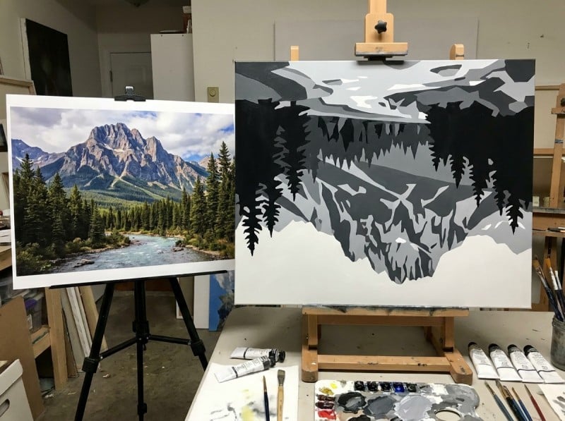
Pick one exercise and try it this week. The eye improves fast once it gets consistent work. And when you come back to colour, you will find yourself reaching for the value plan first without even meaning to.
Next Steps
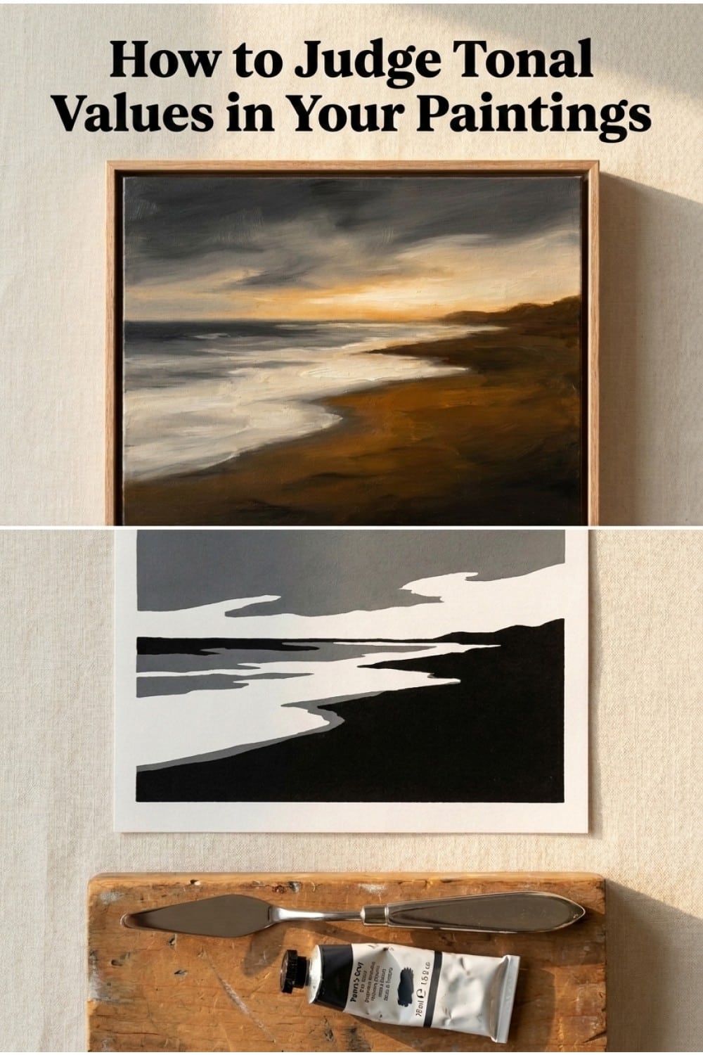
Save this quick-reference graphic to your Pinterest board so you can check it before your next painting. It summarises the core value distribution ideas from this guide in one easy-to-scan layout.
Conclusion
It is easy to get caught up in the excitement of mixing the perfect sky blue or the exact skin tone, but remember that value does the heavy lifting while color takes the credit. If you start treating your tonal values as a deliberate design tool rather than just a coloring exercise, your work will immediately feel more professional and grounded.
For your next three paintings, try a small experiment. Do not touch your colors until you have sketched out a thumbnail-sized value plan. Decide which family will be dominant and where your strongest contrast will sit. Once you have that roadmap, the actual painting process becomes much easier because the most important decisions are already made.
Thinking of values as a choice you make, rather than a reality you copy, is the moment you stop being a student of nature and start being an artist. Grab your sketchbook, find a simple subject, and start designing.