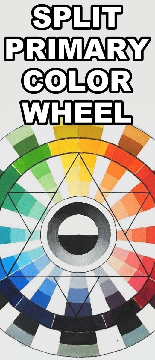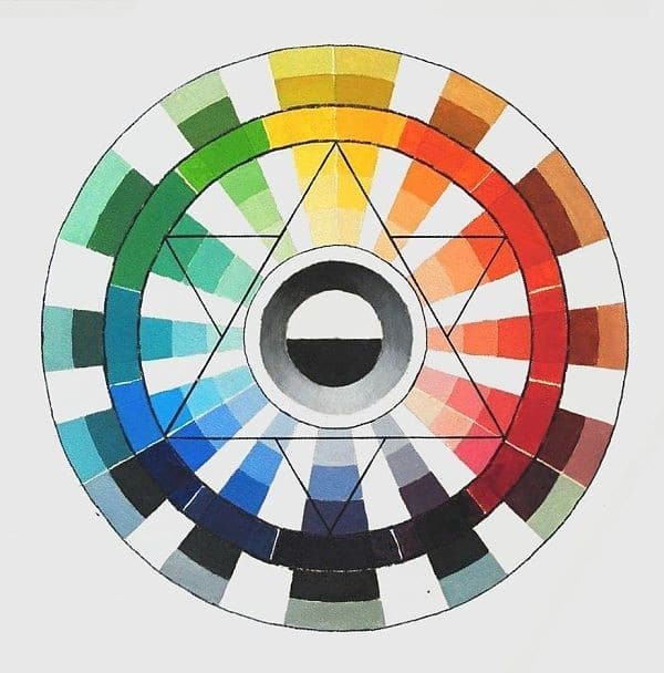
In this lesson we will discuss the split primary colour wheel, see how it can help our colour mixing and learn how to use it correctly.
Standard Colour Wheel
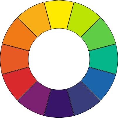
The standard colour wheel consists of three primary colours, red, yellow and blue. We can use that, along with white, to mix any colour under the sun by following the colour mixing rules.
Please view the tutorials about the Standard Colour Wheel as well as the one on the Colour Mixing Rules to familiarise yourself with these two concepts before continuing with this tutorial. This tutorial is an expansion of the previous two and requires you to know those concepts first.
Standard Colour Wheel Limitations
The question always remains which blue, which red and which yellow do we use. Is the correct blue Cerulean, Cobalt, Ultramarine, Cyan,or another one entirely? The same goes for the reds and yellows. Should we use Alizarin Crimson, Cadmium Red, Quinacridone, Magenta, Cadmium Yellow, Cadmium Yellow Light, Lemon Yellow and so on?
Mixing French Ultramarine and Lemon Yellow does not give you the same green as mixing Cerulean Blue and Cadmium Yellow together. In other words even mixing two “primaries” together is going to give you a different result. Here you can see the difference between the two mixes:
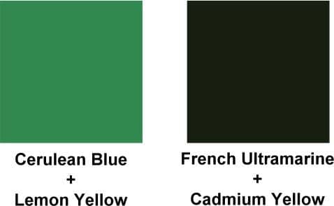
No matter in what ratio you mix French Ultramarine and Cadmium Yellow together, you are never going to get the same greens as you get when using Cobalt Blue and Lemon Yellow.
In other words if we had to “standardise” on using three specific primaries, for example Cadmium Red, Cadmium Yellow and French Ultramarine, we would find that we are simply not able to mix certain colours properly. The same goes for any of the other “standard” primary colour combinations.
Another problem we encounter with the standard colour wheel is that mixing certain colours together creates more or less vibrant secondaries, even though you are mixed the paints directly out of the tube.
The reason for this is because most “primary” paint colours are not perfect primaries. In fact even today we are not exactly sure which three colours form the perfect primary colours., The truth is that all our paint colours are biased towards a secondary colour. Let me give you an example. Here we have two reds:

The one on the left is biased towards orange and the other biased towards blue. Both can be used as “primaries”, but neither are perfect primaries.
If we now use these to mix other colours, we will get different results. If we add yellow to the left hand red we will get a lovely vibrant orange. If however we use the right hand red to mix orange we will get a much duller / less vibrant orange because this red has a blue bias to it. As we know blue is the opposite colour of orange. So in effect if we use the right hand red, we will get a shadowed orange.
This is not always a bad thing. We don't always want to mix a bright / vibrant colour. Especially when painting landscapes, colours tend to be more muted than we first think. Even a “vibrant” colour like grass green can trip the artist up. When we think of grass green, we think of this colour:

yet this is what colour grass actually is:
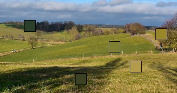
Can you see how knowing how to mix these muted colours can help you?
Solving These Limitations
The way we are going to overcome the limitations of the standard colour wheel and have even more control over our colour mixing is by knowing and using the split primary colour wheel.
We will then have a system we can use to better decide which tube of paint to select, have more control over what type of colour we are going to get (dull or vibrant) once mixed and have a larger variety of colours to use in our paintings.
The Split Primary Colour Wheel
The concept behind the split primary colour wheel is that our primaries are not perfect primaries, but biased towards one side or the other on the colour wheel.
In order to keep our colours as vibrant as possible when mixing our paints we need to ensure we don't inadvertently introduce some of the complimentary colour into the mixture. In order to do this we use two colours for each primary. Each version of the primary is biased towards it's secondary colour.
For example, we use a yellow biased towards the orange side of the wheel as well as a yellow biased towards the green side of the wheel.
The same happens with blue. The one is biased towards green, the other towards purple.
With the two reds, one is biased towards orange and the other towards purple.
If we now want to mix a vibrant purple, we use the blue and the red that are biased towards purple.
That way we are sure that we don't accidentally introduce some of the complimentary colour into the mix, thus keeping our colour as vibrant.
In other words with the split primary colour wheel we use two blues, two yellows and two greens. Here you can see what the new primaries look like:
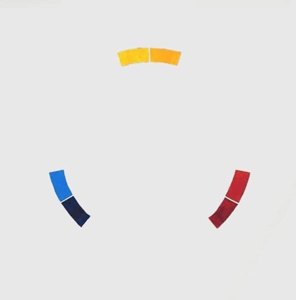
An easy way of remembering the vibrancy rule is by adding lines to the wheel like this:
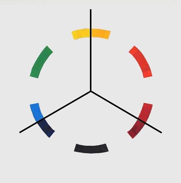
The rule then is to only mix colours together that are inside their individual “pizza slice” when we want to keep our colours vibrant. Colours mixed inside the slice give you “clean” mixes.
The minute you mix colours together that are outside the “pizza slice”, you are introducing some of the opposite colour and will start to dull down / shadow your colour. These give you "dirty" mixes.
In our purple example if we wanted a duller purple then we can use either the red or the blue outside the purple “pizza slice”. You could even use both the red and the blue that are outside the slice if you wanted to.
In each scenario you will get a different purple. This gives you four different versions of purple without even adding any tube yellow or white to the mixture.
We can now similarly get four different versions of green and orange as well
So instead only being able to mix one version of each secondary colour as with the standard colour wheel, we can now mix twelve versions of the secondary colours.
Are you starting to see the possibilities that are opening up to you by using the split primary method? Now imagine how many variations of tertiaries you can get by playing around with different ratios of each of these mixes. Here is the wheel with the clean tertiaries added:
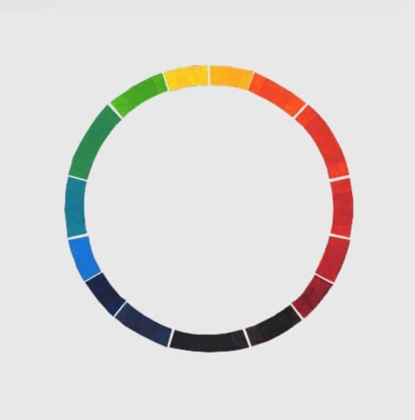
We can then further extend our available mixes by mixing the shadow of each colour by adding the opposite colour on the colour wheel:
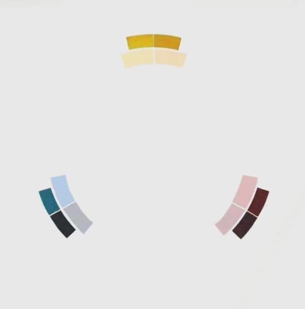
We can mix the grey for each colour by adding white the shadow colour:
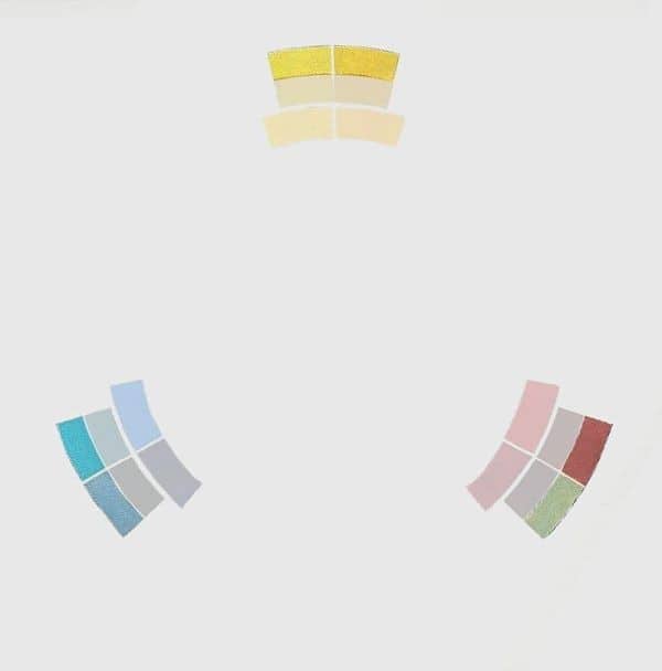
We can mix the highlight for each colour by adding the next colour up on the colour wheel towards yellow, plus white if required :
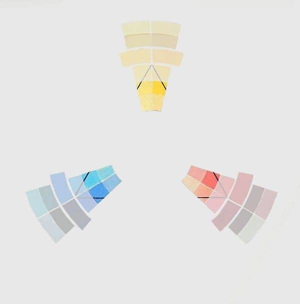
Note in the case of the primary red and blue that are biased towards purple, we add the other primary to it. In other words, you add the green biased blue primary to the purple biased blue, plus white if required. You add the orange biased red to the purple biased red plus, white if required.
All the other colours stick to the rule of using the next distinct colour up. For example when mixing the highlight of the green biased primary blue, you can either add the next tertiary or secondary colour up towards yellow (turquoise or green), plus white if required.
We can also create a variety of tints by adding white to the colour. In this case I have added white in varying degrees to the highlight colour as I find that this gives me a more vibrant tint than adding white to the chroma colour. You can of course also create tints by adding white to the chroma colour (We call these pastel colours):

If we go through the same process with the secondaries and tertiaries, we are then left with a completed “pure” split primary colour wheel looks like:
(We have added a tonal ring in the centre which is a mix of black and white to help us judge tonal values when using the wheel)

Which Split Primary Colours to Use?
There is endless debate about which six paint tube colours to use. Funny enough I have found this not to be critical. These are my personal preferred colours:
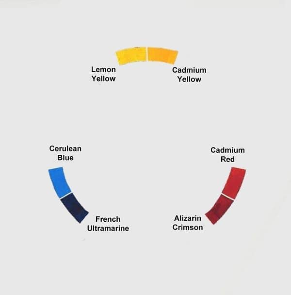
You can however easily substitute these colours for different ones and still be able to mix virtually any colour under the sun. On one very important condition: The primary you are substituting must still be biased towards it's secondary colour.
For example, you could replace Lemon Yellow for Cadmium Yellow Light or Cadmium Yellow Pale as they are both still biased towards the green side of the colour wheel.
You could also replace Alizarin Crimson for Quinacridone Magenta or Cadmium Red Deep as all these colours are blue biased.
There is nothing stopping you from using one version of a split primary in one painting and different one in another situation.
Each artist has their own preference about which six split primary colours to use. No one combination is better than the other. As long as the colours you have chosen stick to the bias rule and allow you to mix the colours you need.
What I suggest you do is print out the Split Primary Colour Wheel template below and make a few of your own using different combinations of primaries.
You will then be able to see then differences when using different primary combinations. Soon you will find your favourites.
Making a Split Primary Color Wheel
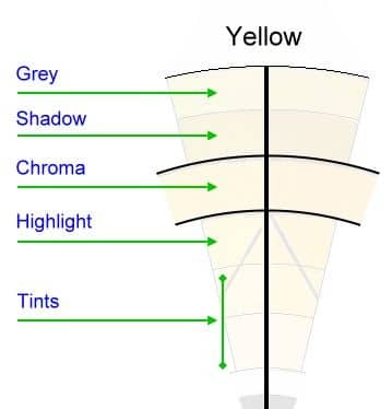
Here is a legend which you can use as you paint to remind you what goes where:
Split Primary Variations
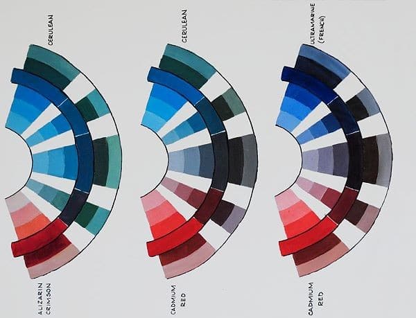
The colour wheel we have created above contains only the "clean" mixes. In other words we have not crossed the line to use colours outside the "pizza slice".
This wheel is fabulous to reference from, but what about all the dirty mixes?
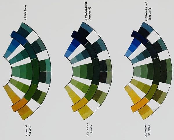
What I recommend you do is download and print the split primary variation template below and then use it to make yourself colour charts of various colour combinations.
You can then use these colour charts to quickly reference from and guide you when deciding which colours to use in order to mix the colour you need.
To give you an example here we have mixed the red and blue variations which “cross the line”. First only one colour crossing the line, then both colours crossing the line. Just look at the beautiful differences in colour as well as vibrancy we are able to get. (Compare these mixes to those on the colour wheel above, which do not cross the line, to see the difference)
Here we have done the same for blue and yellow:
and red and yellow:
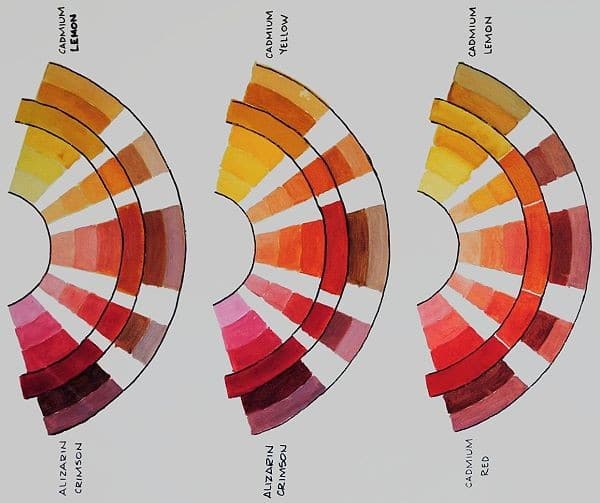
You can repeat this process using different paint tube colours as well to give you an infinite variety of colour charts to reference from.
I hope you have enjoyed this tutorial and use it to dramatically improve your colour mixing range.
Color Buster Color Mixing Tool
The Color Buster Color Mixing Tool helps you to match your paint colors perfectly - say goodbye to muddy colors and hello to beautiful vibrant paintings.
Get your Color Buster Color Mixing Tool HERE
Pin Me
