How Colors Talk to Each Other
Look at a painting from afar, then step closer to observe the individual brushstrokes that make up the painting. What do you notice? Often what you see colors in the brush strokes that look nothing like the scene itself. These unexpected colors may seem like random mistakes, yet when you stand back they blend in perfectly and look correct. What is going on here?
Chances are it's Simultaneous Contrast.
The perception of color has been a subject of extensive study throughout the history of art. One fascinating scientific theory that found its way into the art world and had a profound effect is known as Simultaneous Contrast. The study of contrasting colors and how they interact with each other has inspired several art movements, especially in 19th-century France, and continues to influence artists to this day.
In this article, we will delve deeper into the theory of simultaneous contrast and explore some of its most renowned advocates. Along the way I will add practical examples and exercises you can do as you learn what Simultaneous Contrast is and how you can use it in your artworks.
What is Simultaneous Contrast?
Simultaneous Contrast is a cool trick that happens when we put two colors side by side. They can make each other look different and more intense. It's like they're having a colorful conversation, and it makes art and colors more interesting and exciting to look at!
In more technical terms, Simultaneous contrast is the theory of how colors affect each other when placed side by side, altering our perception of their hues, even though the colors themselves remain unchanged.
The law of simultaneous contrast describes the phenomenon where two colors juxtaposed beside each other will influence each other, causing each color to take on the hue of the complementary color of its adjacent partner. If this sounds complicated, fear not; we will examine this idea in greater detail as we progress.
The Pioneering Work of Michel Eugène Chevreul
The person credited with developing the theory of simultaneous contrast was a French chemist named Michel Eugène Chevreul. Initially renowned for his groundbreaking studies on the chemical compositions of various animal fats, Chevreul's investigations into colors began during his tenure as the director of dyeing at a tapestry works in 1824. At the time, the company faced criticism for producing dull colors in their textiles.
Through extensive research, Chevreul discovered that the issue did not lie with the colors themselves but rather with the optical illusion created by the designs. The chemical compositions of the dyes were accurate, but the way the colors contrasted and complemented each other played a crucial role in how they were perceived. Drawing inspiration from Goethe's color theories and the work of other scientists, Chevreul developed a groundbreaking circular system encompassing all the colors of the visible spectrum.
In 1839, Chevreul published his seminal work, "De la loi du contraste simultané des couleurs" or "The Laws of Contrast of Color." It became a hit and was subsequently translated into German and English from the original French. This influential book not only revolutionized the textile industry but also had a significant impact on areas such as wallpaper design, map making, and mosaics.
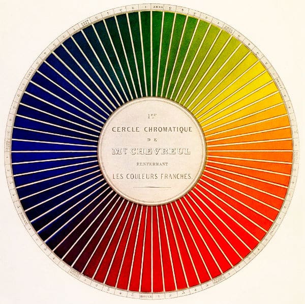
Chevreul's color circle consisted of 72 parts, starting with the primary colors: red, yellow, and blue. He then introduced secondary mixtures like orange, green, and violet, along with six additional secondary mixtures. These colors were further subdivided, taking into account brightness levels. While today's color organization approaches may differ, Chevreul's spectrum was groundbreaking for its time and left a lasting mark on the world of art.
Color Effects
Chevreul's exploration of simultaneous contrast revealed that certain colors interact with each other, influencing the perceived color and tone. How colors are paired can either heighten or diminish the intensity of one another, making the outcome a manipulable effect.
To fully grasp simultaneous contrast, we need to consider chromatic and achromatic colors. Chromatic colors are highly saturated, intense hues that appear vibrant. For example, vermillion paint exhibits an intense orange-red, often considered a "pure" color. In contrast, achromatic colors are less intense, featuring lower saturation and often including white, black, pastels, or earth tones.
Achromatic colors can appear more intense when combined with neutralized hues, such as color-tinged greys like oatmeal and charcoal. Similarly, achromatic colors can seem more vivid when contrasted with their complementary colors, which are the mixtures of the other primary hues. For instance, the complementary color to red is green, which results from combining blue and yellow. This interaction serves as the foundation of simultaneous contrast.
Practical Tip:
If you're painting a vibrant landscape with a bright blue sky and lush green fields. To make the sky appear even more intense and the fields more vibrant, try adding small touches of complementary colors like orange or red to the edges of the clouds. The contrast between the blue and orange will heighten the perceived intensity of both colors, creating a captivating and lively scene.
Moreover, this color theory yields several general rules. A dark color next to a light one makes both colors appear brighter. Warmer colors seem even warmer when contrasted with cooler colors, and conversely, cool colors appear cooler when juxtaposed with warm colors. Additionally, if two equally bright colors are placed next to each other, they will appear less bright.
Practical Tip:
To make your artwork visually dynamic and create a sense of depth, experiment with contrasting warm and cool colors. In a portrait, consider adding a touch of cool blue to the shadows of a subject's warm-toned skin. This subtle addition of a complementary color will not only enhance the shadows but also bring the subject to life, making it appear more three-dimensional.
The Famous Fans of Simultaneous Contrast
Now that we have got to grips with the theory behind simultaneous contrast, we can look to some of its best-known supporters who used Chevreul’s theories to change their artworks and develop new methods of expression.
Eugène Delacroix
Both Chevreul and Eugène Delacroix played crucial roles in inspiring the emergence of the Impressionist movement. Delacroix, deeply influenced by Chevreul's color manual, used its insights to guide the use of color in his paintings. He discovered that by applying colors in small, separate brushstrokes, he could achieve a greater and more impressive visual impact.
Delacroix developed a technique called 'flochetage,' in which he employed small daubs of color to create an optical mixture based on Chevreul's theory. Through optical mixing, primary colors blend into secondary colors, while complementary colors blend into greys or neutral hues. Delacroix was among the first to explore this technique, experimenting with its effects by weaving spots of paint together to enhance his paintings.
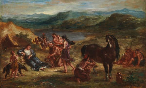
Numerous impressive examples of Delacroix's use of flochetage can be found in his later works. "Ovid among the Scythians" depicts the famous Roman poet Ovid wearing a blue toga, surrounded by figures adorned in red and orange robes, set against the green of the landscape. In this artwork, Delacroix skillfully employs both optical mixing and simultaneous contrast. Though it received mixed reviews when shown in the 1859 Salon, the painting garnered high praise from Degas and other more experimental artists.
Impressionism
The Impressionists, building on Delacroix's work, sought to manipulate light and color in their paintings. Their approach involved capturing an 'impression' of a scene, employing optical illusion and suggestion instead of meticulous detailing. By contrasting light with dark and employing unconventional colors, they created evocative impressions that emphasized emotion and personal experience rather than accurate depictions of the world.
Unlike the Romantic movement's focus on allegory and spirituality, the Impressionists allowed viewers to form their own interpretations of the art. Chevreul's findings, along with those of other optical scientists, provided the Impressionists with the necessary tools to evoke such sensations. By studying color theory, they could manipulate their visual experiences, reducing them to the interplay between light and color. This rationalization of perceptual experiences allowed the Impressionists to produce unique and groundbreaking works.
Vincent van Gogh, known for using simultaneous contrast in many of his paintings, was one of the most prominent artists to embrace this technique. By closely studying Delacroix's paintings and writings on color theory, he acquired a deep understanding of the subject and adopted the technique fervently.
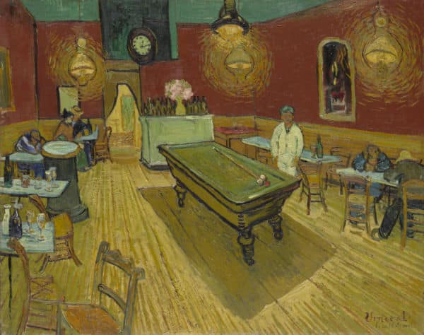
Van Gogh's masterpiece, 'The Night Cafe,' vividly exemplifies the power of simultaneous contrast in creating a striking painting focused on the interplay between colors. The clashing reds and greens in the artwork create a stark and dismal environment that deeply impacts the viewer, drawing out strong emotions.
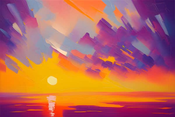
In the painting 'Ethereal Horizon,' above you can see how juxtaposed shades of purple and yellow are used to create a mesmerizing sunset scene. The interplay between these complementary colors not only captures the essence of a serene evening but also invites the viewer to immerse themselves in the vibrant hues without worrying about the detail.
Divisionism & Pointillism
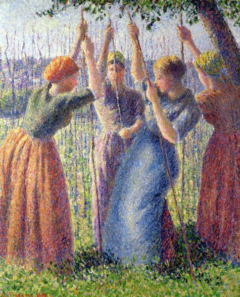
Taking Chevreul's findings to new heights, the Neo-Impressionists embraced Divisionism, later known as Pointillism. This technique involved dividing colors into individual dots to produce an optical effect based on Chevreul's studies. Georges Seurat, the most influential of the Divisionists, invested considerable time and effort into innovating this new style to achieve maximum luminosity in his works.
Pointillism, an extension of Divisionism, took the concept further, employing paintings made entirely from small dots of color. Once again, the Pointillists drew heavily from Chevreul's work in their color theories. Their paintings consisted of a precise arrangement of contrasting colors, using a scientific method to infuse their works with vibrancy. This technique also altered the texture of the artworks, influencing how they interacted with light and enhancing the overall color effect.
Georges Seurat and Paul Signac were the key proponents of Pointillism in the mid-1880s, with their works showcasing this innovative technique. Camille Pissarro, seeking an alternative to Impressionist styles, also adopted the method. During the 1886 Impressionist exhibition, the works of Seurat, Signac, and Pissarro were displayed in a separate room, signifying a clear departure from other Impressionist paintings. Notably, artists such as Van Gogh, Picasso, and Kandinsky also experimented with the Pointillist approach during this period.
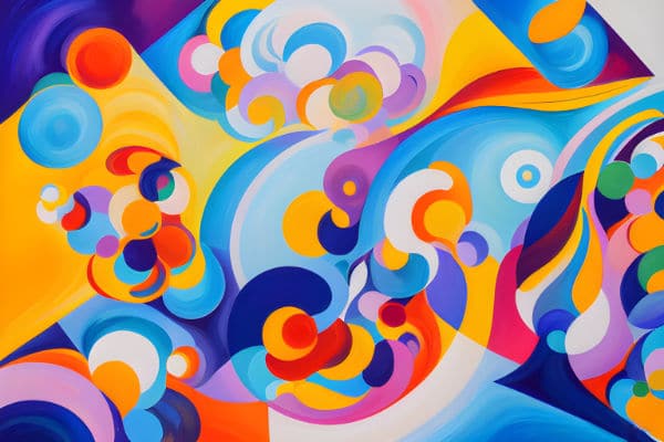
In the painting 'Ethereal Horizon,' above you can see how juxtaposed shades of purple and yellow are used to create a mesmerizing sunset scene. The interplay between these complementary colors not only captures the essence of a serene evening but also invites the viewer to immerse themselves in the vibrant hues without worrying about the detail.
Robert Delaunay
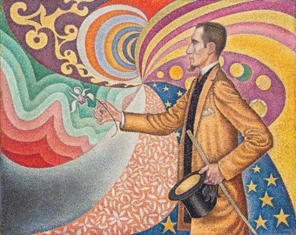
Among later artists, Robert Delaunay stands out for developing his own style called 'simultanism,' drawing inspiration from Chevreul's work on simultaneous contrast, which had previously influenced the Impressionists and post-Impressionists. Collaborating with his wife, Sonya Delaunay, Robert created paintings in the early 20th century characterized by overlapping and juxtaposing shapes made from complementary colors. Their intention was to infuse their works with greater intensity and vibrancy, using this technique as a deliberate response to the prevailing popularity of monochromatic paintings during that time.
As their art progressed, the Delaunays delved into ever more abstract compositions, incorporating circles and interlocking symbols to create fluid and dynamic artworks. Their style became known as Orphism or 'orphic cubism,' a term coined by the poet and critic Guillaume Apollinaire. Despite their abstract tendencies, they remained steadfast in their focus on the interplay between complementary colors and the harmonies they produced, always employing bright and vivid hues. Their goal was to convey sensations and evoke emotional responses through the expressive effects of pure colors. Orphism is now recognized as a significant transitional movement from Cubism to Abstract art.
Like Robert Delaunay, you can experiment with simultaneous contrast by layering complementary colors in abstract compositions. Start by drawing overlapping circles, interesting shapes and symbols onto a canvas. Vary between straight and curved lines to create a sense of movement and energy in the scene. Then start at one corner of the canvas filling in the intersecting areas with paint. Use contrasting and pure colors in each area. These contrasting and vivid colors will evoke emotions and sensations in the viewer and allow your artwork to speak to them on a profound level.
The Influence of Simultaneous Contrast on Contemporary Art
While Simultaneous Contrast had a big impact on art movements from the 19th and early 20th centuries, it is just as relevant in contemporary art. Today artists are constantly experimenting with color interactions and optical effects to convey emotions and messages.
Contemporary artists often employ Simultaneous Contrast in their works to create dynamic visual experiences. They might use contrasting colors to evoke tension or excitement, or employ optical mixing techniques to challenge viewers' perceptions and invite active engagement with the artwork.
In digital art and multimedia installations, Simultaneous Contrast is also utilized to enhance visual impact and create immersive experiences. Artists and designers in various fields, such as graphic design, interior design, fashion and film, draw on the principles of Simultaneous Contrast to create compelling compositions and evoke specific moods or reactions from their audiences.
A Simultaneous Contrast Exercise
Why not play around with Simultaneous Contrast yourself using this exercise:
Materials Needed:
Watercolor or acrylic paints (at least four colors, including the primary colors: red, blue, yellow)
Paintbrushes
Watercolor paper or canvas pad
Instructions:
1. Select four colors: red, blue, yellow, and an additional color of your choice. Ensure that one of the colors you choose is complementary to one of the primary colors. (For example, if you choose blue as your primary color, you could select orange as the complementary color).
2. Create four separate squares or rectangles on your watercolor paper or canvas pad. Leave enough space between each square to observe the interactions of the colors.
3. In the first square, paint a solid block of your primary color (e.g., blue).
4. In the second square, paint a solid block of your chosen complementary color (e.g., orange).
5. In the third square, mix a small amount of the primary color (e.g., blue) with its complementary color (e.g., orange) to create a neutral grayish color. Paint a solid block of this neutral color.
6. In the fourth square, paint small dots or strokes of your primary color (e.g., blue) directly next to small dots or strokes of its complementary color (e.g., orange). The colors should not be mixed; instead, let the viewer's eye blend them optically.
7. Dry the paint using a hairdryer.
Now take a step back and observe the four squares. Notice how the colors interact with each other and how simultaneous contrast affects your perception of each square:
In the first square with a solid block of the primary color (e.g., blue), notice how the color appears vibrant and intense.
In the second square with a solid block of the complementary color (e.g., orange), observe how the colors seem to enhance each other, making the orange appear brighter and more vibrant.
In the third square with the neutral grayish color, observe how the contrast between the primary color and its complementary color creates a sense of balance and harmony.
In the fourth square with the small dots or strokes of the primary color and its complementary color, notice how your eyes blend the colors optically, creating a visual blending effect and enhancing the overall intensity.
Feel free to experiment further with different color combinations, varying the size and placement of the colors next to each other. Observe how simultaneous contrast impacts the perceived brightness, intensity, and mood of the colors.
Conclusion
When Chevreul first formulated his theories of simultaneous contrast in the 1830s, they quickly revolutionized the use of color not only for artists but also for designers, gardeners, architects, and beyond. The adoption of contrasting colors and optical mixing extended from the Impressionists and Post-impressionists to numerous other art movements that followed.
As artists, embracing the concept of simultaneous contrast opens up a world of creative possibilities. By mastering color interactions, you can evoke emotions, create striking visual effects, and elevate the impact of your art. So, next time you pick up your brushes or start a digital masterpiece, remember to experiment with Simultaneous Contrast, allowing your colors to speak to your audience and guide you as you create your own masterpieces.
An essential element of getting that right is knowing the Color Wheel. Why follow my tutorial on How the Color Wheel Works to get your Simultaneous contrast journey started.
Pin Me