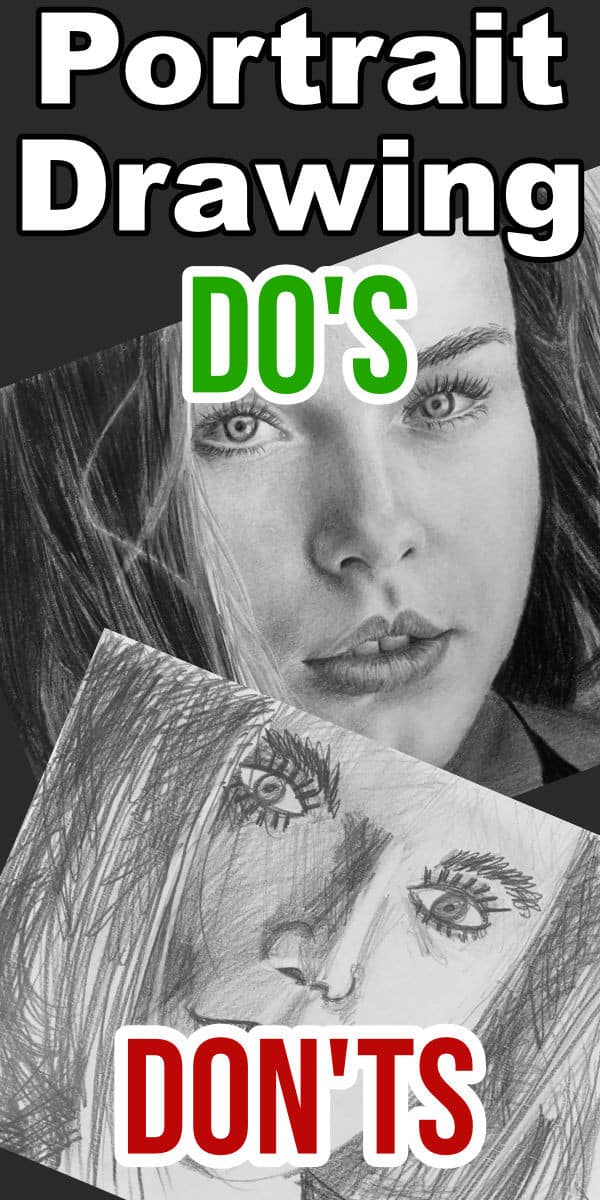
In this tutorial I am going to share with you my top list of Do's and Don'ts when it comes to drawing portraits.
I see artists making the same mistakes over and over again so this tutorial should help you not make those mistakes yourself.
We will start off with the things you mustn't do when drawing faces.
Portrait Drawing Don'ts

In the portrait drawing above I have tried to add in as many mistakes as possible. Here they are:
1) Freehand Sketch
Unless have incredible eye hand co-ordination don't draw your initial outlines for the portrait freehand when you need to get a good likeness of the person. Each of us are unique so even just a few millimeters out of position is enough to break the likeness.
2) Not Taking Perspective Into Account
When sketching artists will often forget that things get smaller due to perspective when the model is not looking directly towards them. For example the closer eye will appear larger than the distant eye.
3) Wrong Eye Shape
The eye is drawn in to look like a surfboard. This is not the shape of the eye, it is a more almond shape with an extra bit for the tear duct.
4) Iris Drawn to Fit Between Eyelids
The iris does not fit between the eyelids. The top of the iris disappears behind the upper eyelid. The bottom of the iris will also often extend slightly beyond the lower eyelid as well.
5) Not Drawing the Pupil in the Centre of the Iris
The pupil is positioned exactly in the centre of the iris. As a result of the eyelid overlapping the iris, the pupil often actually looks like it is higher / off centre, but it isn't.
6) Drawing the Lines in the Iris Too Prominent
The lines in the iris are not actually lines, but texture that in certain cases can appear stripy. Unless you are drawing a very large portrait there is usually no need to add this stripy effect in at all.
7) Drawing the Shape of the Mouth Wrong
A common mistake is to draw the arches formed by the top lip exaggerated so that they look like McDonald's Golden Arches.
The center line where the lips meet is drawn straight when it usually has a curve to it, especially on the outer edges.
8) Wrong Teeth Shape
The teeth are drawn as straight, vertical lines. Only the front two teeth are reasonably square, the rest are curved.
9) Start Drawing Too Dark
Artists often start off drawing too dark, making it very difficult to get good dark contrasts. They will then typically only have very dark tonal values in the drawing and very light tonal values with nothing in between.
10) Giving the Iris a Dark Outline
Some models do have a dark outline around the outer edge of their iris, but not all. You need to carefully observe your subject and not just draw what you think should be there.
11) Not Making the Iris & Pupil Round
The pupil and iris are both perfect circles so you need to get their shapes correct. Taking perspective into account - a circle will appear oval at an angle.
12) Shading Indiscriminately
You can't just shade in any ole direction. Even with very good shading your pencil leaves lines which are visible in the final drawing. You want these lines to conform to the contour of the face.
13) Outlining Everything
The face is basically one continuous shading with very few hard edges or found lines. If you outline all the major features then you get a comic book look and loose the realistic effect.
14) Drawing Nostrils as Holes
If you are looking at a person from normal eye height you can actually not see the nostrils at all. All you see are the shadows cast by the height of the nostril off the face. This shadow forms a shading.
15) Drawing The Eyebrows Too Thick
Don't draw the eyebrows in too large. A classic mistake is to draw them in equally thick at the centre as well as the outside of the face.
16) Only Using One Pencil
When you try to draw a portrait using only one pencil you cannot get the full range of tonal values into the drawing. A hard pencil will not give you the dark tonal values and a soft pencil will not give you the light tonal values.
17) Smudging to Get The Shadings
Trying to lay down a few pencil strokes and then smudge them to get your tonal values does not work. Pencils are not paint. There isn't enough loose graphite left over after a stroke to shade in the adjacent tonal values. Smudging often just makes the loose graphite fill up the tooth of the paper. Once the tooth is full you have to press hard to get the paper to accept more graphite. This makes the whole drawing shiny.
18) Too Prominent Cracks In the Lips
Generally the cracks in the lips are very subtle and are often not even visible from normal viewing distance. Putting them in too prominent makes the viewer wish they could give the drawing some of their lip balm.
19) Dark Lines Between the Teeth
The shading in the area between two adjacent teeth is very subtle. By making this shading too dark you make it appear as though there are gaps between the teeth.
20) Drawing Individual Eyelashes
A classic mistake is to draw the eyelashes individually, perfectly straight and radiating outward from the eye. This makes the eyelashes look like they hare standing at attention.
21) Drawing Individual Hairs
You can't draw each hair on the head. It is simply not possible, there are too many. Trying to do so will look unnatural.
22) Trying to Erase Dark Areas
It is near impossible to erase a dark area without damaging the paper. It is better to plan ahead and keep your light areas light.
Portrait Drawing Do's
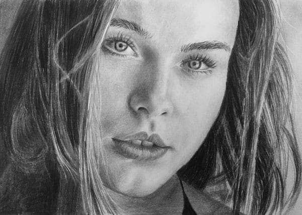
Now let's take a look a the things you do want to do when you are drawing your portraits:
1) Ensure the Lighting on the Model is Correct
When drawing you are creating the illusion of a three dimensional object on a flat surface. In order to do that we need a variety of tonal values. If your subject is being lit from the front then the lighting over the entire face is similar. Drawing the subject using this lighting will create a very flat looking portrait.
Ensure the lighting is to the side so that the one side of the face is darker than the other. You must be able to tell which direction the light is coming from. That will give a drawing that shows good depth.
2) Use a Template
If you are looking for a likeness of the person then I suggest you make a printout of the reference photo at the correct size and trace the outlines of the main features on the face. That way you can be 100% sure they are in the correct position.
If on the other hand you don't need to get a perfect likeness, then by all means go ahead and practice your eye hand co-ordination by free handing the outlines. (In this tutorial we are concerned with getting an exact likeness of our model).
3) Make a Transparent Template
Using a sheet of transparent paper trace the outlines of the major features onto it. This transparency allows you to overlay your initial sketch lines over the drawing at any time. You will be amazed at how quickly a feature or highlight can drift off to the side changing the look of the person dramatically.
4) Use a Variety of Pencils
Get yourself a set of pencils that can give you the full range of tonal values without having to press hard. You can initially use the hard pencils to get light tonal values then progressively softer pencils to get increasingly darker tonal values.
5) Press Lightly
As you shade don't press hard on your pencils. This allows you to erase any part of the drawing at any time as the graphite is only lying on the surface of the paper and not deep into the weave. If you need a darker tonal value, use a softer pencil.
6) Use a Graphite Cloth to Lay in Broad Tonal Values
Take a 9B pencil and a scrap piece of paper. Scratch over the paper with the pencil until it is covered in graphite. You can now use a soft lint free cloth and rub over the paper. This will pick up some of the loose graphite onto the cloth. You can now use the cloth to quickly lay down large areas of tonal value in your drawing. With a portrait I usually use my cloth to quickly establish the positions of the main tonal values of the face. This makes judging the rest of my tonal values easier.
7) Ensure Both Irises are Looking In the Same Direction
If the irises are not looking in the same direction, the subject will appear squint. Often as little as a millimeter can be the difference. Get these positions correct before you start shading them.
8) Ensure You Get the Reflections in the Eye
It is the reflections in the eye that make the eye appear wet. It is the wet look in the eye that makes your portrait drawing look alive. If you get only one thing right with your portrait then this must be it. For that reason I always start with the eye. That way if I for some reason don't get the eye to look alive I have not wasted my time on the rest of the portrait.
9) Shade the White of the Eye
The white is not flat white. The eyeball is round so you need to shade the white of the eye to make the eyeball appear round. Also don't forget that the upper eyelid casts a shadow on the eyeball.
10) Gradually Build Up Your Tonal Values
Instead of trying to lay the exact tonal value down immediately, it is better to start with a lighter tonal value and then gradually darken in layers. This will give you a more smoother, more even looking skin tone.
11) Shade the Eyelids
The eyelids hug the eyeball so they shade lighter / darker as they curl away from the light. The upper eyelid is more prominent that the lower eyelid as it also becomes darker to the top as it forms a crease with the eyebrow area.
12) Not Making the Iris & Pupil Round
The pupil and iris are both perfect circles so you need to get their shapes correct. Taking perspective into account - a circle will appear oval at an angle.
13) The Nose Forms Three Merging Balls
To get the shading of the nose correct visualise the three balls formed by the two nostril wings and the tip of the nose. Then find and draw the areas where they merge. There are no found lines on the nose itself, only on the outer edges by the nostrils and sometimes on the outer edges of the nostril wings.
14) Give the Nose a Shadow
To indicate the height of the nose off the face, you need to show the shadow cast by the height of the nose on the face.
15) Drawing Nostrils as Holes
If you are looking at a person from normal eye height you can actually not see the nostrils at all. All you see are the shadows cast by the height of the nostril off the face. This shadow forms a shading.
16) Eyebrows Taper Outwards
The shape of eyebrows generally taper thinner towards the outside of the face. Carefully observe your subject to see what shape their eyebrows from.
17) Get the Eyebrow Hair Directions Correct
The hairs forming the eyebrows don't curve in a rainbow shape as expected. They will often even curl / grow downward and horizontally. Look carefully at the directions and approximate them on your drawing.
18) Only Smudge to Smooth
Use your pencils to do all the shading work by drawing in overlapping strokes. If you rush you will not overlap your strokes properly leaving gaps in between. This is what makes the skin look rough and uneven. Once your skin is 90% smooth using only your pencils, then you can lightly smudge the graphite using a soft brush or tissue paper. Use this only once you are essentially done and are looking for a final smoothing effect.
19) Draw the Dent Formed Between the Eyes and the Bridge of the Nose
This dent is usually the darkest tonal value on the bridge of the nose. As a result it gives you maximum height of the nose off the face.
20) The Outside Edges of the Mouth are Soft Edges
Unless the model is wearing dark lipstick, the outer edge of the lips do not form a hard line. They tend to form a quick shading. To prevent your lips from looking like they are stuck on, get this quick subtle shading correct.
21) The Top Lip is Darker Than the Bottom Lip
The top lip points downward so is darker than the bottom lip, which points upward.
22) Teeth are Not White
Sadly teeth are not white and they certainly aren't flat. The top lip also casts a shadow on the teeth. As a result they also get shading. It may be a subtle shading, but they need to get it non the less in order to look natural.
23) The Inside of the Mouth Is Dark
If you can see inside the mouth make it progressively darker the deeper into the mouth you can see. This will give you a looking in effect.
24) Round Off the Outer Edges of the Face
Add a subtle shading to the outer edges of the face to show that the face rounds off beyond what you can see. If you don't, it makes the face appear to end like the edge of a wall, flattening the face in the process.
25) Give The Neck a Shadow
The face protrudes away from the body casting a shadow on the neck. You will often need to use your artist license to add this shadow ensuring that it is darker than the chin. (A lighter object always appears closer and a darker object always appears further away.)
26) Hair Clumps Together
Instead of trying to draw each individual hair, look out for the clumps formed by the hairs. Draw these clumps and the tonal values they create in the direction of the hair. This will create the illusion of hair, saving you the headache of trying to draw each strand.
27) Add Fly Away Hairs
Hair is never perfect, there are always individual strands of hair that are blowing in the breeze or just doing their own thing. Drawing in a few of these fly away hairs will create the illusion that you have drawn every single hair.
28) Recheck Your Tonal Value At the End
After you have completed the hair, stand back to check your tonal values. When you first started drawing most of the paper was white so even light tonal values looked dark. Now that all your tonal values are in, you will often find that the initial areas you drew were too light. By standing back at the end you will be able to see these incorrect tonal value and adjust them.
That concludes this list of portrait drawing do's and don'ts. I hope they have helped you and you have learnt a lot.
If it has please consider becoming a patron on the site. Patrons get access to a comprehensive portrait drawing course as well as many pencil portrait projects. Learn More About Becoming a Patron.
Pin Me