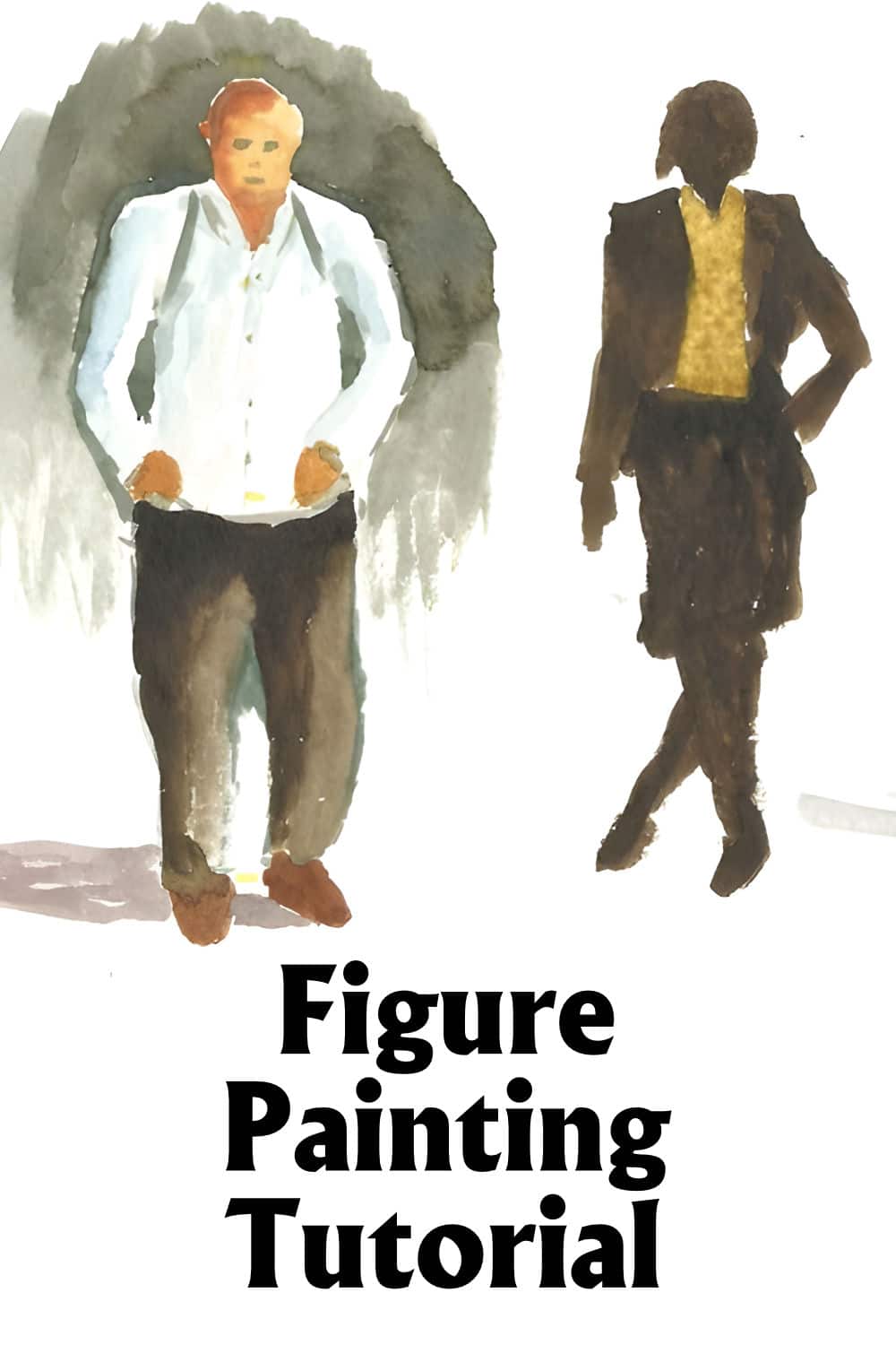
Have you ever wanted to add figures into your paintings and never had the courage to do so? Have you ever tried to, but failed in your estimate by making either way too large or too small? I know many artists who are scared to add figures into their paintings. They are scared to do so because they have the idea that it is just too difficult and by adding the figures they will mess up their painting.
Let me show you have you can, with very little practice, add very reasonable figures to your paintings.
We are not going into the realm of large figure painting here, but how to add small figures into a landscape or a cityscape. In these cases the figures are not be the focal point of the painting, but only additions to indicate that there is movement and life as opposed to a static composition.
This tutorial has been designed to take you step by step in learning to paint small figures.
Why Add Figures Into Your Paintings?
By adding figures into your paintings you are not only adding life, you are also adding movement as well as the implication of sound as well. You didn't think it was possible to paint sound did you?
What about the footsteps of someone walking down the path, or the sound of a figure using a hammer on an anvil in your painting.
By adding figures into your paintings where appropriate you can conjure up all these senses in your artworks.
The Secret of Painting Figures
The first thing you need to know is that anything nearby shows a lot of detail and, as it recedes into the distance, less and less of the detail is observable. This reduction in detail is one of the secrets to painting small figures. As the figures are small, there are hardly any details that you need to be frightened of.
What is the second and most important secret? Shapes! That's correct – shapes.
Most objects are easily recognized, not by their detail or color, but by their intrinsic shape. Shapes can also be defined as silhouettes. If, for example, I gave you two silhouettes, one of a truck and one of a train, you would immediately recognize which is which without seeing any detail at all.
Let's go ahead now and apply this principle to our small figures.
(Remembering that this tutorial is to be read and studied in conjunction with the accompanying video tutorial. All the figures used here have been taken from the video.)
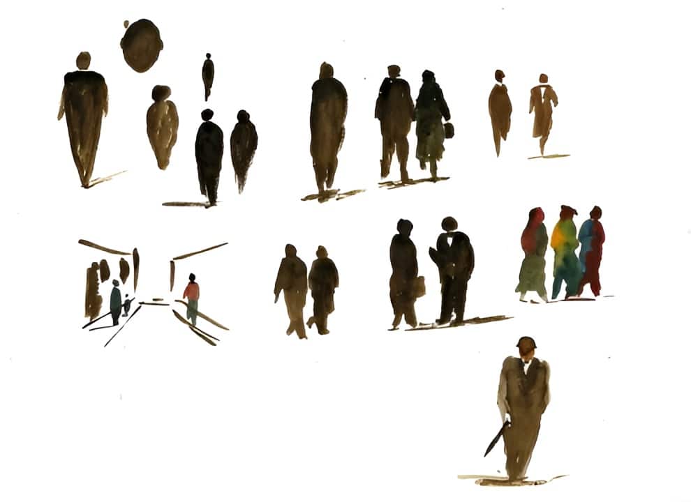
Initially don't stress about using color until you have had some practice painting figures in monotone (one color). It is more important for you to get to grips with the shapes than with the color. Adding color can come later.
What is the basic shape of a figure walking away or towards you?
Just remember the shape of a carrot.
The Carrot Shaped Figure

This is the most basic of shapes and can be easily mastered. Don't try to be too neat; we just want to give the impression of a figure.
You do however need to be careful of one thing when painting these figures. Take a look at this version and see if you can spot what the problem is:
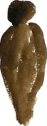
It is a very common mistake that artists make. Look carefully at the figure above. The head is much too large for the body height.
The best advice I can give you when painting small figures, is to paint the body first and then the head. When you need to add the head, start with a small dot and then slowly enlarge until it is optically the correct size.
A sure way for a beginner to mess up a figure is to start with the head, and then add the body. What happens in this situation is that the artists starts off with a head which is too big. They then end having to make the body large in order to get the ratio between the head and the body correct. The end result is a figure which is way too tall for the scene.
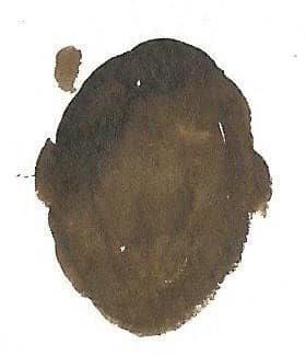
Another point to remember is that the head is very seldom round. Take time to observe people around you. You will notice that most heads are of an oval or egg shape.
The Modified Carrot Shaped Figure
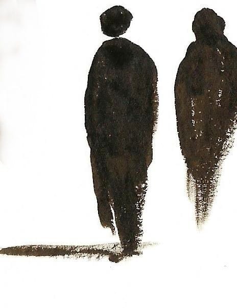
Once you are comfortable with painting figures in the carrot shape you can start changing it to indicate that one foot is off the ground. Take special note that no feet or shoes have been added. Too much detail will spoil the effect. Remember : These figures are NOT to be the focal point in the painting. They are only supplementary.
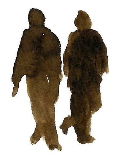
Here we have two figures walking together. They have only the bottom section of the “carrot” modified in order to show the movement of the legs.
Tip - When you have two figures walking together like this, it is easier on the eye if you make the figures walking in step. Just change the position of the one figure's leg to be slightly different to the leg of the other person so it does not look as if they are clones.
Notice on these two figures that it is only the angle of the lifted leg which has been changed from the carrot shape, yet it has indicated that they are not walking directly towards you as a result.
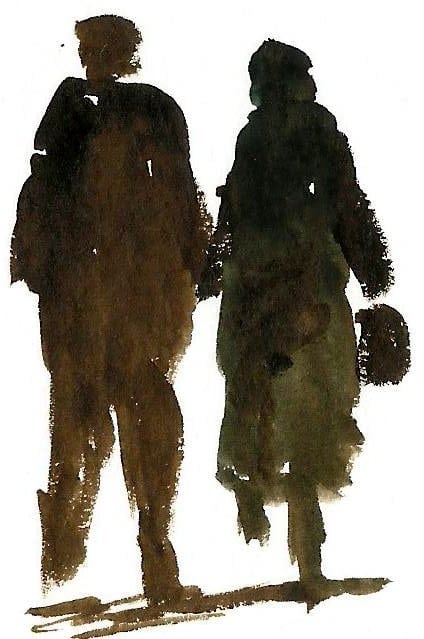
This couple are either walking towards or away from you. We know this because the change in leg positions are vertical. At this point we can't tell if they are walking towards us or away from us, so let's learn how to indicate direction too.
Indicating Direction in Your Figures
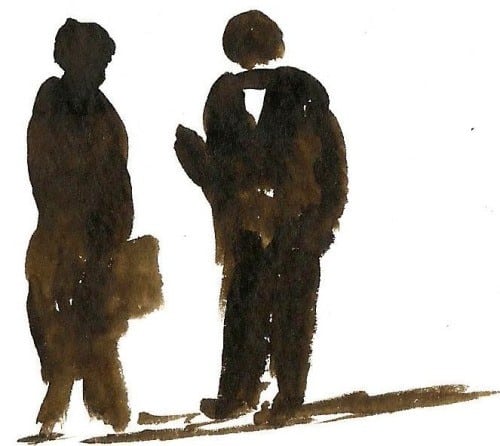
People are not always facing in the same direction. Above we have two figures facing each other and deep in conversation. The left hand figure is more sideways than the figure on the right. See how I left a white triangle open on the right hand figure to indicate that he is facing more towards us. Also notice the tiny indication of a foot on the right hand figure which also indicates the direction the person is facing.

When you have figures far in the distance then you can simply use the carrot shape to indicate them, the setting and the viewers imagination will tell the viewers which direction each figure is facing.
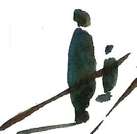
Here an indication of a mother and child on the sidewalk in a cityscape. Notice here how the egg shape of the mother's head has been tilted to indicate she is facing sideways.
Adding Minor Details Your Figures
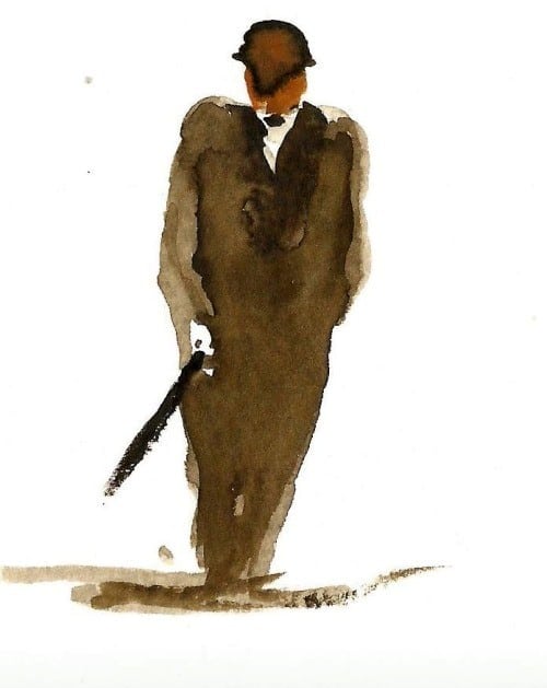
Once you have a handle on using pure monotone shapes (silhouettes), you may start using the different tonal ranges to bring another dimension to your figures.
This is another interesting figure which has also been painted using the “carrot” shape. This time however we can see some "detail" because the person is a little closer. We still can't see much – just enough to give the impression of detail. In this image I have added extra dark values to the central area to create the impression of a suit. I have also darkened the shadow areas where the arms and body meet.
Notice the little speck of light – small – but just sufficient to optically show the separation of the legs. This small bit of "air" indicates the one leg is in front of the other.
Speaking of specks of light - also notice that a small empty patch has been left to indicate the shirt and hand. These two hints of detail tell us the man is walking towards us as opposed to away.
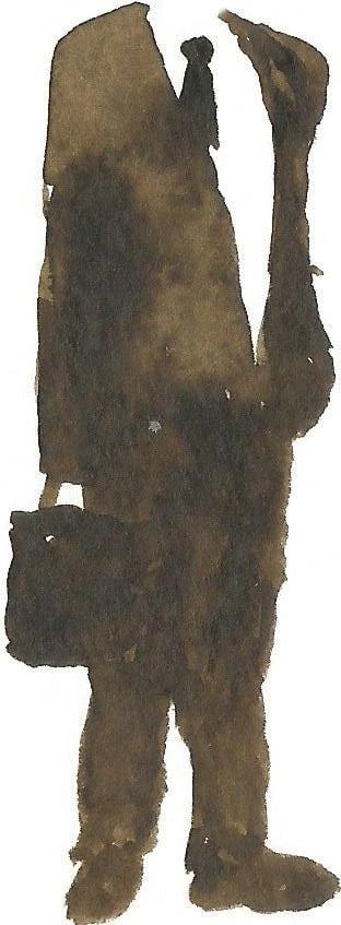
For all the figures we have painted up to this point, I recommend that you get this far BEFORE you add the head. It is much easier at this stage to judge the shape and size of the head to suit the size of the body.
Adding Color Your Figures
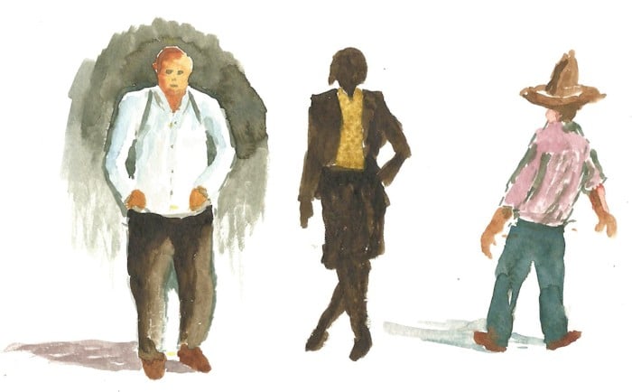
Now that you are confident painting monotone figure, you can start to add some color. In these figures I have started to add a touch more detail and even spots of color in order for them to appear closer to us than the previous figures. Yet if you look closely I have only suggested the essential shadings and features. There is still no real detail. As the person gets closer to you, the figure appears larger so you can add more detail and more color.
Indicating Movement
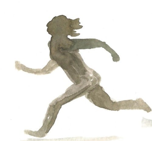
The position of the body and the different limbs can indicate motion as you can see from the figure above. Practice painting figures in action like this by using simple brush strokes. An artist's wooden model will be of great help when trying to get the correct pose and judge the correct limb ratios.
As you can see adding figures to your paintings isn't nearly as intimidating as it first appears and with just a little bit of practice you will be painting these figures with confidence.
Pin Me
