A practical comparison for choosing a drawing medium
Pencils are familiar old friends used to express ourselves for as long as we can remember. Charcoal is more mysterious. We may admire the exciting, dramatic drawings it makes, but secretly doubt if we could control it, or if we're beginners, if it’s the best choice for learning to draw.
Although it's difficult to tell a charcoal pencil from a graphite pencil on the shelf, they give different results. So, before deciding which to choose, let's look more closely at the differences.
What’s the Difference?
Graphite
Graphite is sold as a powder, a block, or a pencil.
Graphite pencils (also called lead pencils, although they contain no lead) come in different degrees of hardness. Hard pencils are labelled with an H (hard) and a number. The higher the number, the harder the pencil, the lighter the mark it’ll make, and the scratchier it’ll feel. Soft pencils are marked with B (black) and get darker and softer as the number increases.

Graphite sticks are made from graphite powder mixed with a binder and are not enclosed in wood like a pencil.

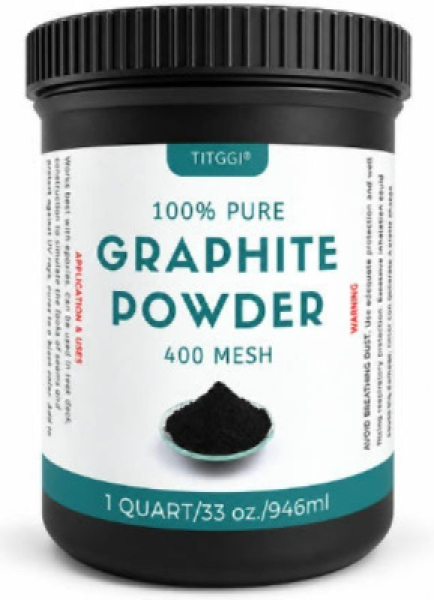
Graphite powder is made from crushed graphite.
Charcoal
Charcoal is made from burnt organic material, often willow or vine wood. It is sold as:
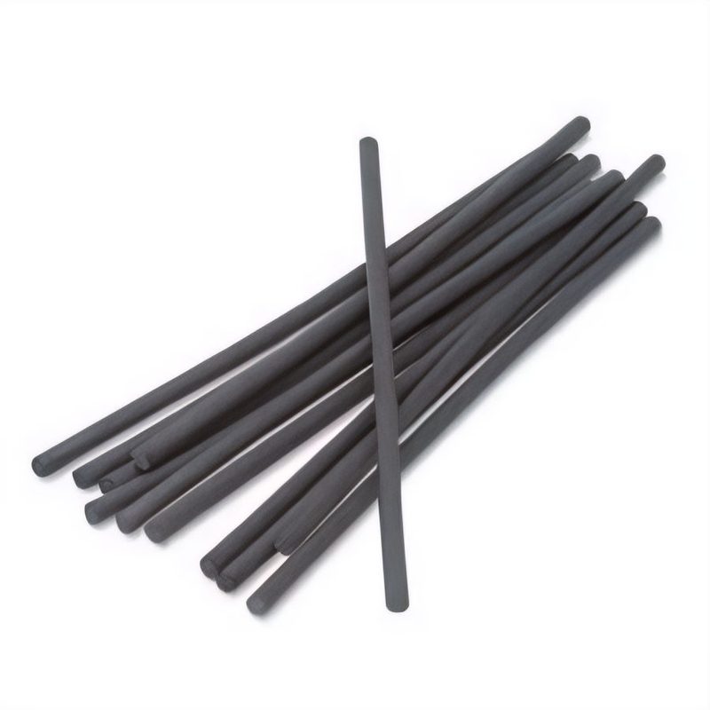
Soft, crumbly sticks, called vine or willow sticks. Willow sticks are softer and darker than those made from vines.
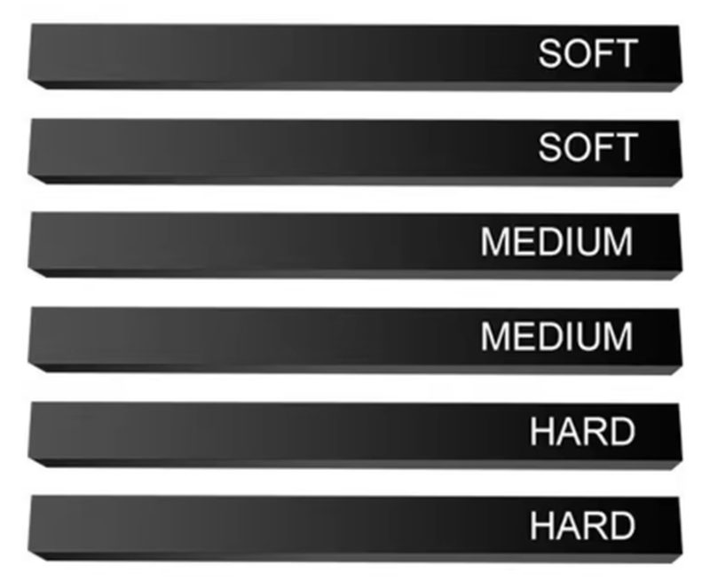
Charcoal pencils are the most familiar form. They have degrees of darkness. The softer the grade, the darker and more powdery they are.

Charcoal blocks are made by grinding the burnt wood into a powder and mixing it with a binder, such as gum or wax, to create a paste. The paste is compressed into blocks or enclosed in wood to make pencils. These compressed versions are more durable and solid than willow or vine charcoal.
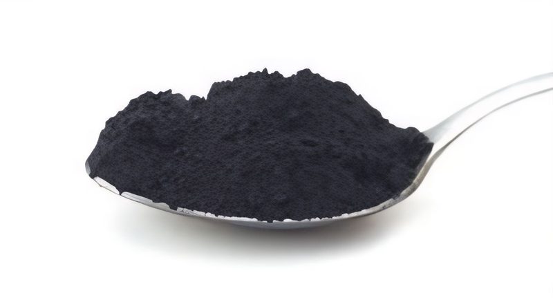
Charcoal powder is made by grinding up sticks or blocks and can be bought ready-made.
Both graphite and charcoal are dry media, readily available, inexpensive, and perfect for beginners. But they offer quite different experiences.
Texture & Mark-making
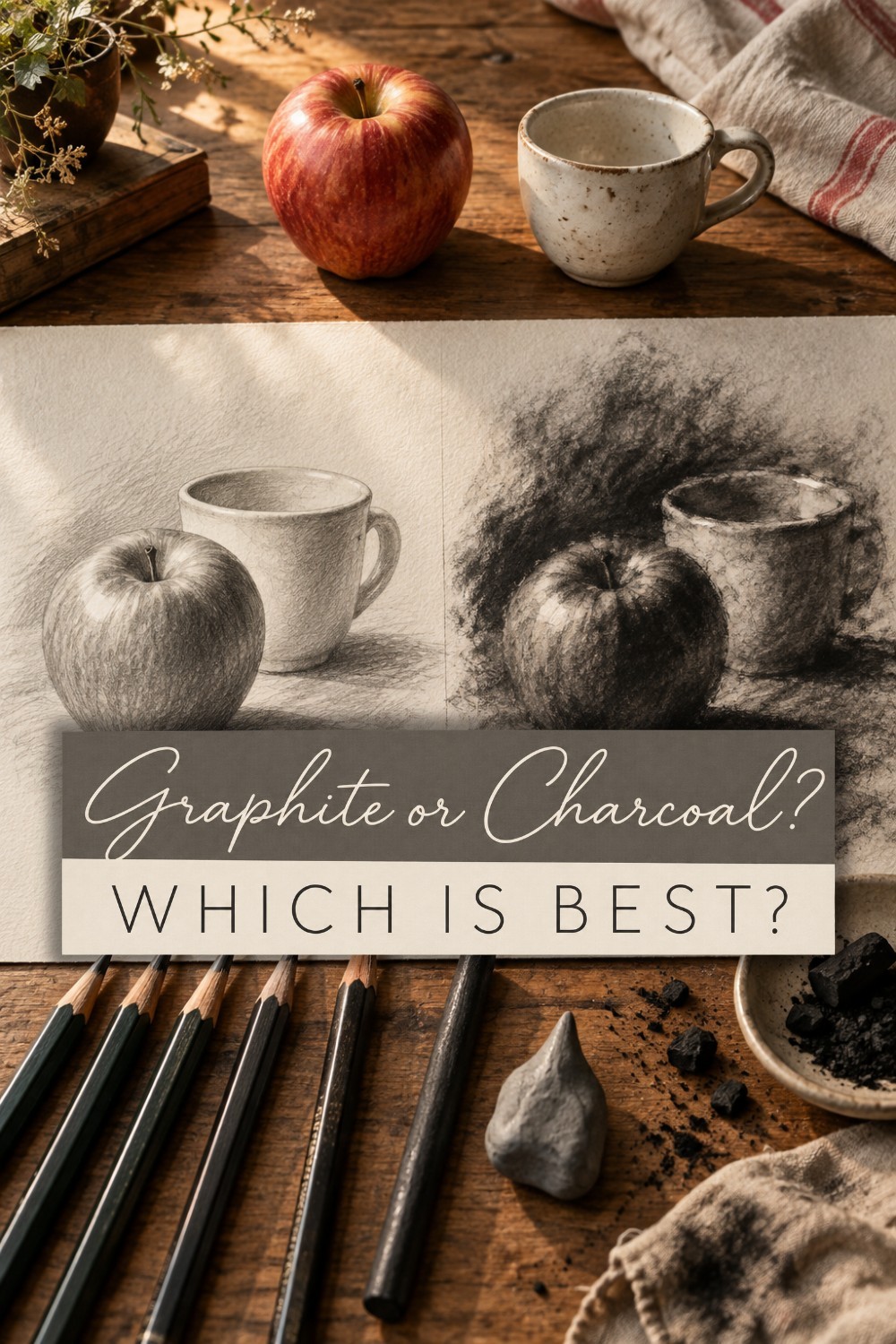
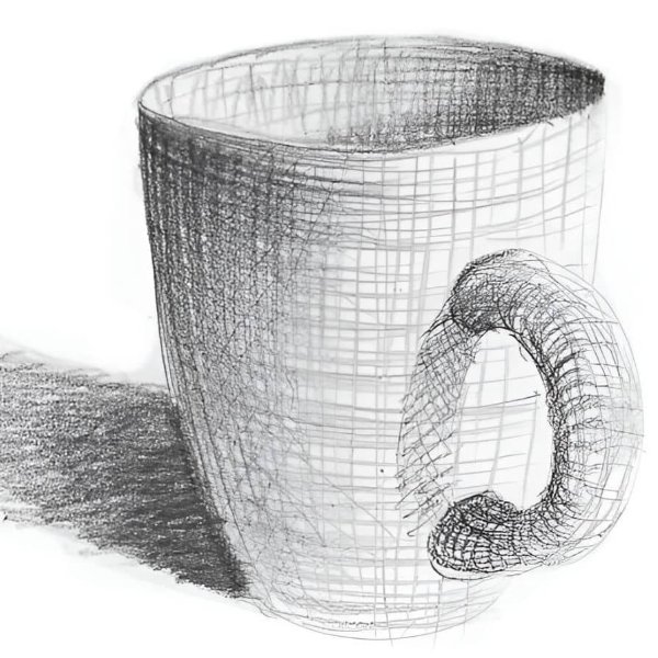
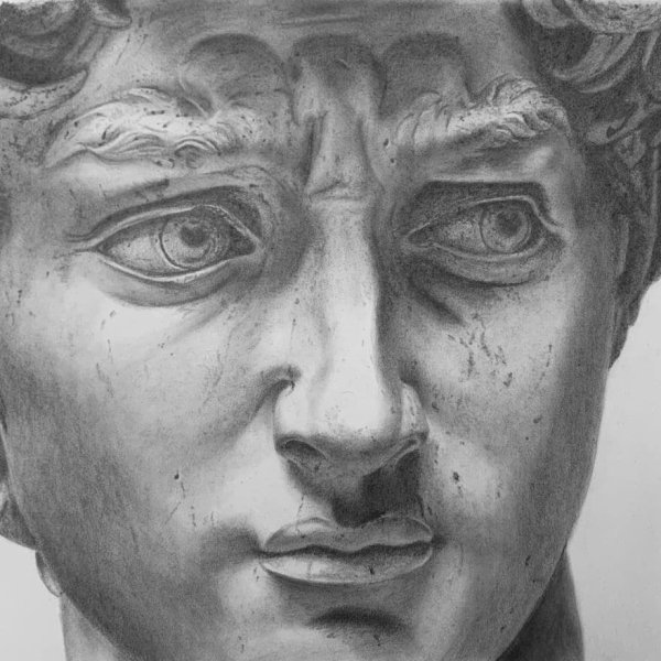
Graphite pencil glides smoothly over paper, creating clean, controlled lines excellent for fine detail and precision.
Charcoal also lays down smoothly. It makes rich, dramatic marks and has a powdery texture that smudges easily to create atmospheric effects.
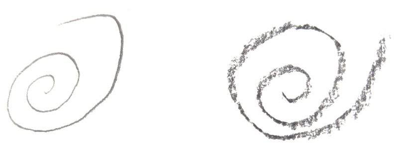
Whether you choose charcoal or graphite will depend on the result you want. For tight control, fine shading, and neatness, choose graphite.
For bold, dramatic marks with a looser feel, choose charcoal.
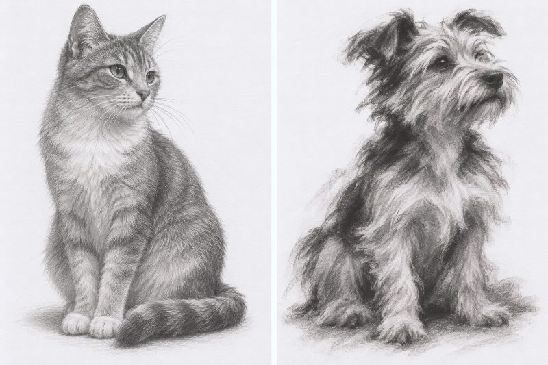
Compare graphite to a neat, dependable pen pal, charcoal to a wild, expressive best friend who dances on tables at parties. One isn’t better than the other; only different, and both deserve a place in your art journey.
Erasing & Correcting
Beginners make mistakes. Graphite erases easily with a soft plastic or kneaded eraser, provided you haven’t pressed so hard that you damaged the tooth of the paper. That makes corrections easier.
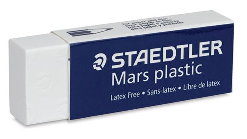
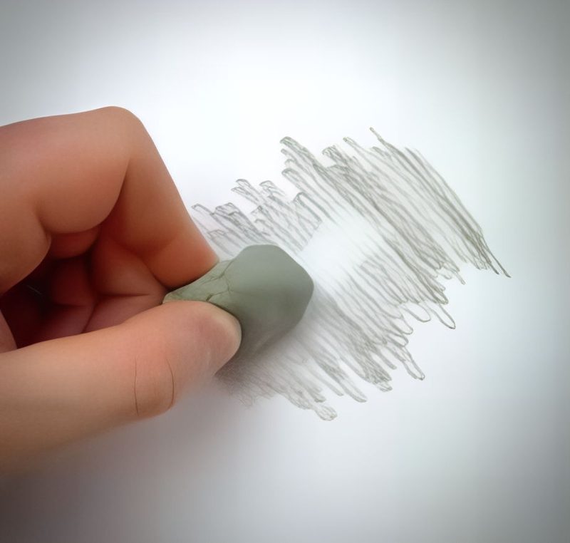
Vine or willow charcoal sits on top of the paper and is easily erased. Compressed charcoal, which includes charcoal sticks and pencils, doesn’t. You can't remove the marks they make completely.
Messiness
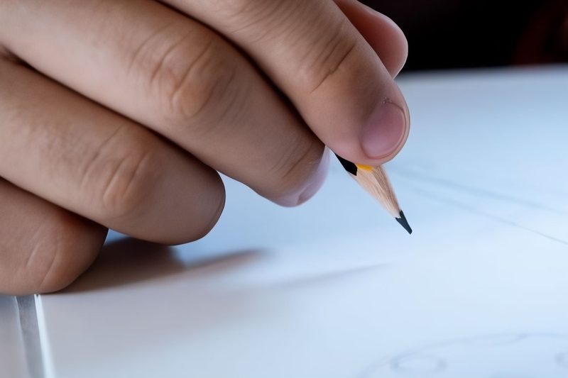
Graphite (when enclosed in a pencil) is neat. A quick wipe will remove it from your hands, and it stays where you put it on the paper.
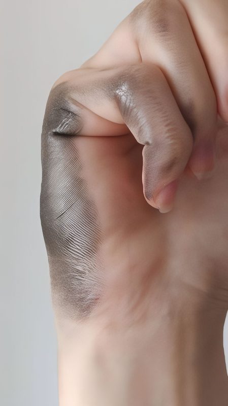
Charcoal smudges easily and is more difficult to control, especially the looser vine or willow form with its crumbly texture. Charcoal’s tendency to smudge easily can be an advantage to cover large areas or encourage freedom of gesture over perfection.
If neatness and control are important to you, choose graphite. If you don’t mind a little mess and like to be expressive, charcoal delivers.
What Paper to Use
Paper choice can make or break your drawing experience, and graphite and charcoal have quite different needs.
Charcoal relies on a paper with visible tooth, meaning a slightly rough surface with tiny peaks and valleys. These catch the charcoal particles and hold them in place, which is what allows charcoal to build up so quickly into rich darks. Pastel paper, charcoal paper (such as Canson Mi-Teintes), and heavier cartridge papers all work well. Some charcoal papers even have a faint tint of grey, cream, or tan, which can be useful if you want to work from mid-tone up to highlights as well as down to shadow.
Graphite is more forgiving when it comes to paper choice, but the surface still matters. A smooth, hot-pressed paper or a fine-grain cartridge paper is ideal for detailed pencil work, letting you achieve crisp lines and subtle gradations. However, if the paper is too smooth or has a coated, glossy finish, graphite can sit on the surface rather than sinking into it, leading to that shiny build-up we’ll talk about later. Too much tooth, on the other hand, can make fine linework harder to control, since the pencil point will skip across the raised texture instead of gliding smoothly.
If you like working across a range of papers, a mid-weight drawing paper with a slight texture (often labelled “medium” tooth) is a reasonable middle ground for graphite, offering enough grip for shading without sacrificing too much precision. For charcoal, it is worth erring on the rougher side, since a paper that is too smooth will cause the charcoal to sit loosely and smudge away before you’ve had a chance to develop your drawing.
Weight is also worth considering, especially if you plan to use charcoal heavily or work back into the paper with an eraser. Lightweight papers can buckle, tear, or become fuzzy under repeated erasing and blending, so a heavier paper (160gsm or more) will hold up better to a vigorous drawing session.
Tonal Range
Value, the lightness or darkness of a mark, is one of the most important tools you have for creating depth in a drawing. A drawing made with only one value will always look flat, no matter how carefully the lines are placed. This is because our eyes read light values as coming forward and dark values as receding into the distance. By combining light and dark values thoughtfully, you create the illusion of three-dimensional space on a flat sheet of paper.
Value doesn't just create depth, it also gives objects their form. Think of a simple circle. Shaded in a single flat value, it remains a circle, a two-dimensional shape with no sense of weight or structure. Add a range of light and dark values across its surface, and that same circle transforms into a sphere, something that appears to occupy real space and catch real light.
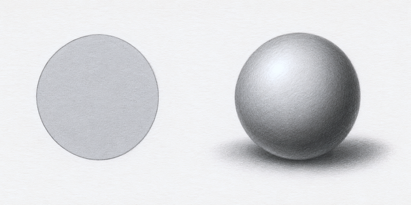
Beyond depth and form, value sets the emotional tone of a piece. A drawing built mostly from dark values tends to feel heavier, moodier, more dramatic. One built from lighter values often feels softer, airier, or more delicate. A balanced mix of both can create a sense of calm realism. This is where graphite and charcoal start to show their different personalities.
Charcoal is capable of producing a much darker, richer black than graphite can ever achieve. That deeper range gives charcoal drawings a natural capacity for drama and contrast straight out of the stick, without much effort. Graphite, by comparison, has a more limited tonal ceiling. To reach a comparably deep, rich dark, you'll usually need to build up several layers of pencil, blending between each pass with a blending stump, tissue, or your finger to smooth out the strokes and deepen the tone gradually.
Charcoal reaches those deep darks with far less build-up, and many artists use charcoal dust, brushes, fingers, or tissue to spread and soften it across the page rather than relying on individual pencil-style strokes. That difference in how quickly each medium reaches its full tonal range has a lot to do with how fast you can work, which we'll get into shortly.
Drawing Speed
Charcoal is the sprinter of the two media. Because it covers large areas in seconds and blends with a touch of your finger or a cloth, you can rough in an entire composition, from big shapes to shadow masses, in the time it takes to sharpen a pencil. This makes it ideal for timed poses, gesture drawing, or any situation where you need to capture something fleeting, like a model who'll only hold a position for a few minutes or light that's about to change. The forgiving, smudgy quality we've already looked at works in your favour here too, since there's no need to pause and fix small errors when the overall effect is what matters.
Graphite asks for patience. Building up tone means layering light, overlapping strokes again and again, especially if you're avoiding the shine that comes from pressing too hard (more on that in the next section). Precision takes time, and if you're drawing fine detail, like eyelashes or strands of hair, you'll naturally slow down to keep your lines controlled. This isn't a drawback so much as a different kind of satisfaction. Graphite rewards the slow, steady accumulation of marks, while charcoal rewards boldness and decisiveness.
If you're short on time or want to loosen up your drawing practice, charcoal will get you results faster. If you enjoy the meditative pace of careful mark-making, graphite offers that in spades.
Final appearance
Graphite, when layered, is reflective. The notorious “graphite shine” is a problem for some artists. This shine can distract from your drawing, but many artists don’t consider this a problem, just a characteristic of the medium.
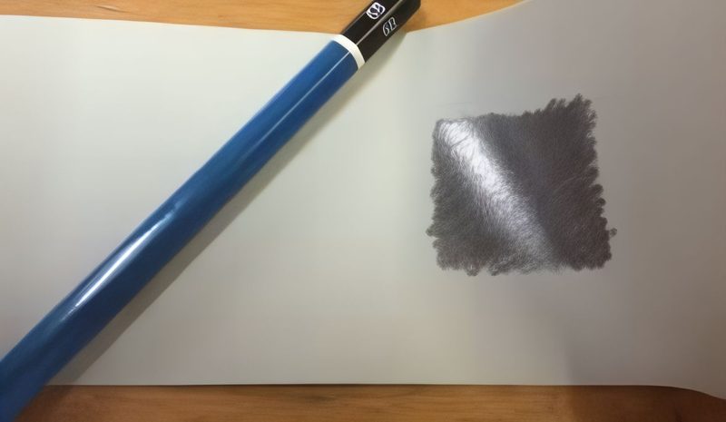
Charcoal is matt with no shine.
How Permanent Are They?
Both are dry media and will smudge – both an advantage and a disadvantage. If you don’t want smudges when working or when framing finished artwork, both need to be protected.
When drawing, keep a piece of paper under your hand to protect the drawing. If you are right-handed, try working from left to right and top to bottom so your hand doesn’t disturb finished areas. Reverse the direction if you are left-handed.
Charcoal smudges more easily than graphite, so use it creatively.
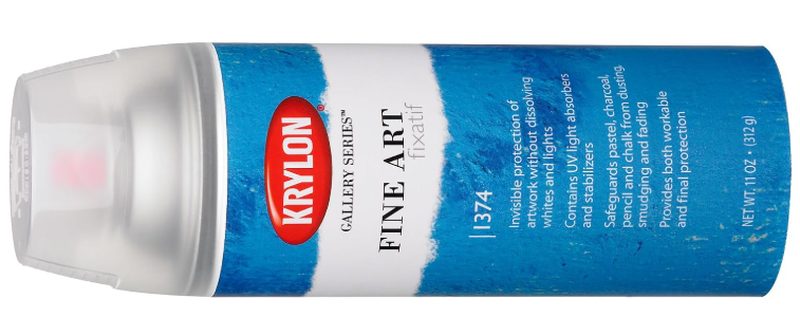
You can prevent graphite and charcoal drawings from smudging using a fixative spray. Fixative sprays labelled “reworkable” allow for more layers, which is useful to stop smudging while drawing.
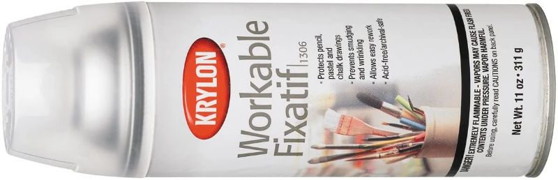
Those fixatives not labelled reworkable don’t allow for more layers. They protect the drawing like an invisible sheet of glass.
Once sprayed with either type of fixative, it won't be possible to erase.
Fixatives tend to increase the contrast in graphite drawings and slightly reduce graphite shine.
Try it Yourself
To experience how the two mediums feel, draw a simple still life like an apple or a cup in graphite, then draw it again in charcoal.
As you do notice:
- How your hand moves and the feel of each medium.
- How long it takes to build up shadows.
- If the finish is matt or reflective.
- How dark your deepest darks are.
- How easily they blend.
- How easily they erase.
- If you enjoy detail or freedom more.
This will help you decide which medium is best for you. If you are still undecided, why not have the best of both worlds by combining the two?
Combining Charcoal & Graphite
Charcoal and graphite are not besties; they tolerate each other but don’t mix well. Use graphite in areas of your drawing where you want fine detail and delicate shading. Use charcoal for dramatic darks.
In places where they need to overlap, create a transition area by laying down graphite sparingly, leaving some of the tooth of the paper uncovered, then use charcoal lightly over the top. Charcoal won’t stick to the graphite but will stick to the exposed paper. In this way, a good visual blend between the two is possible.
Last Thoughts
Choosing between graphite and charcoal is not about choosing the “right” one. It’s about what helps you to feel more connected to your drawing.
Neither medium will magically make you draw better. Constant practice will improve your skills, and experimenting will teach you more than theory ever could. Don’t be afraid to try both. Let one be your comfort zone and the other your playground. You will learn something from each and become a better artist.