In this tutorial we will look at one of the most popular colour wheels (RYB) and how it is used to mix any colour under the sun.
Primary Colours

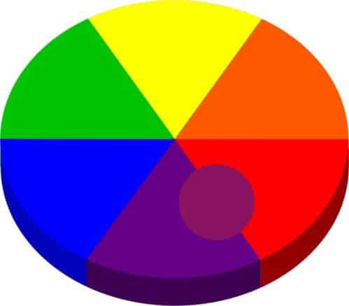
In painting we have three primary colours – yellow, blue and red. These colours cannot be mixed so you will need to purchase them in a tube.
We can however use them to mix all the other colours of the rainbow.
We will start off by placing these colours next to each other with yellow at the top. You will see later why we always keep yellow at the top of the colour wheel.
Secondary Colours
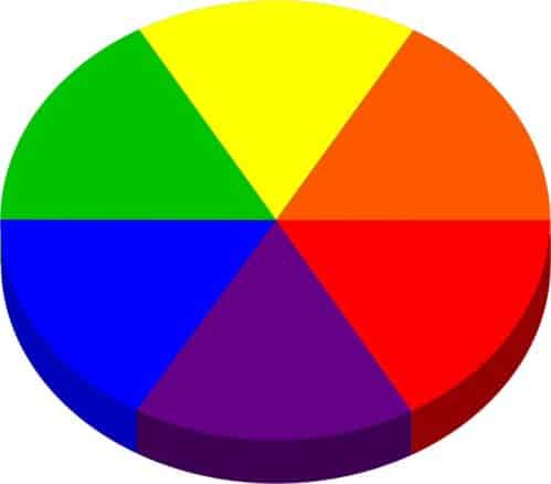
We can now expand the colour wheel by mixing adjacent colours together. These three new colours are called secondary colours. They are orange, green and purple.
These six colours for our completed colour wheel as far our colour mixing rules are concerned.
In order for us to learn how the colour mixing rules work we will first need to understand how light affects the object it is illuminating.
Tonal Value
When rays of light hit an object, some of those rays are reflected off the object. If we increase the amount of light falling on the object, more light will reflect off of it making it appear brighter.
The opposite happens when the amount of light falling on the object decreases.
This transition from light to dark is what we call tonal value. As the light can theoretically be gradually dimmed or brightened the change can be represented like this:

To make it easier for us to work with these changes we split the tonal range up into 10 steps like this:
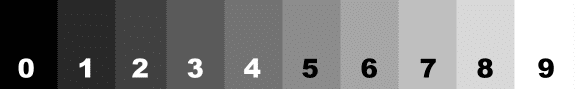
Black is value 0 and white is value 9
Objects Absorb Colour
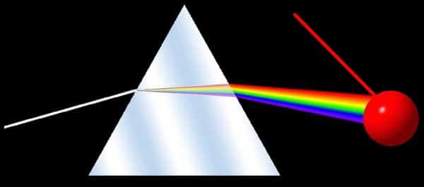
“White” light from the sun or a globe contains all the colours of the rainbow. If we shine that light through a prism we can see how these colours separate.
What happens when white light hits an object is that the objects absorbs all the colours except it's own colour. That remaining colour is then reflected back to our eye.
When we paint we are mixing our colours in such a way that they only reflect the required colour.
Black and White

If we look at the spectrum of colours we will notice that black and white are missing. These are two special colours which we need to deal with separately.
White reflects all the light falling on it back to our eye. As a result it is impossible to mix colours together to get whit as all other colours absorb light. This means that we need to purchase our white paint.
Inversely, black absorbs all the light falling on it. This means we can mix black.
We do this by mixing our three primary colours together in a ratio of roughly 4 parts blue, 2 parts red and 1 part yellow. The three primaries then absorb all the light leaving nothing to reflect back to our eye.
Highlights and Shadows
When painting we are actually creating an illusion as we are making a flat canvas look like it has three dimensional objects on it.
In order to make these objects look three dimensional, we need to understand why see an object as having dimension as opposed flat.
The best way of doing this is to place a flat object and a three dimensional object next to each other so we can take a look at the differences between them:
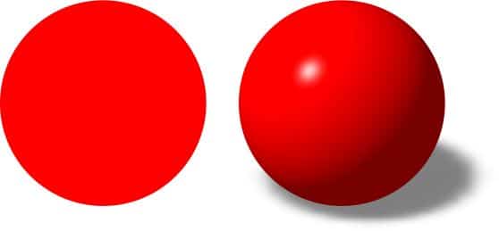
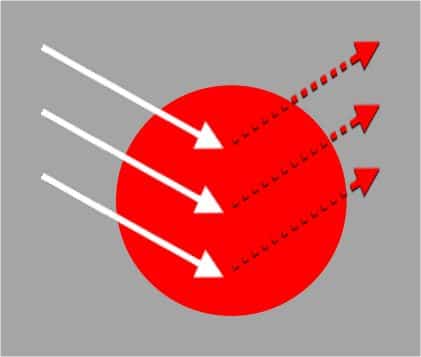
A flat object facing directly towards us would consist of only one colour as the light hitting the surface would reflect off the surface at a uniform angle. With a uniform amount of light hitting our eye, the surface looks uniform:
A three dimensional object on the other hand causes the light to reflect off it's surface at different angles causing more or less light to reflect towards our eye in the various areas. If more light reflects towards our eye, that area looks brighter. Areas where less light is reflected back to our eye look darker:
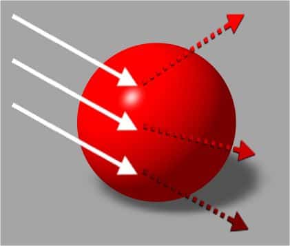
Further compounding this effect is the amount of light hitting each area of the object. Areas facing directly towards the light have more light available to reflect back to our eye. Areas facing away from the light hardly get any light hitting them so cannot reflect much back either making them appear darker.
We call these lighter areas highlights and darker areas shadows.
In order to make the objects we are painting look 3 dimensional, we need to paint these highlights and shadows.
What to Mix?
Needless to say each object will have a large variety of colours / tonal values in between the highlight and shadow colours. If we had to try and mix each of these we would spend the whole day mixing paint leaving no time left to paint.
In order to simplify the amount of colours we mix we find the base colour of the object. In other words the colour the object would be if it were flat.
From there we identify our lightest colour (highlight colour) and our darkest colour (shadow colour).
To do this we use our tonal chart.
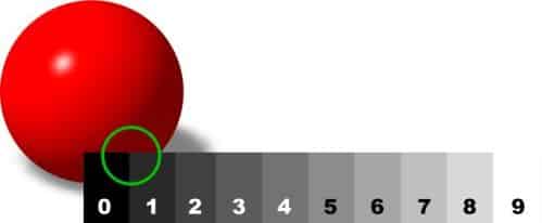
The base colour will generally be value 4 or 5. The shadow colour will generally lie between value 0 to 2 and the highlight between 7 and 9.
The rest of the colours will be variations of these three and we will generally be able to get them by blending two of the three mixed colours into each other on the canvas.
Okay now let's use all this knowledge to actually mix the base, highlight and shadows colours.
Mixing the Base Colour
We always mix our base colour first. Compare your base colour to the colours on the colour wheel to find the closest match. Compare it to the three primaries, then the three secondaries.
You want to know what is the underlying primary colour is as that tells us which general colour area we are working in. In other words are you mixing a red, yellow or blue colour? In our example the underlying base colour is red:
Then we need to know if our colour is biased towards one of the secondary colours. In our example we can see that our colour is biased towards purple:
We now instantly know which colours we need to use in order to get to our required colour. In our example we will add blue to red to mix our desired colour.
Tip – always add the secondary colour gradually. You can always add more paint to the mix, but you can't take any out.
This mix will get you in the general ball park.
Fine Tuning the Base Colour
From there we can fine tune the colour to get a perfect match by doing one of the following:
Lighten / increase the tonal value by adding white.
Brighten by adding the next colour up on the colour wheel and
Darken by adding the next colour down.
It may also be necessary to shadow the colour slightly to get it correct. We will also need to mix a separate shadow colour as well so let's take a look at how to do that now.
Mixing the Shadow Colour

If we reduce the amount of light falling onto an object until there is no light falling on it, we will see black so that is our darkest possible shadow.
We know that we can mix black by adding the three primary colours together.
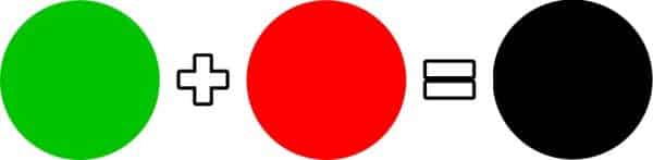
Looking carefully at the colour wheel we are able to spot a shortcut to mixing black. The opposite colour on the colour wheel of any one of the primaries is a mixture of the other two primaries.
For example, the opposite of red is green. Green is a mixture of blue and yellow.
So by combining opposite colours on the colour wheel we are also mixing the three primaries together:
Mix opposite colours together in varying ratios will thus allow us to darken a colour as much or as little as we need.
I have memorised that red and green are opposite. I have also memorised the other two combinations – blue is opposite to orange and yellow and purple are opposites.
This has saved me hours of mixing time and guessing which colour to add to shadow a colour over the years. If you memorise these three colour combinations, you can do the same.

In our maroon ball example, we can see that the majority colour is red, so we can use green to obtain the shadow colour.
Now that we have the base colour and the shadow colours mixed, let's move on to mixing the highlight colour.
Mixing the Highlight Colour
Our first reaction when wanting to mix a highlight colour is to add white to the mix.
While this will certainly lighten the colour. If we do this for all our highlights however we will find that our final painting will look dull and washed out.
The reason for this is because when more light falls on an object, the object not only appears lighter, it also appears brighter.
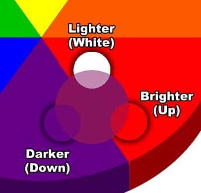
In other words we also need a way to brighten a colour. We do this by adding the next colour up on the colour wheel towards yellow – hence the need to hold your colour wheel with yellow at the top.
Tip – the way I remember that yellow needs to be at the top of the colour wheel is: The sunniest colour on the colour wheel is yellow. The sun is always above us, so sunny yellow must be at the top of the colour wheel too.
The rule for mixing our highlight colour is then: Add the next colour up on the colour wheel towards yellow plus white to mix the highlight.
Let me demonstrate the difference between just adding white as opposed to using the correct approach. On the left we have added an outer ring to the colour wheel showing what the highlight of each colour would look like when mixed correctly and on the right we only used white to mix the highlight:
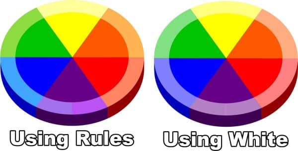
Can you see how much more vibrant and alive the highlights are when mixed correctly?
Now just imaging how much more vibrant and alive YOUR paintings are going to look now that you know the rule!
Now that we know the rule, let's look at two interesting cases – what do we do about yellow which has no “next colour up” and purple which has two “next colour up”?
Which yellow we are able to only add white. As it is the sun colour, it remains vibrant when adding only white.
With purple we can add either blue or red to brighten it. Which you choose will depend on in which direction you need to tint your colour. Look carefully to see if the colour you need needs to be bluer or redder:
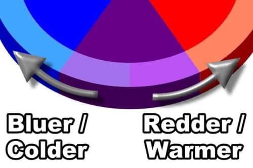
If that is not obvious you can also decide on whether you want your highlight colour to be warmer or cooler. If you need it cooler, add blue, if you need it warmer, add red.
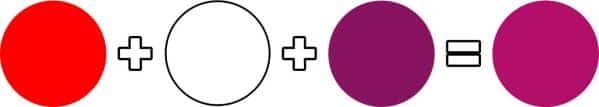
In our maroon ball example we can add red plus white to get the highlight colour:
Tip - I always add the next colour up towards yellow in the mix first as you will often find that doing this results in the exact colour you are trying to match. Only if that doesn't work will I add white.
Wrapping Up
With that you now know how to mix your base, highlight and shadow colours. Here are our three colours from the example:
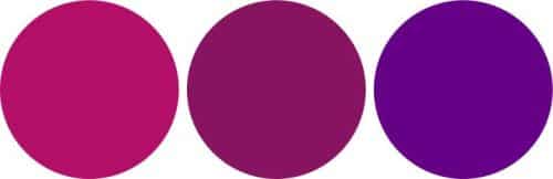
Painting with these three colours will allow you to paint beautifully realistic and vibrant paintings with exceptional depth.
Let me repeat that sentence again with added notes so you can see how your rules fit into it:
Painting with these three colours will allow you to paint beautifully realistic (correctly matched base colours) and vibrant (correctly mixed highlights) paintings with exceptional depth (correctly mixed shadow colours and good contrast between the highlight and shadow colours).
I know these rules will serve you as well as they have served me.
Recommended Resources
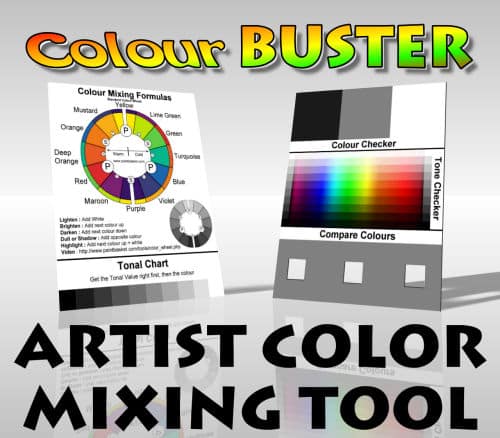
Color Buster Color Mixing Tool
The Color Buster Color Mixing Tool helps you to match your paint colors perfectly - say goodbye to muddy colors and hello to beautiful vibrant paintings.
Get your Color Buster Color Mixing Tool HERE
Pin Me