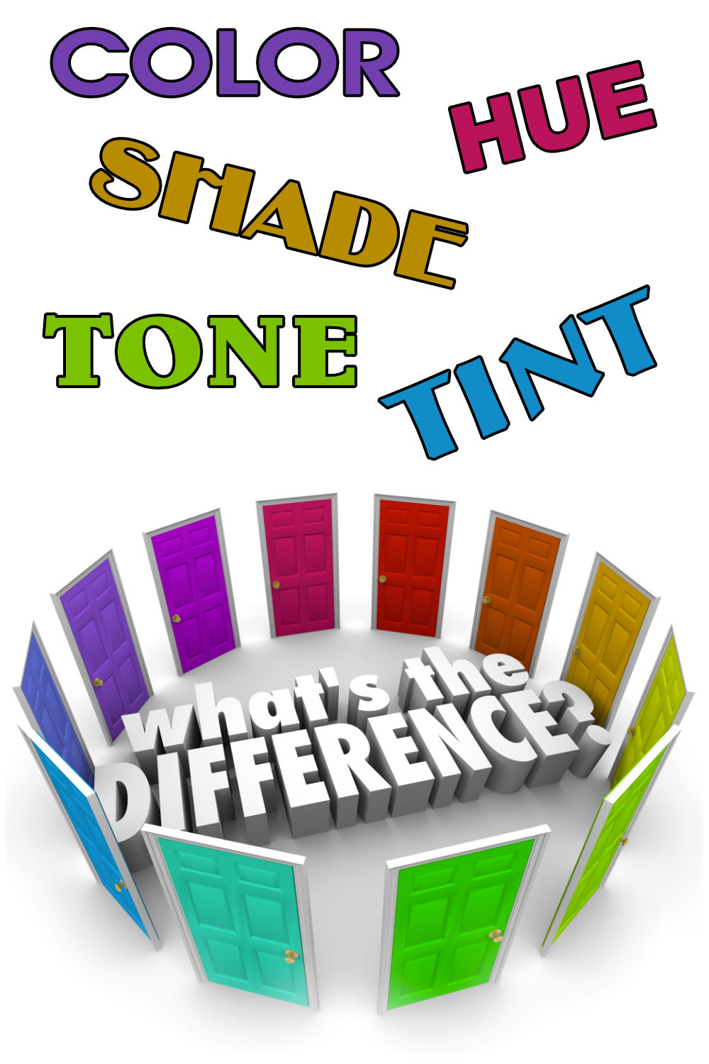
Color, tint, tone, shade and hue are all linked to color theory but there are key differences between each term. It is helpful to be able to tell these terms apart so that you can understand painting guides and resources. It can also help you become a better artist in the long run.
Many people tend to use color, tint, tone, shade and hue to describe colors, without fully knowing what they mean. In fact, these words aren’t interchangeable. Each word means something specific in relation to color theory.
Read on for a breakdown of the differences between color, tint, tone, shade and hue and the contexts where you use each term, as well as how to recognize each one.
What is Color?

Each of the 6 blocks above are all a different color.
You can get an endless variety of colors. They can be lighter, darker, more vibrant, less vibrant and any color of the rainbow including black and white.
The way we see a color has to do with how color reacts when light falls on it. The light from the sun contains all the colors of the rainbow, but put together we see it as white light.
When this light falls on an object, the object absorbs all the colors contained in this white light except it’s own. This remaining color is then reflected back to our eye.
As each color is different and there are an endless combination of colors, we use various other terms to further describe our colors.
These terms are hue, tint, tone and shade.
We will start with the broadest term hue.
What is Hue?
As artists we are constantly mixing new colors and calling them different names like Alizarin Crimson or Cerulean Blue.
Each of these colors can however be derived from 3 primary colors, red, yellow and blue.
Let’s take these 3 yellows for example:

Although they are three different colors, they are all still yellow.
This “base” or majority or dominant color is called it’s hue. In this case the hue of these three colors is yellow.
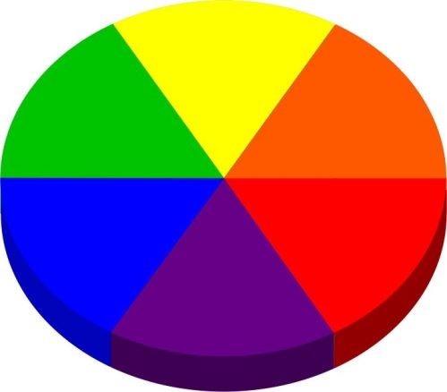
At it’s most basic there are only 3 hues – red, yellow and blue.
For practical reasons though hue has been expanded to included also the secondary colours.
So you can describe the hue of a color as being either red, orange, yellow, green, blue or purple.
Here is another example to drive the point home:
Each of the different colors above have a green hue.
What is Tint?

The first way to modify a color is to add white to it. When we do this, we are tinting the color.
Here are a few tints mixed from the green above:

As you can see a tint is related to the lightness of a color.
One thing to note is the effect of adding white to a color. The white reduces the darkness of the color, but it doesn’t influence how bright or luminous that color is. It is simply paler than the original color.
A well-known example of tinted colors are pastel colors. Pastel colors are made by adding a large amount of white to a pure color. The result is softer colors that can be used to create a variety of effects.
What is Shade?

A shade involves adding black to a pure color or a mixture of colors. In this way, it is similar to a tint but instead of adjusting the lightness, it changes the darkness. This means that a shade is the same as a pure color, but it is darker thanks to the effect of the black.
The more black you add to a color, the darker it becomes. If you add a large quantity of black, the mixture will be almost completely black with very little of the original color still visible. When you’re mixing shades, it’s a good idea to add only a very small amount of black at a time to help you find your desired shade.
Shades are often more intense than pure colors. They can be used to create a richer effect in your artworks and can be a helpful tool for influencing the atmosphere of your work.
Of course, the term ‘shade’ also has another meaning. Shade refers to spaces where sunlight doesn’t fall directly. Shade is the darker area, usually in the shadows. This can be a useful way to remember the definition of the term shade in color theory. Shade is color with more black added, it is darker than the pure color.
What is Tone?

A tone is any pure color that has grey (black AND white) added to it. In the context of tones, the grey used is completely neutral, so it is only made from a mixture of black and white.
The effect of adding black and white to a pure color is that the intensity of the color is lessened. This is the same effect regardless of whether the grey is lighter or darker. It always reduces the brilliance of the pure color.
You will be able to recognize tones because they are less bold than pure colors. They are normally gentler or more subtle. You can find tones everywhere in ordinary life. However, if too much grey is added to a color, then the brilliance is lost completely. After this point, it’s almost impossible to restore the color so it’s worth being cautious when you’re mixing paints to make tones.
Tint, Tone, Shade and Hue in Practice
Now that you know the definitions behind tint, tone, shade and hue, you can start to consider how they work together in real life contexts.

Take for example monochromatic colors. Monochromatic colors are colors based on just one hue. The color combination involves different tints, tones and shades of the same hue. This creates an interesting effect because it provides a more pared-back feel to artworks compared to having a range of different hues.
Using monochromatic palettes in your paintings can also help you to produce certain effects. Monochrome colors can generate certain atmospheres and emotions. For instance, yellow is generally associated with happiness and warmth while red is often linked to drama, passion or violence.
Many artists also create shades without using black at all. Instead, they mix neutral dark pigments like charcoal grey or burnt sienna. These mixtures are more complex than shades produced using black and can create interesting effects in your work.
Using Tint and Shade
In your painting, you might be tempted to just use one type of tint and shade in your work. For instance, you might choose one shade of blue and use this shade throughout the entire piece. However, the best effects happen when you mix different tints and shades together in the same artworks.
In the words of the landscape painter Clyde Aspevig, “Every time you shift to a different color or different hue you are creating interest. It’s a subtle thing but it builds content.” Using a combination allows you to build up a more naturalistic looking piece, as well as making it more visually interesting.
A great example of this technique is the work of the Impressionists. Many artists of the Impressionist movement chose not to use black in their work. Instead, they built up their paintings using different tints and shades. Darker shades were used in place of black in many cases.
Practicing Your Knowledge
If you want to test your knowledge of the difference between a tint, tone, shade and hue, you can try using the definitions in examples from everyday life.
Have a go at picking up a magazine or looking at one of your favorite artworks or even analyzing the images in this article. Focus on one small patch of the image and try to discern what types of tints, tones, shades and hues have been used to create the piece.
The easiest place to start is with hues. What are the dominant colors used to create each hue? What colors can you recognize? For some hues this will be immediately obvious. For others, there might be an equal mixture of two colors that make the hue.
To get experience using tint, tone and shade, the easiest way is to put some colors down on the palette. Then play around by adding different amounts of white and black to those colours.
Conclusion
While it might seem confusing at first, the differences between color, hue, tint, tone and shade are actually quite easy to understand. Each one is linked to a simple and fundamental part of color mixing theory.
As artists, being aware of how colors can be adjusted and manipulated can be really helpful for creating your own work. It is especially fun to play around with different tints, tones and shades to see what affects you can create in your paintings.
This kind of basic color theory can also help you to experiment more. If you can become more confident in mixing paints, you can create more complex and diverse paintings. It also becomes easier to translate the images in your mind or the landscape around you into your own art.
Having a good knowledge of the color wheel is also important. If you want to learn how the color wheel works you can follow my tutorial on that.
If you want to make your own color wheel you can follow that class as well.
Pin Me