Business cards are a critical component when running a business. They are like little silent sales people and can bring in new business for years after you have handed them out.
For this reason you want to hand them out at every possible opportunity.
You should never let somebody you have just met leave without your business card in their hand because you may never see them again otherwise.
One of three things could happen to that business card once you part ways.
a) It gets stored for later use
b) It gets handed to someone else who will use it
c) It ends up in the bin
Obviously the first two scenarios are good, the third one isn't.
Years ago I ran a printing company and designed thousands of business cards during that time.
As a result I learnt what makes one business card stand out from the crowd which causes the receiver to keep it, and what makes another end up in the trash.
I have broken these features down into 10 tips you can use when designing your own business cards.
Tip 1 : Show Your Artwork On The Card
You are an artist and create beautiful artworks. It would defy logic not show your artwork on your business card.
Obviously you can't show all your artworks. A business card is pretty small so you will only be able to display one, possibly two, before they become so small you can't see what they are.
There are two ways of doing this:

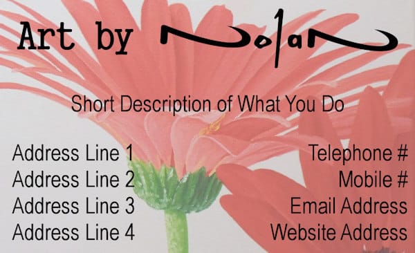
a) You add the artwork in as the background of the card with all the wording on top of the artwork.
This allows you to show more detail in the artwork, but has one big drawback.
Not all images make it good backgrounds. If the background image is too busy / has too many things happening in it, then it makes the text on top very difficult to read.
Keep this in mind when selecting an artwork which will cover the whole card.
One way to overcome this problem is to get your designer to add a thin white border around the text as this helps a lot.
Another is to add the artwork in as a watermark background. You can see how I have done this in the card above.

b) the other option is to show the artwork on the card and then space the text around it.
You lose detail in the artwork as it is smaller, but the artwork, and text are now perfectly visible.
I recommend asking your designer to create at least one of each option so you can see how they look.
In the example above the background of the bird painting was green so I used the same colour to "extend" the background further. That made the artwork look like it was designed to fit in the "empty" space on the card, where in fact it was designed the other way around.
Tip 2 : Don't Forget Your Details
You'll be amazed at how often people forget critical details off their business cards, only to realise their mistake months afterwards.
As space is at a premium you only want to add the most valuable contact info to your card.
It is pointless adding your postal address to the card if nobody ever posts anything to you.
Forgetting your website address on the other hand is a major disaster.
Here is a list of the most common items people add to their business cards:
1) landline number
2) mobile number
3) physical address
4) email address
5) website address
6) social media profiles (Twitter, Facebook, Instagram, Pinterest, LinkedIn, etc.)
7) postal address
Tip 3 : Triple Check Your Details
People make mistakes and typing your info incorrectly into the computer while designing your business card is one of them.
As a result it is very important that you check the sample that the printer gives you before going ahead with the print job.
Go over each detail slowly and thoroughly to ensure they are correct.
You don't want to pay for 500 business cards only to realise your telephone number reads 123456 instead of 123458.
The printer usually asks you to sign a sample before they print the final batch.
If you have signed that everything is correct when it isn't, then the loss will be yours and you will have to pay for a new batch of cards to be printed.
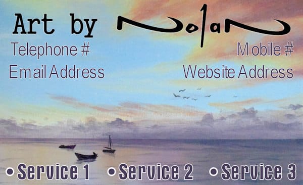
Tip 4 : Use Bullet Points

You can't write sentences or paragraphs on a business card. Sometimes however you may need to get a lot of information across on the card.
Using bullet points is the perfect way to do that.
Things you can add to your bullet points could be the different services you provide or the different products you sell.
The rule I use for bullet points is to reduce each bullet point down to a maximum of two words.
If you can't reduce the product or service description to two words then that product or service is too complicated to describe on a card.
In this case you would rather emphasize you website address in order to encourage the person to visit there. On your website you are not limited for space and can use as much space as you need to describe your product.
If you really do need to use more than two words then you can use tip number 5.
Tip 5 : Use The Back Of The Card
The back of the business card is half of the real estate available on the card. Why would you leave it blank?
Adding text to the back of a business card costs next to nothing so don't be shy to use the back to elaborate or add extra info.
My favourite method is to only add essential contact details on the front of the card, a slogan, or 3 to 5 word summary of what I do.
I then add the bullet points containing product or service information onto the back of the card.
Tip : Create a QR code that links to your website. That way somebody can scan the QR code instead of typing in the website address. You can create free QR codes here.
Add the QR code to the back, or front, of your business card.
Tip 6 : Leave Room On The Back Of The Card
You will often find that as you are chatting to a customer you will need to jot something down for them. It could be a price, artwork name, or something similar.
Writing this information down on the back of the card saves you the trouble of running around to find a post it note.
You also have the further advantage that the customer now only has one item to carry.
This extra information on the card also increases the chance that the customer will keep the card instead of throwing it in the bin.
Tip 7 : Be Creative
Feel free to be creative with your business cards. We even had a barber once that made his cards look like a razor blade. They were laser cut out of thin steel to the shape of a razor blade.
With then printed his details on to the "blades".
You obviously don't have to go that extreme with your cards, but do try different things to make your cards stand out from the crowd.
A few of the popular choices are to have a touch of embossing added to the card, to have the logo coated with a layer of varnish and to have the logo foiled onto the card.
Foiling is a process where they use metallic foil and embed it onto the card in your required shape.
You get an incredible variety of foils which can add excitement and sparkle to your cards so chat to your printer about this option.
Tip 8 : Keep It Simple
It is fabulous to get creative with your business cards, just ensure that you keep it simple.
As mentioned before space is at a premium on a business card so it can quickly become cluttered and ugly.
Only add the essential details. If you're adding sparkle and gloss by having some foiling, embossing or varnishing, don't go overboard. Only an accent of sparkle is needed to make the card look awesome.
Anything more and the card starts to look unprofessional.
Tip 9 : Do The One Year Test
The test of whether you have designed a card which is practical is to give it to somebody you don't know and ask them to tell you what you do. They need to do this within 30 seconds.
If they can't, you need to keep working on the wording and layout of the card until it is instantly obvious what you do.
I like to call this process the one year test.
You give somebody your card today and they know what the card is about so they pop it into their Rolodex. One year later they are flipping through their Rolodex and your card pops up. Will they instantly remember you and what you do, or will they blankly stare at the card wondering what on earth was this card for?
Tip 10 : Your Cards Must Be Good Quality
Don't print your own cards in order to save money. It is unlikely that you really can print them cheaper and even if you can, will they still look professional?
There is nothing worse than somebody handing you a home made business card that is printed on flimsy card, the print is all stripey because they were having hassles with the ink refill that day and then the card isn't even rectangular because they cut it out using a pair of scissors.
The chance of me giving this person any of my business slim to zero. If they are prepared to cut corners and do a cheap job with their own business cards, what kind of quality are the products they sell? What corners have they cut to make those products?
Having decent business cards printed is surprisingly affordable. 500 cards will cost you less than $80 if you shop around. If you really are strapped for cash then you can opt for 100 business cards which will set you back less than $20.
If just one of those cards brings in just one customer how much money will you make?
If you look after the customer they will bring in 10 times more than the cost of ALL those cards, if not more.
Bonus Tip 11 : Stick To The Standard Size
A standard business card is 3.5" x 2" (9cm x 5.5cm).
Business owners are often tempted to fiddle with these dimensions.
Crafters are especially prone to breaking this rule as they feel they can create their own business cards. They add all sorts of paint effects to the card along with flowers, ribbons and bows to make the card look special. They will often even go so far as to hand write their info on to each card.
Yes the card DOES stand out from the crowd and the person will probably keep it because it looks so amazing. The problem however is that the card will not fit into a standard business card holder. As a result the card then lies lose customers drawer. When they look for it a few weeks or months later to contact you they can't find it because it is lost between all the other clutter in the drawer.
You have just wasted all the time and effort it took to hand craft the card and lost the business anyway.
We have already discussed some of the ways to be creative with your card while still keeping them standard size and thickness. Rather stick to these methods.
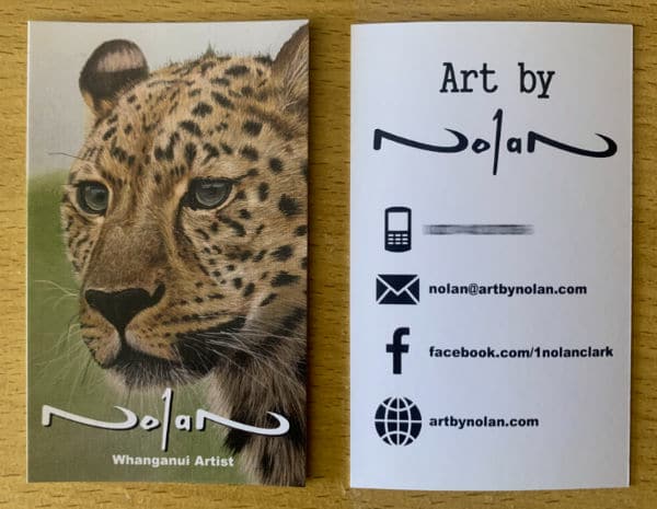
For interest sake this is what my current business card looks like:

As you can see I have a good example of my art on the front and have kept it as simple as possible with only my logo and service description on the front. That way you instantly know what I do and what type of art you can expect from me.
All the details are on the back of the card nicely spaced to make the info easy to read.
There is also plenty of white space to scribble little notes on.
Good luck with designing your business cards. I know they are going to look awesome.
If you have run into challenges when designing your business cards, or have your own designing tips, let me know about them in the comments below.
You may also be interested in reading my article on the best hashtags for artists which will help you with your social media marketing.
Pin Me
