The most important aspect of painting is your knowledge of the colour spectrum and how the colours fit together. No matter what medium you paint in or what style of painting you prefer, if you don’t know your colour wheel you may as well give it up for a bad job. The funny thing is that many people seem to battle with the colour wheel, yet it is very basic when you have learnt it the correct way.
Let’s look at where the colours we see come from first.
White Light
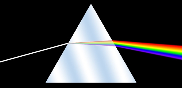
Rays coming from the sun or a light bulb are invisible and are called ‘white’ light. This white light consists of all the colours of the rainbow. We see the object that the light is shining on because the object is reflecting some of that white light back to your eyes. What part of the white light that is reflected is determined by the colour of the object eg. a green ball will only reflect the green frequency (component) of the white light. White light consists of seven distinct colours, namely red, orange, yellow, green, blue, indigo and violet. Of these seven colours, three of them can be used to mix the rest. They are red, yellow and blue. How do we know this?
Let’s look at where the colours we see come from first.
Primary Colours
Isaac Newton found that white light going through a prism is broken up into these seven colours. Further experimentation showed that by combining red, yellow and/or blue together in different amounts any colour could be obtained. These colours (red, yellow and blue) are called primary colours and are shown below:
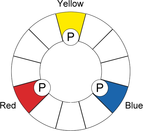
This forms the basis of our colour wheel. You will notice that the three colours form a triangle. Memorise this triangle and you are half way to knowing your colour wheel.
Secondary Colours
If we now mix all the colours that are touching each other together we get a wheel as shown below:
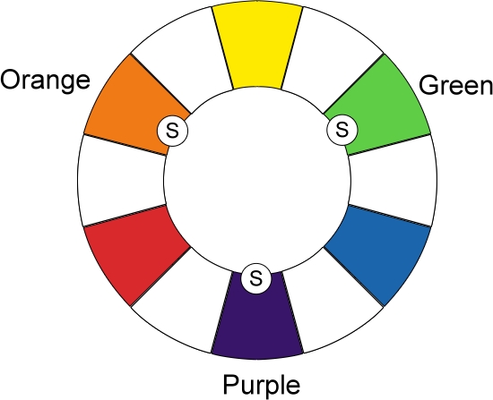
These three new colours are called secondary colours. Memorise these six colours and their position in relation to each other and you will never again battle with your colour wheel. From here you can work out how to mix any colour that you need.
Tertiary Colours
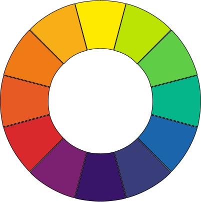
From this basic colour wheel we can expand it a little further by mixing adjacent colours again to get the wheel below:
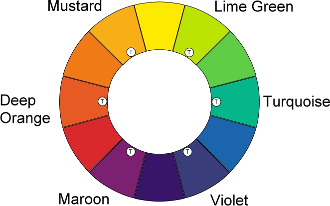
These new colours are called tertiary colours.
Complementary Colours
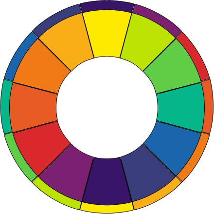
Each of these colours has an opposite. You find the colours’ opposite by looking directly across the colour wheel eg. the opposite of blue is orange. The opposite of any colour is called it’s complementary colour.
Harmonious Colours
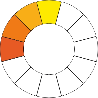
Colours next to each other on the wheel are called harmonious colours eg. turquoise, blue and violet are harmonious colours. In the picture below the harmonious colours of mustard are shown :
Warm and Cold Colours
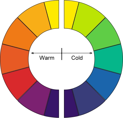
Looking at the colour wheel, we can divide it into two sections. The colours on either side are called warm an cold colours. See if you can determine which are cold colours and which are warm. Yup you guessed it – red, yellow, orange, maroon are warm colours and blue, green, violet and lime are cold colours. Here the wheel has been split to show the two sides :
Black and White are Special Colours

Now we need to look at two colours that are not on the colour wheel – black and white.
With paint we cannot mix white, but we can mix a form of black. You need to buy your white as a separate colour. Black can be mixed by combining all three of your primary colours i.e. red, yellow and blue.
The reason for this is explained in the Color Mixing tutorial.
Tying it all together
Let’s put all this together to see the final wheel:
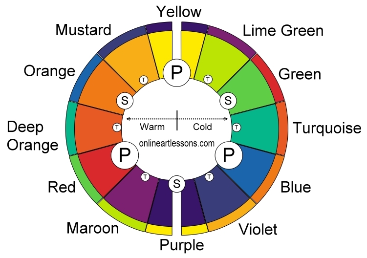
If there is only one thing that you learn in all your painting adventures, let this be it. The next step is to put this knowledge into practice, to fully understand a colour wheel there is only one way to learn, and that is to use it. In our colour mixing tutorial we build on this knowledge to help us paint more realistic, vivid and alive paintings, don’t miss out.
Recommended Resources
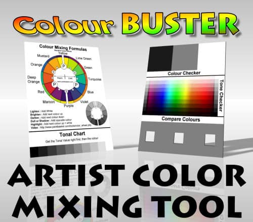
Color Buster Color Mixing Tool
The Color Buster Color Mixing Tool helps you to match your paint colors perfectly – say goodbye to muddy colors and hello to beautiful vibrant paintings.
Get your Color Buster Color Mixing Tool HERE
Pin Me
