In this tutorial we will be learning about monochromatic artworks.
What are they, why would you want to create them and of course how they can turn you into a better artist.
Monochrome Artwork Definition
We will start off by looking at what a monochrome artwork is.
Monochrome means the artwork has been created using shades of one colour.
By far the most popular monochrome artworks are graphite drawings.
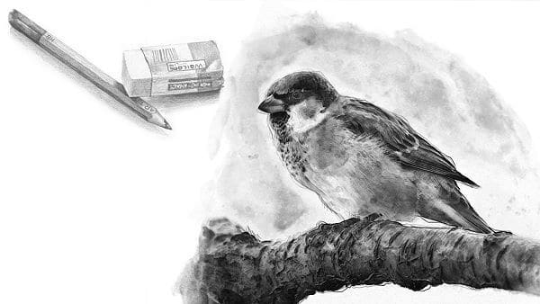
Chances are when you started off on your artistic journey, you were given a pencil and an eraser and taught to draw.
Graphite pencils aren’t however the only way to create monochromatic artworks.
We can create them in any medium.
Monochrome also doesn’t mean black and white, it means one colour.
You can pick any colour under the sun and create a monochrome artwork.
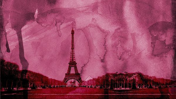
You could paint a landscape in all red or draw a still life using only variations of blue.

Pick a colour and off you go right?
Well, yes and no.
Of course you can use any colour under the sun to create any painting you like. There is certainly nothing stopping you.
There is however one factor you may want to consider before you whip out your brushes to start painting.
Colours Convey Emotions
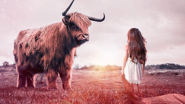
Each colour conveys a different feeling or emotion. For example red makes you think of heat and danger.
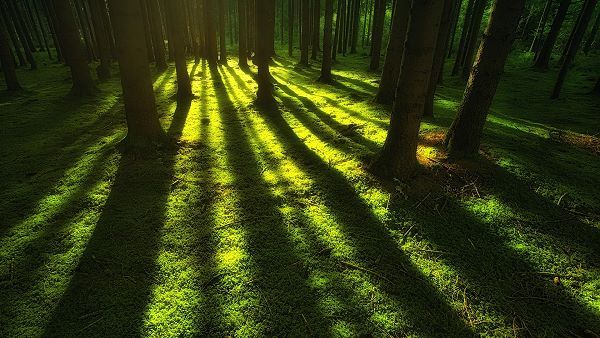
Green is a cool colour so makes you think of grass, moss and subsequently cold feet.
Can you see where I am going with this?
If you want a nice peaceful artwork for the bedroom, red is probably not the colour to go for. You need to consider what emotional effect the final artwork will have on the viewer.
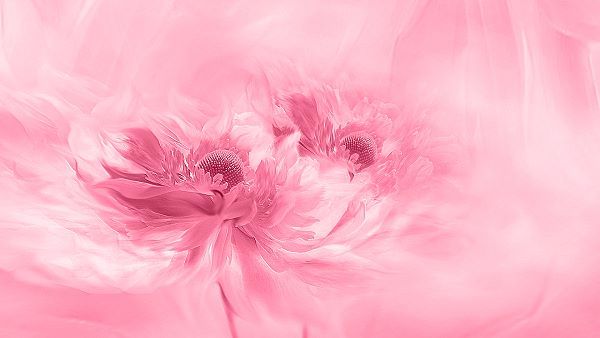
In this case a pastel colour would be a better choice.
Monochrome or Monotone?
So here is something interesting: Do you say monochrome or monotone when referring to an artwork created using shades of a single colour?
I know that I often say monotone, maybe you do too? This is in fact totally wrong.
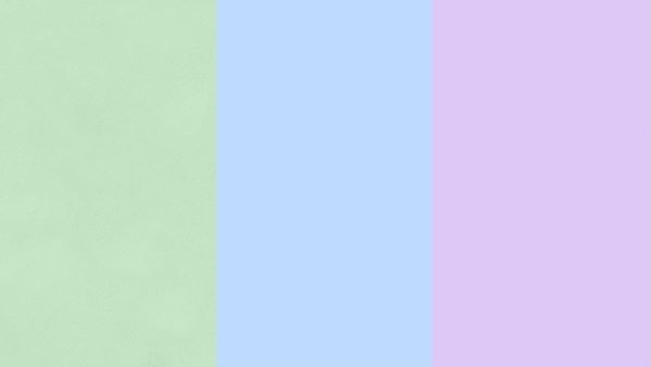
Think about it. Monotone means the same tonal value. No highlights, shadows or midtones. If you were to use only one tonal value you would have to use multiple colours of the same tonal value in order to create your artwork.
This would leave you with an interesting, but very flat looking artwork.
In fact, if you had to take a black and white photo of the artwork you would not see anything. It would appear as if there is nothing there.
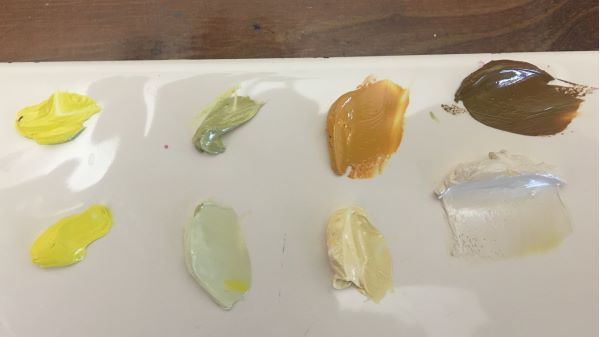
Here I have taken 4 colours, light medium and dark, then adjusted their tonal values to be the same.
The original colours are on top and and the colours that I have mixed to get equal tonal values are below. Here is the same photo converted to black and white:
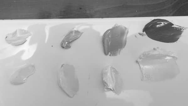
Compare the colour photo and the black and white photo and notice how the equal tonal value colours on the black and white photo all appear the same.
Ways to Use Monochrome?
Here is a good question:
Why would you want to paint or draw in monochrome when you have all the colours of the rainbow at your disposal?
The answer is actually quite simple:
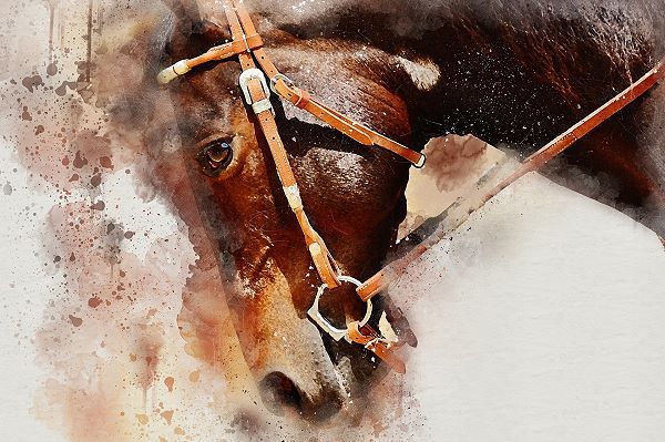
For the effect.
We have already touched on how colour affects the emotions and mood of the person looking at the artwork. By the same token you can convey your own emotions and mood in the artwork.
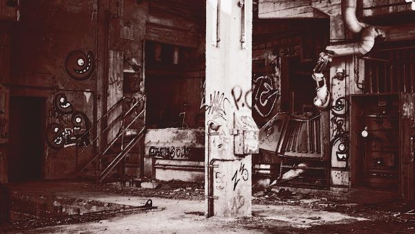
If you find something dull and dreary, paint it using browns or greys.
There are also other, more mundane reasons you would want to work in monochrome.
One of them being that you may want the colour in the artwork to match the colour scheme in your lounge.
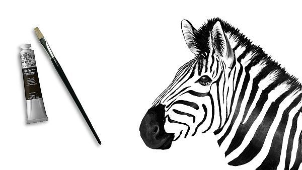
Another is to create a monochrome underpainting before adding the colour to the artwork.
Why would you want to do this?
One of the biggest problems I find new artists have is that they are scared of using contrast.
They don’t want to go too dark in case the artwork looks dull and dead.
Ironically the opposite is true. You need dark shadows to make your highlights appear bright.
Working in monochrome forces you to ignore the colour and to look at the underlying tonal values.
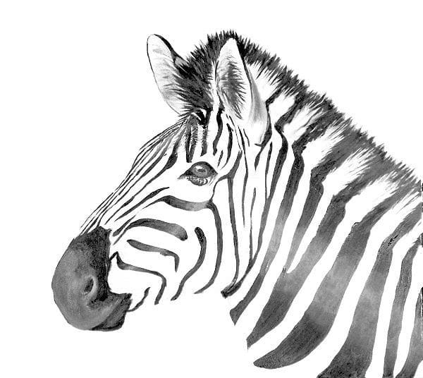
The minute you do this it becomes obvious that you need good contrasts otherwise the artwork looks flat.
The most common method of doing a monochrome under painting is the classic Grisaille layer used by the old masters. With this method the entire scene is painted using only shades of neutral grey.
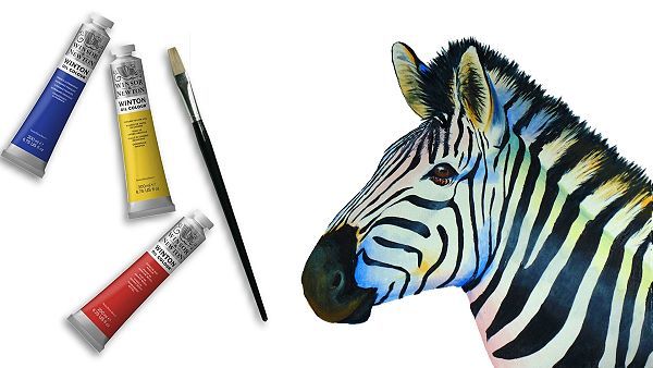
Once dry the colour is added using transparent glazes.
A different method is called Verdaccio.
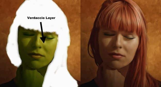
Here yellow is added to the grey in order to get a greenish monochrome underpainting. This technique is popular with portrait artists.
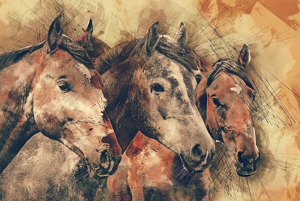
Landscape artists also often like to use Burnt Sienna to create a quick monochrome underpainting or sketch of the scene before moving over to painting it in colour.
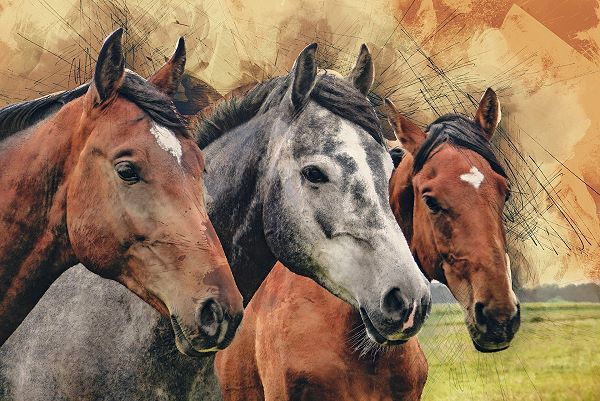
The advantage of working in monochrome is that you are removing the whole colour aspect from the artwork.
This not only gives a nice effect when hanging on the wall, it makes it so much easier for the beginner to master a medium.
They are less overwhelmed when having to concentrate on the tonal values only. Once they have a good grasp on tonal values adding colour is so much easier.
This is why most art tutors will start you off with pencil drawing before progressing you to paint.
Adding Spot Colours to Monochrome Artworks
Now let’s see what we can do to make our monochrome artworks stand out even more.
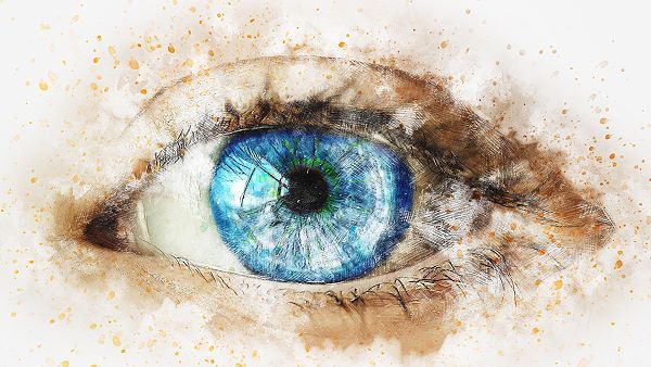
One way of creating drama in your monochrome artworks is to add a spot of additional colour to the focal point. Doing this cements the viewer’s eye on the focal point.
A popular way of doing this is to create the whole artwork in grayscale and then add colour to the focal point.
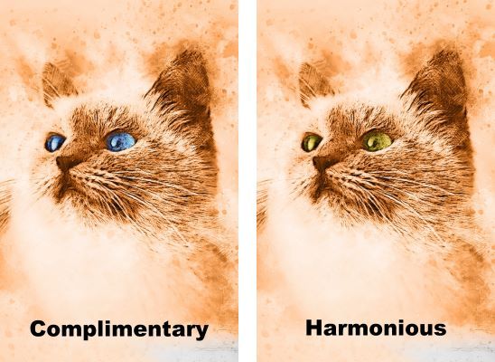
When not working in greyscale, you could also use the opposite colour in the focal area. This will make the focal point pop and appear very vibrant. You could also use a harmonious colour to not break the emotional effect of the artwork.
Colour Mixing
On a practical level I like to mix up 5 versions of the chosen colour.

I start by mixing the base colour. The colour I want the overall artwork to have.
Then I mix a highlight and shadow version using standard colour mixing rules.
These are then placed on the palette spread apart like this:
Adjacent colours can then be mixed to create the midtones.
This gives me a good variety of tonal values to choose from when painting.
I will then block in these colours on the canvas at the places where their tonal values correspond.
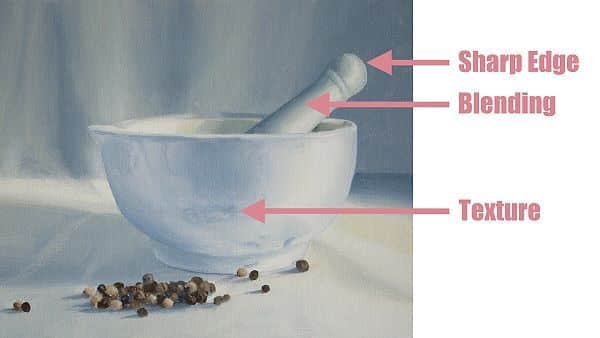
To merge the colours together you look to see how they meet. Do they meet in a sharp edge, do they blend together or form a texture.
Further Study
That concludes this tutorial.
There are however several indepth tutorials on the site which will teach you more about working in monochrome. You can access these by clicking the banners below:
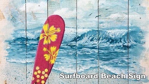
In the surfboard beach sign class you will learn how to paint a monochrome seascape.
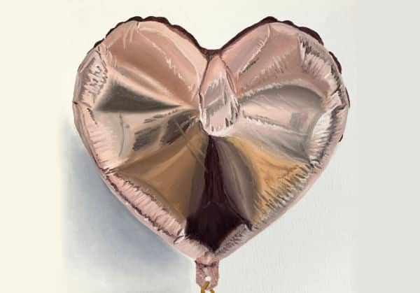
In the Foil Balloon class you will learn how to spot the tonal ranges correctly as well as find the details and spot colors in the reflections.
Pin Me
