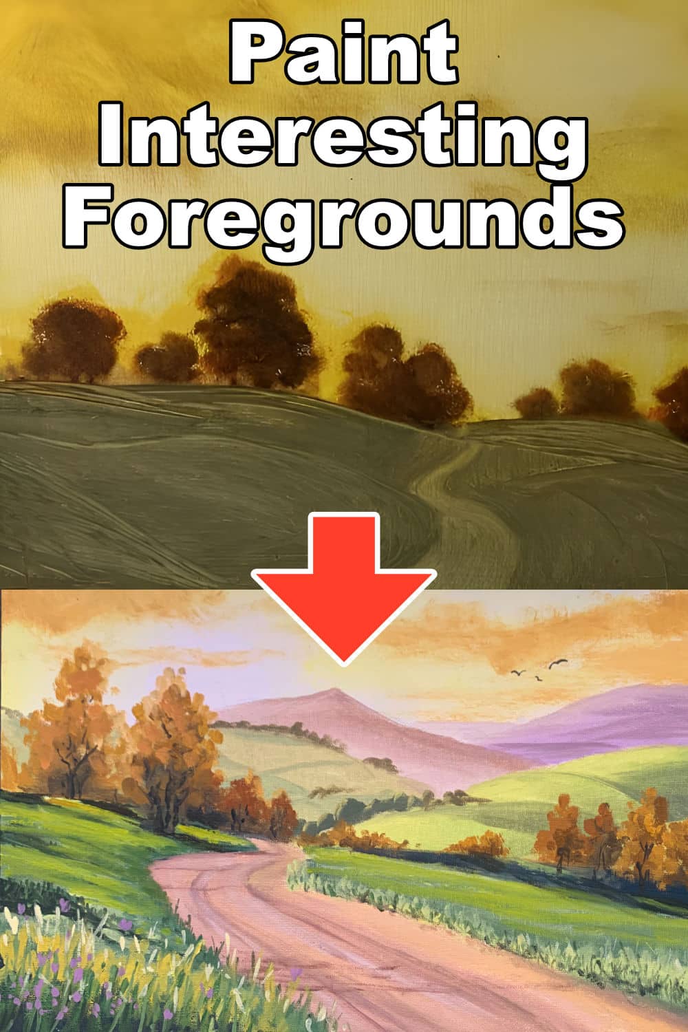
Have you ever wished your landscape paintings could feel as deep and inviting as the real outdoors? Perfecting the foreground is essential for that. In this tutorial I will show you some of the things you can do to keep your foregrounds interesting and inviting to look at, edging the viewer to step into your painting.
Painting Ground Angles in Landscapes
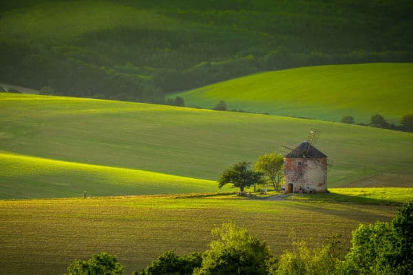
When painting landscapes, it’s important to show the different angles of the ground. Each slope or dip adds to the scene’s realism. Think about a meadow: one side might slope up, and the other might curve down. By painting these angles as they are, your artwork gains depth and feels more real.
This method helps the viewer’s eye move through your painting, making them feel like they are part of the scene. It’s a way to make your foreground interesting and give your landscape a true-to-life appearance.
The Play of Light and Color
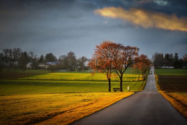
Sunlight doesn’t hit every part of the ground the same way, and this changes the colors you see in a landscape. When the sun is low, like during sunrise or sunset, it might cast a warm, golden color. Midday sun can make colors look brighter and more vivid.
As you paint, think about where the sun is in your scene. This will help you decide what colors to use for different parts of the ground. For instance, an area in full sunlight might use bright greens and yellows, while a shaded area could have cooler tones like blues and grays.
This play of light and color not only makes your painting more vibrant but also adds a sense of time and atmosphere. It’s a great way to make your foreground pop and keep the viewer’s interest.
Adding Depth with Shadows
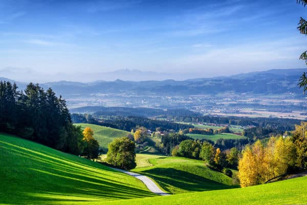
Shadows are key for adding depth and visual interest to your landscape paintings. They help define the forms of the ground and other objects, showing their shape and texture. When shadows stretch across a meadow or hillside, they break up the monotony and add layers of tonal value.
To paint effective shadows, observe how they vary in color and intensity. Near the object casting the shadow, colors may be darker and cooler, gradually lightening and softening as they stretch away from the object. This variation gives your scene a three-dimensional look and enhances the realism.
Incorporating shadows is not just about adding dark areas; it’s about creating a balance that guides the viewer’s eye across your painting. It brings light, life and movement to your painting, making the scene more engaging.
Using Linear Perspective in Landscapes
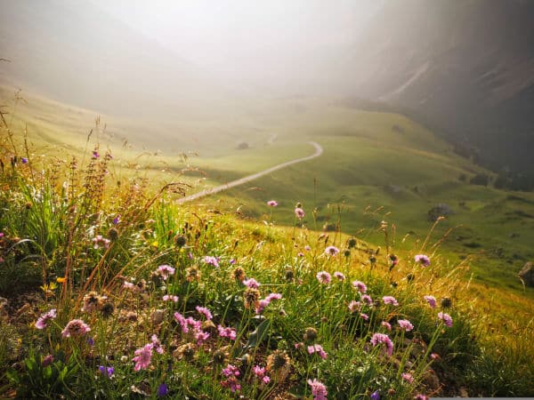
Linear perspective is a powerful tool in landscape painting. It helps show how objects change size and detail based on their distance from the viewer. Objects closer to the front are larger and more detailed, while those further away get smaller and less detailed.
This technique helps create a sense of depth in your paintings. When you paint a tree in the foreground larger and with more details like individual leaves and textures, and then paint trees in the background smaller and with fewer details, it makes your scene look more realistic. The viewer can feel the space and distance, as if they could walk right into your painting.
Using linear perspective correctly can dramatically improve the realism and depth of your landscapes, making them more immersive and visually appealing.
Enhancing Depth with Atmospheric Perspective

Atmospheric perspective is a technique that adds depth by changing the color and clarity of objects as they recede into the distance. Closer objects appear more vibrant and detailed, while distant objects blend more with the sky color and lose some detail. This mimics how our eyes see the world.
In your paintings, use this method to make the foreground pop with rich, vibrant colors. As you paint elements further back, gradually shift to softer, lighter hues, similar to the sky. This not only creates a realistic sense of depth but also conveys the vastness of the landscape.
By effectively using atmospheric perspective, you can draw viewers into your painting, guiding them from the vivid foreground through to the hazy, serene background.
Variety in Ground Cover for Visual Interest
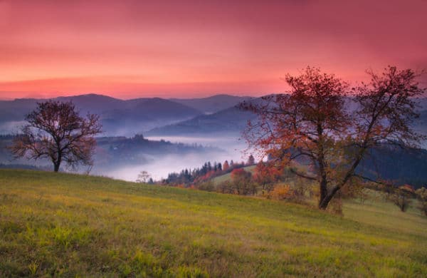
Painting different types of ground cover can dramatically enhance the interest and realism of your landscape paintings. Whether it’s lush grass, scattered leaves, or rocky patches, each type of ground cover adds its own texture and color to the scene.
Try to integrate various ground covers in your painting to reflect the natural diversity of the landscape. For example, a meadow might have areas of tall grass interspersed with wildflowers, while a rocky path could be dotted with moss and small bushes. Each element not only adds color and texture but also helps define the terrain’s shape and contours.
By carefully choosing and placing different ground covers, you can make your foregrounds more dynamic and engaging.
This variety keeps the viewer’s eye moving around the painting, discovering new details and features.
Incorporating Natural Elements into the Foreground
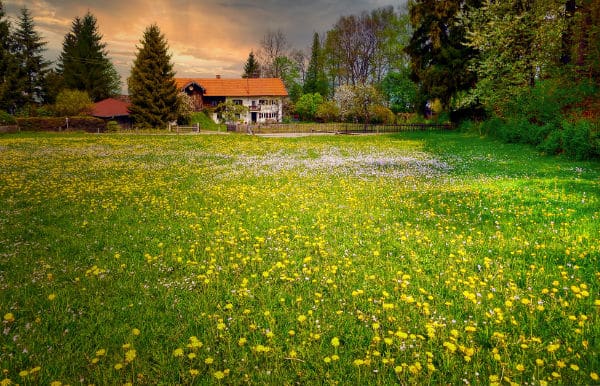
Adding natural elements like plants, trees, and boulders to the foreground of your landscape paintings can significantly boost their appeal and realism. These elements serve as focal points and can effectively draw the viewer’s attention.
Consider the type of environment you’re painting and select elements that naturally occur in that setting. For instance, in a forest scene, you might include dense shrubbery and tall, detailed trees in the foreground. In a desert landscape, scattered rocks and sparse, tough vegetation could be used to keep the viewer interested.
Each of these elements not only enriches the visual texture and complexity of your painting but also helps to anchor the viewer’s gaze in the foreground, creating a sense of depth and space. Additionally, these objects create highlights and shadows which also contribute to the overall mood of your foreground.
Adding Man-Made Elements to Enhance Landscapes
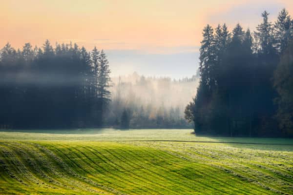
Incorporating man-made objects like plow marks, paths, or even browning cut grass can add a unique touch to your landscape paintings. These elements provide a hint of human activity and even allow you to tell a story in your painting.
For example, plow marks in a field can lead the viewer’s eye through the composition and their angles can suggest humps & bumps in the field. A path curving through a forest can evoke feelings of wanderlust and mystery. Even subtle hints like freshly cut grass with its distinctive color and texture can bring a sense of freshness, activity and season to your painting.
These man-made features not only diversify the visual elements in your artwork but also create opportunities to play with color contrasts and textural differences. They make the landscape feel more relatable and grounded in everyday life.
Creating Depth with Overlapping Objects
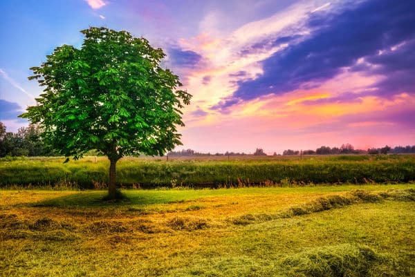
Overlapping objects in your landscape paintings is a crucial technique for creating depth and adding interest. By placing some elements in front of others, you establish a sense of spatial order and perspective that can make your scene feel more three-dimensional.
For instance, a tree branch that overlaps the edge of a distant hill helps to frame the scene and gives a clearer sense of which elements are nearer or farther away. Similarly, rocks or plants in the foreground that partially cover or obscure parts of the background can enhance the feeling of depth.
This layering not only makes your painting more dynamic but also guides the viewer’s eye through the composition, encouraging them to explore the painting more fully. It’s a simple yet effective way to make your landscapes more engaging and realistic.
In Summary
Mastering your foreground is crucial to creating depth and interest in your landscape paintings. By adjusting angles, playing with light and color, and adding layers through natural and man-made elements, you can transform your landscape paintings from simple sketches to rich, inviting scenes that capture the viewer’s imagination.
Remember, the power of a great painting lies in its ability to tell a story and evoke emotions so start with an interesting foreground and let it lead the viewer’s eye into the painting.
I hope this tutorial has been helpful. Another key concept that ties in nicely with this subject is called Simultaneous Contrast, or you may want follow my tutorial on How to Paint Awesome Backgrounds.
Pin Me
