
19 Basics Every Artist Must Do

Many hours of hard work go into a finished artwork, so give yourself the best chance of success.
Here are guidelines of what to take into consideration before you start (preferably) and / or to see if changes need to be made to your finished piece.
Believe You Can and Learn by Doing
Evaluate your drawing. Break complex shapes or textures into smaller, simpler pieces and check if you have reproduced them accurately. (It’s often best to turn your reference upside down when doing this to keep your brain from interpreting the shapes instead of seeing what’s actually there).
Check that you have followed the rules of perspective and that objects on the same plane in your drawing are of the correct relative size. If you have a person standing next to a fence post in the foreground, make sure the objects in the are background appear smaller than those in the foreground to give an illusion of distance.
If you wanted to move your figure and the fence post to a different place in the scene, check that the proportion of size to height of the post and figure remain the same as you do.
There will be times when you feel you just can’t get it right, but instead of giving up or doubting your ability, take a break and watch the Perspective Drawing Tutorial again.
Persevering until you achieve that aha moment is an unavoidable part of every artist’s journey.
However, don’t get caught in the trap of spending too much of your time watching other artists work instead of working yourself. Nothing is a substitute for practice. Get shortcuts and tips from watching others, but remember mastery is in the doing not the knowing.
Do Mini Studies
Sometimes you may be busy with an artwork that includes something that you are not confident with. Maybe you are afraid of clouds because yours just never seem to come out as good as you would like. This is when doing studies can help you improve that one specific area.
Many successful artists work out any problems by drawing their subject first in pencil or charcoal to get values, proportions and composition correct and then do separate colour studies before even starting on the final artwork.
While learning, (which for an artist means always no matter how advanced you are), doing mini studies of the individual elements which together make up the final piece, enables problems to be identified and solved in advance.
In our example you could follow a How to Paint Clouds tutorial on a separate canvas first in order to learn the techniques you are missing. Then using a small canvas practice painting the clouds from the scene you are wanting to paint.
Do as many practice studies as you need until you have built up the confidence, and skills, to paint the clouds on your final canvas.
Set Yourself Up For Success
Even if you only have a small space dedicated to art and not an entire studio, make sure your space is tidy and well organised with everything you’ll need close to hand. Decorate your space with items that are meaningful to you and make you feel comfortable and up-beat. If possible, play the kind of music that puts you in the “zone” and ensure you have enough light, either natural, artificial or both.
Choose Your Subject With Care

Analyse the reason you chose the subject you are about to paint / draw. You and your subject are going to get intimately acquainted as you work to produce your masterpiece, so make sure you know what that “special quality” was that drew your attention.
Successful art evokes an emotional reaction in the viewer, but you can’t achieve this unless you feel the emotion yourself first. It could be the way the light falls on a landscape at a particular time of day, or the way the look in the tiger's eye connects with the viewer that lifts it above just another animal photograph.
Give careful thought in advance as to what mood you want to convey in your artwork; sombre or bright, energetic or calm. Pick the colours; warm or cool, intense or subdued, that will best bring your message across.
Decide if you want a light-hearted high key picture where the value scale is concentrated on the top end of the value scale or a dark and moody picture using values only from the bottom of the scale. Alternatively, you could choose to use values evenly distributed throughout the value scale. Just be aware that your choices before you begin, will affect the outcome.
Choose Your Surface & Medium Wisely
Once you have decided on your subject and the atmosphere you want to convey, consider the surface and the medium you want to use. Both will play a large role in the feeling you can create especially when using dry media.
Charcoal lends itself to more loose and spontaneous drawings than either graphite or coloured pencil. Charcoal on rough, textured paper conveys a totally different feel to charcoal blended smoothly on a smooth paper.

Charcoal (left) lends itself to a loose impressionistic style.
Graphite (right) used in a more realistic style.

Your choice of surface will also determine what is possible to achieve with the medium you are using. Using pastels on heavily textured sanded paper offers more options (e.g., using light over dark and vice versa), than does the same medium on a less textured paper. The number of layers possible using a sanded paper will also be far more.

Decide if a white or a coloured surface would serve you best. Canvases can be stained with coloured paint, (called an imprimatura). An imprimatura is simple to do and makes it easier to judge values as it’s usually a mid-value on the value scale. (it could be any colour or mix of colours). You only have to worry about judging your lightest and darkest values, while a white surface which is already the highest value possible, makes judging values more difficult. Having bits of the imprimatura peeking through the finished painting can also give a more cohesive final effect than if you painted on white canvas.
Toned drawing paper for dry media also offer the same advantages over white paper.

A previously white canvas stained to form a mid-tone.
Toned paper comes in various colours.

The variations of surfaces to choose from in both colour and texture are vast, but its important to be aware that the surface you choose can affect the outcome.
Fitting Your Subject to Your Surface
If working from a photograph, see if the dimensions of your photo will fit into the dimensions of the surface you plan to use, and if not, what adjustments need to be made to the picture (or the surface) to make it fit.

Visualising how much of your canvas will be filled by your reference.
Cropping the reference to fill the surface you are using.
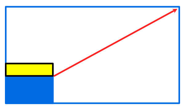
Align your reference photo or print with the bottom corner of your surface and draw a line from one corner to the other as shown in the diagram above. Where this line intersects the edge of your surface is the area the content of the picture will fill. The blank space, (above shown in yellow), is the area that is not covered by the content of the photo.
You can decide to add additional background to fill the area or crop the image so that it fits better into the shape of the art surface. (see above).
You could also trim the surface to fit the photo. This is easy when using paper or loose canvas but not possible when using pre-stretched canvases.
Choosing a Format for Your Painting

Whether you choose a horizontal (landscape) or a vertical (portrait) orientation usually depend on whether you want to emphasize horizontal or vertical lines. If your subject is a seascape or landscape, then it’s most common to choose a landscape (horizontal) format which emphasises space.
If, however, your subject has strong vertical lines, then a portrait format which seems to make the subject feel more regal may be better.
These are however just guidelines not rules. Square, triangular, asymmetrical or round formats are also options – just be sure to consider what you want to convey before choosing.
Doing a Notan
Although it may seem tedious, especially when you’re all fired up to start, it’s always advisable to first do a Notan study.
Many artists are unfamiliar or intimidated by Notan studies. Notan is a Japanese word meaning “light dark harmony”. Notans are actually not complicated and are a useful tool to spot flaws in your composition before you even start thus saving time and frustration later.
When making a Notan, you distinguish between, and group together, shapes in shadow and shapes in light. You can use a two-colour Notan, using only black and white, or a three, or even four colour Notan by using up to 2 shades of grey as well as black and white. If you use more than 4 values, then it is no longer considered a Notan but a value study.
This exercise forces you to simplify to the “bare bones” of the subject and, as there is no distracting detail or colour, you can easily spot small changes in the grouping or shape of light and dark values that would make your composition hang together more pleasingly. It’s even possible to create a Notan on your computer by simplifying the values; (playing with the contrast setting), and then posterizing the image.
Thumbnail Sketches
Thumbnail sketches like Notans, are also tiny sketches made using the main shapes of your subject that allow you see which arrangement of shapes results in the best composition before you start on your artwork.

Thumbnails are very rough sketches, only a few centimetres big. Because they have no details, just shapes, changes are easy and quick.
Thumbnails allow you to more easily spot and change boring shapes - too regular shapes like squares, circles or triangles - into something more dynamic and irregular. You can quickly experiment with light angles and shadows as well as cropping alternatives and the positioning of the focal point.
At best working with thumbnails can lead you to exciting new insights, at worst, they show you what doesn’t work.
You could even take it a step further and do thumbnails in colour, (gouache or coloured pencils are useful for this as they are quick to use), to get a feel for how different colour combinations will affect the mood of the piece and what colour mixing is involved before you start.
Consider the Negative Spaces
Negative spaces - the spaces surrounding your subject that form part of the background - should always be interesting. If you have a large area which is the same value it’s often boring to the viewer (people just love variety), think of ways to break it up.
Clouds are always useful to make an expanse of negative sky shape more interesting. If you do want a cloudless sky, you could enliven it by adding a horizontal graduation of colour.
Shadows falling across an otherwise boring foreground from a tree or other object which is outside the frame of the painting and not visible to the viewer, has solved the boring negative space problem for many an artist.
In some circumstances cropping negative space which doesn’t really contribute to atmosphere you are trying to create from your reference before you start is the way to go.

Check your negative spaces. They should always be an interesting element of the overall design, not just there to fill the space between the subject and the frame.
Resting Places

An area of little contrast in the foreground (a resting area for the eye), makes the figure and the background stand out by contrast. The use of warm and cool colour contrast enhances the effect.
Van Gogh
For a painting to be easy to look at, there should be places for the eye to rest where nothing much is happening. which makes the focal point or subject more striking by contrast. The same applies to the use of neutrals, or low intensity colours, to emphasise the use of higher intensity colours which then automatically draw the eye.
Choosing your Colour Palette

A Gamut Mask example, with the resulting colour palette shown below it.
In art, the fewer the colours used the more cohesive and pleasing the result usually is. Having colours vying for attention can be distracting for the viewer.
One way to help you limit your palette is by using a colour gamut mask.
This is a mask that you lay over a color wheel in order to limit your palette.
You can find out more about the Gamut Mask concept here.
Check for Clones
Make sure you don’t unwittingly create clones. Repeating shapes e.g., clouds, fence posts, trees etc., should not be identical to another or they become boring. Vary shapes slightly or introduce a different colour for variety.
Look out for boring shapes in your art like circles, squares and rectangles which rarely occur in nature – asymmetrical, organic shapes are more exciting to the eye.

By varying the height and shape of the pine trees an interesting silhouette is the result.
An asymmetrical tree silhouette is more interesting to the eye than a symmetrical (lollipop – like) shape would be.

Use a Mirror
After working close-up for many hours, it is difficult to be objective. Regularly take a few steps backward and judge your progress from a distance. Take regular breaks away from your work so that when you return you have fresh perspective.
A mirror is an essential tool in any studio. By looking at your work in a mirror, you’ll spot irregularities that you otherwise wouldn’t.
Take a picture of your art and view it next to your reference photo in the computer. Differences in value and shape will suddenly become obvious. This is especially true if you convert both reference and artwork to black and white first.
When your artwork is finished, hang it on your wall or prop it up in your studio where you will pass by it often as you work. Often small changes that will improve it dramatically, only become evident after a while.
There’s always a limit, however. At some point you must decide you’re done. Sign your work and move on to the next project. Perfection is impossible. Big improvement is what you are striving for, not unnoticeable tweaks.

Hang your artwork where you can glance at it regularly while doing other things.
Check for the “Cut Out” Look
If you paint your background after your subject is finished, look very carefully for a minute gap between the subject and the background which gives a “cut out” look, as if it’s on top and not part of the background. To prevent this, purposefully allow some of the background to overlap the outline of the subject and then go back and re-establish the edges of your subject.
Also ensure things are going "in" on one side of the subject and "coming out" the other side as this makes the background look like it is behind the subject.
Darken the Edges
Although not a rule, making the edges of your picture subtlety darker than the central area around the subject stops the viewer’s eye from sliding out of the picture at the edges and directs the eye to where you want it – on the subject.
I call this the spotlight effect. Imagine the only light in the scene is a spotlight - it will illuminate the subject brightly and then quickly fade darker to the sides so that the only thing you can see "properly" is the focal point.
Focal Point and Contrast
There is a saying which goes : You can't have bright lights without dark shadows.
In other words something can only look bright if it has something dark next to it, to contrast against.
Check you have the greatest contrast at the focal point to make it stand out. Contrast can be achieved through values (light against dark – possible the most common way), but also through the use of colour (warm against cool or intense against dull), texture, shape, size etc.
Once you have finished the artwork, try bumping up your highlights and deepening your darks even more around the focal point to make your work pop.
Presentation
Proper presentation shows your artwork in its best light. If you can’t afford to frame it, at least have a mat professionally cut and cover with cellophane to both protect and give your work a professional finish.
Don’t make your signature so big that it’s the first thing that catches the eye. Use the placement of the signature to help balance an artwork if necessary. Use a colour that blends in with the background so that the signature if visible but not in-your-face.
If you’re working in pastel or charcoal, consider fixing your work with a fixative to protect it until it’s framed behind glass. Before fixing make sure all smudges are erased.
Varnishing a painting is advisable. Acrylic paint tend to become dull as they dry. Varnising your painting will restore the original depth of colour.
Different oil paints dry with different amounts of sheen, so a coat of varnish not only protects the art but unifies the sheen.
When All is Said and Done…
If your painting/ drawing doesn’t turn out as you’d hoped, don’t slow your progress by doubting your ability. Instead try to make an unemotional assessment of what worked and what still needs improvement. Concentrate on improving one thing at a time.
Never compare yourself to another artist. Everyone is unique. You can emulate the style of someone you admire by analysing what it is that draws you to their art but don’t try to be a carbon copy – allow your own style to develop and trust yourself. Peoples’ taste is so wide in art that the only person you have to worry about satisfying, is yourself.
If you like your artworks, other will too.
