The 8 principles of art are:
- Balance
- Proportion
- Emphasis
- Variety
- Harmony
- Unity
- Movement
- Rhythm
Closely related to, but not the same as, the Elements of Art which are:
1. Colour
2. Form
3. Line
4. Shape
5. Space
6. Texture
7. Value
(View my tutorial about the 7 Elements of Art)
Introduction to the Principles of Art
Art, much like the world around us, thrives on balance, variety, and harmony. Whether you're a seasoned hobby artist who's painted serene landscapes or a young student doodling figures in your notebook, there's an invisible set of rules you're tapping into. These aren't just arbitrary rules but principles that have shaped artworks across centuries and cultures. They're the guiding forces that give a painting depth, a sculpture its poise, or a sketch its charm.
Introducing the "8 Principles of Art" - a toolkit every artist employs, sometimes unknowingly, to create, critique, and appreciate art. While these principles might seem technical at first glance, they're best understood not just by reading, but by seeing and doing. As we delve into each principle, think of your favorite artwork or your recent creation. You'll be surprised how these principles come alive!
How Principles and Elements Work Together
Before diving deep into the principles of art, it's essential to understand how they work hand-in-hand with the elements of art. Think of the elements of art (like color, line, and shape) as the raw materials or the building blocks. They are the tangible things we can identify in a piece of art.
On the other hand, the principles of art (like balance, harmony, and rhythm) are the ways those elements are arranged or applied. It's akin to the rules or guidelines that make the use of those elements more effective, like a blueprint for constructing a building.
For instance, you could have a splash of color (an element) on a canvas, but how and where you place it, how you balance it with other colors or shapes, and the rhythm you create with repeating splashes are all guided by the principles.
As we delve into each principle, notice how they often reference or lean on the elements. It's this intricate dance between the two that makes art so compelling and diverse. Every artist chooses how to balance and use these elements and principles, crafting their unique voice and style in the process.
Now, let’s start our journey through the 8 Principles of Art!
1. Balance
What is Balance?
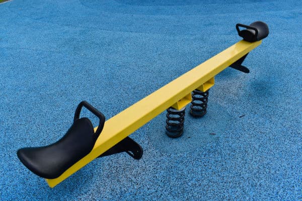
When we think of balance, we might imagine a seesaw in the playground. If two kids of the same weight sit on either end, it stays level, right? This idea of keeping things even and steady is what balance in art is all about. But in art, it's not just about weight; it's about how things look and feel to our eyes.
Understanding Balance in Our 3D World
Everyday life is three-dimensional. We live in a world where things can topple over if they're not balanced. Think of stacking books on a table. If you put too many on one side, the pile might fall over. That's because things in our world have physical weight, and they're affected by gravity.
Balance in 2D Art
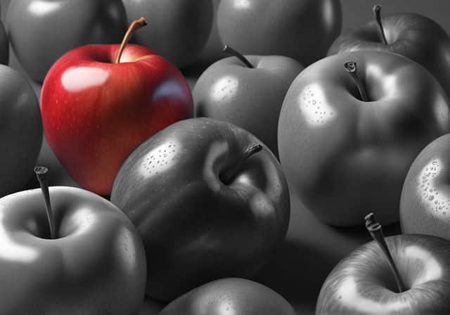
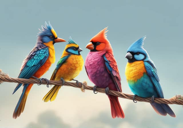
Art, especially paintings or drawings, exists on flat surfaces. Here, balance isn't about actual weight; it's about visual weight. Visual weight is about how much an object in the art grabs our attention compared to others. So, imagine a bright red apple drawn next to a bunch of gray apples. Even if the red apple is smaller, our eyes are drawn to it, giving it more "visual weight."
Using Elements of Art to Achieve Balance
Elements of art like color, size, and shape can change the visual weight of objects in a picture. For example, a dark-colored object can seem heavier than a light-colored one, even if they're the same size. So, artists play around with these elements to make sure their artwork feels balanced and keeps our attention where they want it.
Why Balance Matters
Ever felt uneasy looking at an image that felt like it was tipping over? We instinctively look for balance in what we see because it feels comfortable and familiar. Our world, from the way our bodies are built to the cars we drive, is generally symmetrical and balanced.
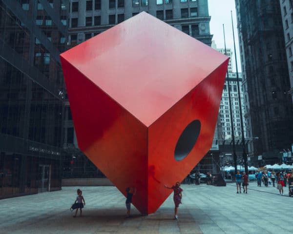
But here's a twist: Artists can shake things up and use imbalance intentionally to evoke feelings of tension or unease. Take a look at Isamu Noguchi's "Red Cube" for instance. It seems off-balance, and that's done on purpose to grab our attention and make us think.
Types of Balance
There are different ways artists can balance the visual weight in their work:
Symmetrical Balance: Think of a butterfly. One side mirrors the other. In art, a design can be split in half, and each side has a similar visual weight, even if they aren't identical.
Asymmetrical Balance: This is where the two sides don't match but still feel balanced. It's like having a taller stack of lighter-colored books on one side and a shorter stack of darker-colored books on the other. They’re different, but they balance out.
Radial Balance: Ever looked at a sunflower or a clock face? The design radiates out from the center. Everything is balanced around a central point.
There’s no right or wrong way to balance art. Artists get to decide how they want their work to feel and look. The key is knowing about these tools and playing around with them.
2. Proportion / Scale
Understanding the Difference
At first glance, "proportion" and "scale" might seem like interchangeable terms, but there's a subtle yet crucial distinction:
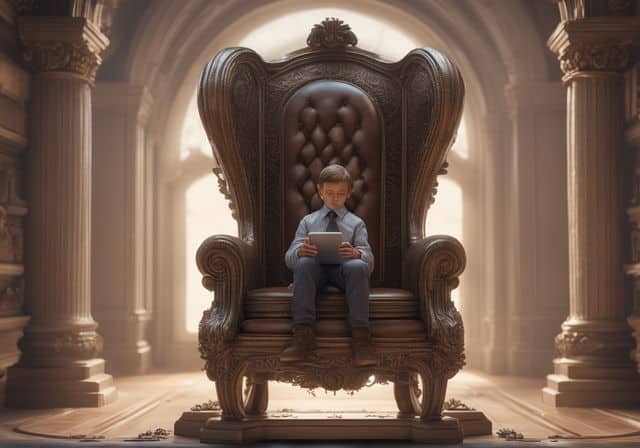
Proportion refers to the relative size of parts within a whole. Imagine a human face: if the eyes are too large compared to the nose, the proportions seem off, even if the face itself is drawn to a realistic size.
Scale deals with the size of an object in relation to a different and separate object. A drawing of a giant holding a regular-sized human showcases scale. The human is drawn to its natural size, but the giant is drawn larger to show its immense scale compared to the human. The human and the giant are two different / separate objects.
With these definitions in mind, let's dive deeper into why these two elements are pivotal in art.
Why Proportion and Scale Matter
In art, playing with size and scale can make our paintings pop and leave a lasting impression. Think of scale and proportion as the magic ingredients that bring depth, balance, and intrigue to a piece. By adjusting how big or small something appears, or how parts of an object relate to one another, we can tell a story, set a mood, create the illusion of distance or even challenge the viewer's perceptions. It's like giving our art a voice of its own, where it can whisper, sing, or shout, depending on how we use scale and proportion!
Historical Glimpse
Throughout history, artists have experimented with proportion and scale to craft memorable and impactful works. The Renaissance masters were obsessed with perfect proportions, often employing the Golden Ratio to create harmonious compositions. On the other hand, ancient Egyptian art showcased figures in sizes based on their social status rather than realism.
Seeing Proportion in Everyday Life
Ever watched a cartoon where a character has enormous eyes but a tiny body? That's a playful twist on proportion to make characters more expressive. Or think about a room. A massive sofa in a small room can feel overwhelming, but place that same sofa in a grand living room, and it feels just right. That's scale in action in our daily lives.
Playing with Perception
Artists like Picasso, with his unique cubist style, bent the rules of proportion to showcase multiple perspectives and realities within a single frame. These intentional distortions challenge our perceptions and evoke deep thought and emotions.
Tools of the Trade
Achieving the desired proportion and scale isn't always about intuition. When deciding on the proportion or scale for your painting, think about the message or feeling you want to convey. If you want to draw attention to a specific object or character, you might make it larger or more detailed. On the other hand, if you want to create a sense of distance or show something is less important, you could paint it smaller or in the background.
Artists employ tools, like grids and templates, to help get proportions right. So, whether you're sketching a portrait or designing a poster, knowing the nuances of proportion and scale can be your secret weapon.
3. Emphasis
Spotlight on the Star: What's Emphasis?
Next up in our list on the 8 principles of art is emphasis. In the world of art, emphasis is like shining a spotlight on the star of the show. It's the artist's way of saying, "Hey, look here first!" Emphasis helps direct the viewer's attention to a particular part or parts of an artwork that the artist deems most important.
Practical Examples of Emphasis
The Bright Red Apple: Imagine a painting of a fruit basket with various fruits like bananas, grapes, and oranges. If the artist paints a single apple in bright red while keeping other fruits in muted colors, your eyes will naturally be drawn to the apple first. (You saw this in the one red apple vs many grey apples example earlier). That's emphasis in action!
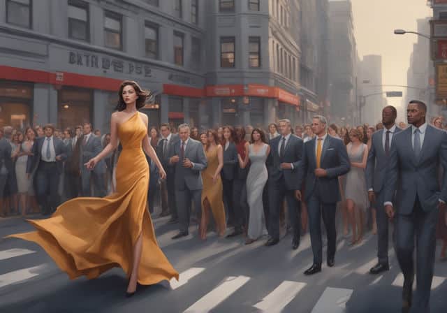
The Solo Dancer: Picture a scene in a busy street with many people walking around. In the center, there's a dancer in a vibrant costume, striking a pose. Even though there are numerous characters in the painting, the dancer, due to her position and vibrant attire, captures your attention immediately.
Subordination: The Supporting Cast
Now, while emphasis is about highlighting, subordination is its counter-part. It's about toning down other parts of the artwork to ensure the main point of emphasis stands out.
The Blurred Background: Think about photographs where the subject is in sharp focus, but the background is blurred. That blur is a form of subordination. In a painting, artists might use softer lines, muted colors, or less detail in the background, ensuring the viewer's attention stays on the sharply detailed subject.
Playing with Emphasis and Subordination
When creating or looking at art, observe how artists play with these tools. What do they want you to see first? How do they use colors, lines, and details to guide your eyes? Understanding and playing with emphasis and subordination can make your artworks more engaging and dynamic.
4. Variety
Breaking the Monotony: What is Variety?
Variety is like spice in art! It's about introducing different elements or unexpected changes to break the monotony and keep the viewer engaged. It's what keeps a piece of art lively and interesting. While repetition can create a sense of unity or rhythm, variety ensures that artworks don't become predictable or boring.
Practical Examples of Variety
Watch Out for Cloning: If you've ever painted a line of trees and realized they all look eerily similar, you've bumped into the challenge of 'cloning'. It's a common hiccup where we unintentionally repeat elements by using the same brush stroke every time. When all trees are the same shape, size, color, or spaced evenly apart, it can feel a bit dull. By introducing different types of trees, varying their heights, or playing with the spacing between them, you bring in variety and make your artwork more realistic and lively.
Using Elements of Art to Inject Variety
Variety in art is achieved using elements of art.
Color Play: Imagine a serene ocean scene. Instead of just blues, what if you add hints of purples, teals, or even sunset oranges? These unexpected splashes of color can add an element of surprise and depth to your painting. A common method of doing this is to use complimentary colors.
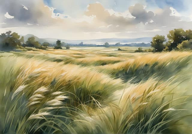
Changing Strokes: If you're painting a field of grass, instead of using the same brushstroke for the entire field, try mixing it up. Some strokes can be short and dab-like, others long and sweeping, while some can be thick and others thin. This introduces a textural variety, making the grass seem more natural and dynamic.
Remember, variety doesn't mean chaos. It's about cleverly introducing differences within a cohesive theme to make the artwork more engaging. So next time you pick up your brush or pencil, think about where you can break the pattern and surprise your viewer!
5. Harmony
Finding the Sweet Spot: What is Harmony?
In art, just as in music, harmony is about creating a sense of unity and togetherness. It's the beautiful balance achieved when all the different elements in a piece come together to create a consistent, cohesive look and feel. Harmony ensures that even with variety and contrast, an artwork feels as one complete, coordinated piece, rather than a mishmash of random elements.
Why Harmony Matters
Harmony is what gives viewers a sense of comfort and satisfaction when they look at a piece of art. It ensures that despite the diverse elements present, everything feels related and part of a bigger picture. It's like a puzzle – each piece is different, but they all fit together perfectly to create a single image.
Practical Examples of Harmony
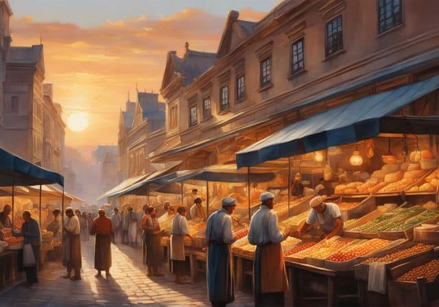
Harmonizing Through Color: Imagine a painting of a bustling city market. There are people, stalls, products, and more. Using a dominant color scheme, like warm tones of reds, oranges, and yellows, can make all these diverse elements feel unified, as if bathed in the golden light of sunset.
Texture Harmony: If you're creating a beach scene, even if the sand, waves, and palm trees have different textures, using consistent, smooth brush strokes can bring a harmonious feel to the entire scene.
Repetition with a Twist: Consider a floral painting. While each flower can be unique, having a common element – like a similar petal shape or recurring leaf pattern – can infuse harmony.
Harmony and Variety: Two Sides of the Same Coin
While variety introduces different elements to break monotony, harmony ensures these diverse elements coexist beautifully. They work together. Think of harmony as the thread that strings different beads (variety) into a lovely necklace.
Next time you're creating or admiring art, look for those harmonious touches that tie everything together. It's a subtle, yet powerful tool in the artist's palette!
6. Unity
Piecing it All Together: What is Unity?
Imagine a jigsaw puzzle. Each piece, unique in shape and design, comes together to create one beautiful picture. In art, unity is much the same. It's the feeling that everything in the artwork belongs together and nothing feels out of place. It's what makes an artwork feel complete, whole, and satisfying to look at.
Why Unity Matters
Unity is like the glue that holds an artwork together. It ensures that despite the different elements and variety introduced, the piece feels coordinated. When there’s unity, viewers get a sense of completeness, like everything they're seeing belongs together.
Practical Examples of Unity
The Honeycomb Design: Think about a honeycomb or the network of cracks in dried mud. The patterns are different, but they're all connected, forming a whole. It's the negative space, or the space between, that binds the patterns and provides unity.
Repeating Elements: Look at a painting filled with swirling patterns. Even if the colors or sizes of the swirls differ, the repeated pattern gives the painting a sense of unity. It’s like hearing a repeated chorus in a song.
Shared Lighting or Shadows: Imagine a bustling street scene at night, with people, cars, and buildings. Even though each element is distinct, if they're all cast under the same streetlight's glow or have similar shadow directions, it brings a unifying feel to the scene.
Unity and Other Principles
Unity doesn’t work in isolation. It often dances with other principles like variety, balance, and harmony. For example, while variety introduces different elements, unity ensures they all feel coordinated. And while harmony ensures elements relate well, unity ensures they feel like parts of a single whole.
Tips for Achieving Unity
Color Palette: Sticking to a specific color palette can help in achieving unity. Even if you introduce various shapes or lines, using colors from the same family can make them all feel related.
Consistent Textures: If you're working on a piece with various elements, using a similar texture throughout can bind the elements together.
Placement and Composition: Arranging elements in a manner where they relate to one another, maybe through leading lines or a focal point, can boost unity.
Next time you're creating or enjoying a piece of art, see if you can spot the elements that bring unity. It's a silent force, working behind the scenes, but it makes all the difference!
7. Rhythm
Feeling the Beat: What is Rhythm in Art?
Art principle #7 is rhythm. When you hear the word 'rhythm', you might think of music – the steady beat of a drum or the pattern in which a song flows. In art, rhythm works in a similar way. It's about creating patterns and repetition, guiding the viewer's eye and creating a flow throughout the artwork. Think of rhythm as the heartbeat of a piece, giving it life and motion even if it's a still image.
Why Rhythm Matters
Rhythm in art creates a sense of movement. It can make a painting or sculpture feel alive, drawing the viewer in and guiding them through the artwork. Just as a catchy beat in a song keeps you hooked, a well-executed rhythm in art keeps your attention.
Practical Examples of Rhythm
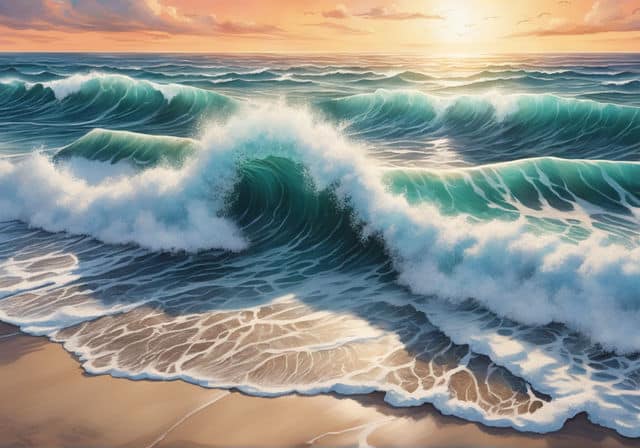
Waves on a Beach: Imagine a painting of a seascape. The repeated pattern of waves crashing on the shore creates a rhythm, guiding your eyes from one wave to the next, feeling their ebb and flow.
City Skylines: Picture a city skyline at sunset. The alternating pattern of tall skyscrapers and shorter buildings creates a visual rhythm, almost like the peaks and valleys in a heartbeat monitor.
Patterned Fabrics in Portraits: Think of a portrait where the subject is wearing a striped or patterned shirt. The repetition of the stripes or patterns introduces rhythm into the artwork, adding depth and interest.
Creating Rhythm in Your Work
Rhythm and repetition go hand in hand. Introducing repeated elements, whether they're shapes, colors, or lines, can establish rhythm. But it's also about balance. Too much repetition and the artwork might feel monotonous; too little and it might lack coherence.
A tip for achieving rhythm is to play with variations. If you're using repeated shapes, perhaps vary their size or spacing slightly. If you're working with colors, introduce subtle changes in hue or tone as they repeat.
Rhythm and Movement
One of the beautiful things about rhythm is how it can suggest movement. Just as dancers move to the rhythm of music, viewers' eyes "dance" across an artwork guided by its rhythm.
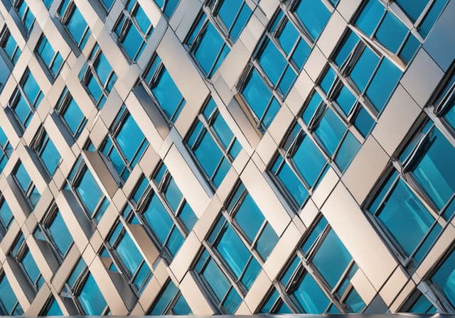
An example of this is how the repeating windows in the photo above gives you the feeling of movement where you know there is none.
Next time you create or admire an artwork, take a moment to feel its rhythm. It might be subtle, but once you tune into it, you'll appreciate the artwork on a whole new level!
8. Movement
Capturing Motion: What is Movement in Art?
If rhythm is the repetitive beat in a song, movement is the melody that flows and evolves over that beat. It's the artist's way of suggesting there's activity or a flow of energy, even if the artwork is static.
Understanding the Difference: Rhythm vs. Movement
While rhythm creates a pattern or repetition that can evoke a feeling of motion, movement brings that motion to life. Think of rhythm as the repetitive dance steps on a dance floor, while movement is the actual act of dancing and swirling around.
Practical Examples of Movement
The Swirling Skirt: Imagine a painting of a dancer with her skirt swirling in the air. The skirt's curved lines and the flow of the fabric give the illusion that it's caught in mid-twirl, suggesting movement.

The Racing Car: In the painting of a racing car you can see how I have used blurred lines in the background while keeping the car in sharp focus. This gives a sense of rapid motion, even if the car is just an image on canvas.
Birds in Flight: A scene with birds, where their wings are captured mid-flap and their bodies are angled, suggests the act of flying.
Action Lines: Meandering or curving action lines suggest the object is moving more slowly and not in a straight line. These lines give an indication of the path or direction of an object's motion in the artwork.
Playing with Value for Movement: Value is a key element in art to depict movement. By placing low and high key (value) colors next to each other, the eye is compelled to jump from one to the other, creating a sense of movement. Conversely, when two colors of the same value are side-by-side, the eye moves smoothly over them, and the sensation of movement diminishes.
Achieving Movement in Art
Artists have various tools at their disposal to depict movement. Action lines, blurring, overlapping, and playing with color value are just some techniques to suggest motion. The positioning of objects or the direction of gaze of characters can also lead the viewer's eye in a particular direction, implying movement.
Connecting the Dots: Rhythm and Movement Together
In many pieces, rhythm and movement work together. The rhythm sets the pattern, the tempo, while movement brings it to life. When you're creating or admiring art, see if you can identify both. They're like partners in a dance, each enhancing the other to make the artwork come alive.
Conclusion
These 8 principles of art serve as invaluable guides, helping artists to craft visually compelling pieces that resonate with viewers. They provide a framework, enabling the harmonious integration of the basic elements of art. Yet, it's essential to remember that these principles are not rigid rules but flexible tools.
As you immerse yourself in the world of art, don't be afraid to experiment, play, and even challenge these principles. By understanding and manipulating them, you can unlock new depths in your artwork, ensuring each piece is as unique and expressive as your own artistic voice.
So, pick up that brush or pencil and let the principles of art be the wind beneath your creative wings.
I hope you have enjoyed this article. Remember to check out the article on the 7 Elements of Art as it follows on from this one.
Pin Me